User interface

Apple came up with this interface behavior that would seem strange before
Mobile Safari has a feature that automatically closes tabs. It reveals the ill-conceived nature of the interface as a whole

In user interfaces, a spinner is a normal indicator of thinking or loading. However, the modern web is often build from blocks that could be loading independently
If you start dragging a window’s border, the window will start to resize horizontally or vertically in that direction

Recently, I wrote about Facebook’s crappy handling of long posts: it’s trims the text randomly and loses your reading position when expanded


Pinpointing individual problems with the Facebook’s user interface is odd, as everything there is done with contempt for the user

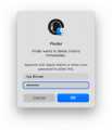
Here is an example of a dumb user interface. You can’t just enter your full phone number, you have to select a country from the list first
Notifications often appear at the wrong time: while I am trying to finish a sentence or to listen to my colleague on a call
When running out of fuel, not only does my car light an LED, but also offers to show the nearest petrol stations using the built-in navigation
I designed the new user interface for the BarPrepHero app. Now it stands out among apps for lawyers