Here is one lesson I have learnt working on Envy, a cool Hawaiian car rental.
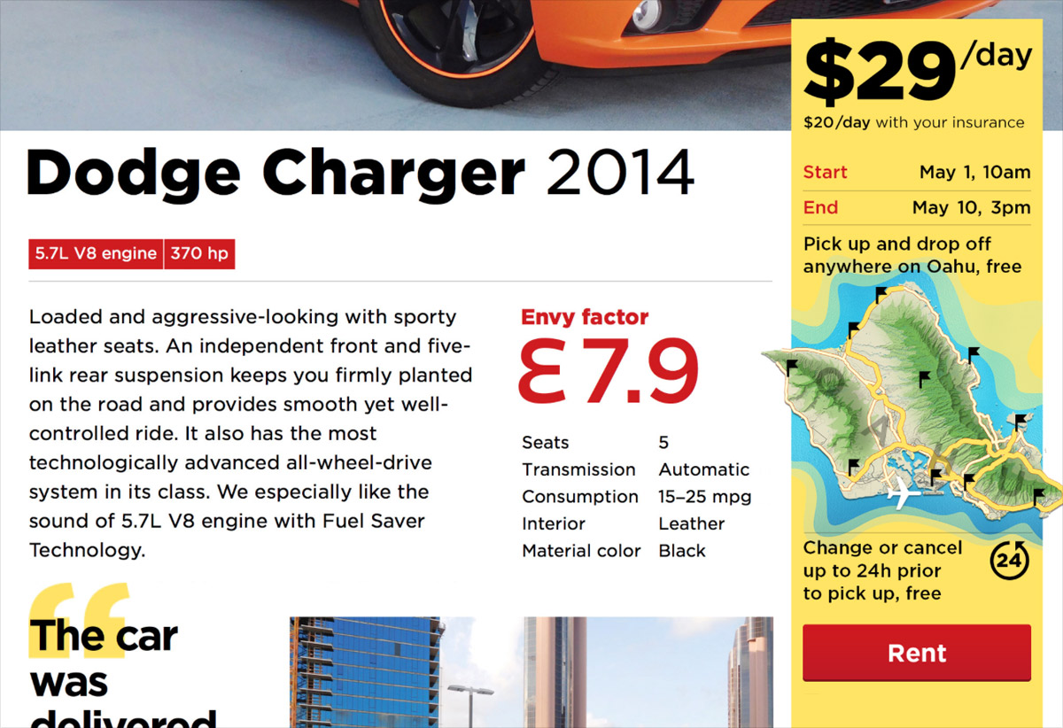
On a car page, there is a yellow price tag with a “Rent” button:
A typical way to get to this page is the following. On the front page a client chooses the desired rent dates, clicks “Find”, then selects from available cars. It is possible though, that by the time the client selects a car, somebody else books it already. Or the client reloads the car page in a couple of days, and the car is gone. One way or the other, a client can end up on the car page with the pre-selected rent dates, for which the car is no longer available, and they won’t be able to rent it.
Also, on the front page we show the best cars we have. A client can click any of them and get to its page, having skipped the dates selection altogether. In this case, the dates won’t be specified, and the client also won’t be able to rent the car. We didn’t want the client to be confused by the disabled “Rent” button, so in addition to the front page, we put the dates selectors to this price tag itself.
I presented the design of the car page to Ilya Sinelnikov (co-creator of Envy) and was talking about the price tag.
I said, we didn’t like that the “Rent” button is disabled sometimes: the website is there for the people to rent cars. But how can you rent a car which is taken by someöne else? At first, we thought that we could automatically change the dates to the nearest available ones. But it can result in a disaster: what if the client doesn’t notice the change, pays for the rent, comes to pick-up the car, and learns that we don’t have it? I said, we were also thinking about some tool to explain the problem and help the client change the dates, but there was no chance to make it on time for the website launch. So, I said, for now I suggest just disabling “Rent” the button in this case.
Also, I said, a car could become unavailable while the clients looks at its page. Therefore we needed to re-check the availability after the “Rent” button is pressed, and inform the client of a problem, if it occurs. For now, I said, we’ve designed this error page. In the future it would be better to suggest a date change or offer another car. But this is also not going to be implemented by launch...
Ilya interrupts: “To hell with the dates, let’s just make the button always enabled.”
What? There can be no car for the client when they come.
“The client is willing to pay us money”, Ilya says, “and you prevent them from it by disabling the button. This is inefficient. Let them pay, and we’ll sort it out”.
And then Ilya enlightens me. Envy as a business must be able to sort this out anyway. It is possible that a booked car is not available for the client, say, if the previous client breaks it, or whatever. In order to make the client happy, Envy offers them a better car for the same price.
For Ilya, it all appeared as if I was trying to stop his client from paying him money with my UI. But from the business perspective my UI consistency hurdles are insignificant. Dates have accidentally overlapped? Oops, sorry, here’s a Mercedes instead of a Ford, no big deal. In the worst case, if there’s a super-picky client who won’t take anything but the very car they’ve chosen on the website, we’ll return the money and apologise.
So we made the “Rent” button always enabled. If by the time the client clicks it, the car becomes unavailable for the selected dates, the manager gets a notification about a problem, and it is their job then to contact the client and agree on a new car or dates. And if the dates are not selected at all, clicking “Rent” moves the focus to the dates fields and opens the calendar, so that the client knows what to do.
Principle: the “Buy” button should always work.