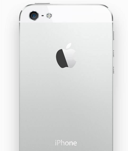
Many designers seem to not like the size of the circles in iOS 7 icons constructed with the help of “Jonny Ive’s grid”. Here is a fragment from Neven Mrgan’s blog:
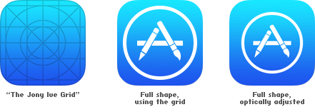
The large circle is too big. Many apps in iOS 7 use it: all the Store apps, Safari, Messages, Photos… In all these icons, the big shape in the center is simply too big. Every icon designer I’ve asked would instead draw something like the icon on the right. To our eyes—and we get paid to have good ones, we’re told—this is more correct.
At first, I also liked the smaller “iOS 6 style” circle better, it looked more balanced to me. But I also kept thinking that there was something good about the new icon. Somehow the fact that there were almost no margins around the circle makes it look lighter. Why?
A couple of days ago I accidentally saw a state-of-the-art washing machine (by pure accident it turned out to be Samsung). My own washing machine is about 20 years old, but it still works fine, so I never bothered to look at the new ones. On the left, the washing machine I saw, or the right, my own one:
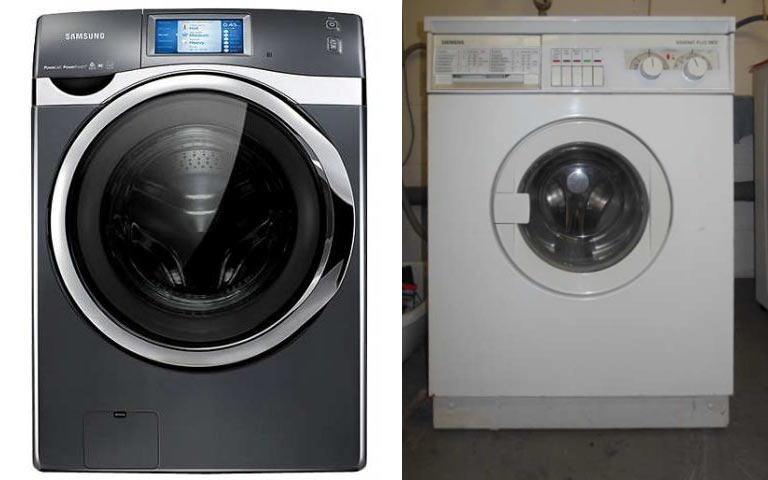
Notice something? After having seen the one on the left, I can no longer tolerate the old iOS 6 icons. Those gigantic margins make them look heavy and outdated (like the washing machine on the right). The old TV sets’ curvy screens also had very large areas around them, it was technically necessary. The old houses had very small windows, or it would be next to impossible to heat them. But today people build houses where the whole wall is a window. Televisions try to have as thin frames as possible. And washing machines have large transparent doors.
The new App Store icons should be spacious. There is no need to balance the inner and outer parts of the circle: the outer part has no reason to exist at all. At the same time, the bigger the App Store sign is within the icon, the easier it is to see it. Which is a win.
What we perceive as beautiful is largely defined by the technological progress.