Selected

Later Ctrl + ↑

Make iTunes Store better by removing it from iTunes

A lot has been said about how bad iTunes is. What bugs me most is that some actions within iTunes prevent me from actually listening to music. Sometimes iTunes is “Looking for iPhone...” and you can’t do anything until it’s done. And it still doesn’t do the most obviously useful thing for music listener: permanently display current track name somewhere. So we had to make Emcee.

But I’d like to take a look at the iTunes Store (including the App Store). How can it be made better?

What I hate about iTunes store is that it’s clearly a web site, but I can’t use a browser to browse it. The web view of iTunes is crippled and ridiculously slow. Why not use Safari? It will not only make the store better for the user, but I believe Apple will sell more songs and apps.

I can’t open a link in new window or tab. Sometimes I want to check out several things from a chart or from search results. Unfortunately, ⌘-clicking them won’t help, I’ll have to open each, then go back. I don’t think I’m the only one who forgets about going back.

I can’t add link to bookmarks. iTunes has a “wishlist”, but it’s only available on a Mac, not iPad or iPhone (or I wasn’t able to find it there). I want to use the Safari bookmarks manager with the store like with anything else and I want it to be synced between my devices. There are also, of course, no bookmarklets in iTunes, so I can’t tweet an app and I can’t send it to Instapaper (some apps have really long descriptions). No obvious way to save and share links is bad.

Some other things I can do in Safari but not in iTunes: zoom a page, drag an image (i. e. album art), pin a portion of a page to Dashboard, search history, find in page. I’ve found myself searching for a feature in an app’s description a couple of times, and I had to use eyes for that, which is just waste of time.

iTunes is already so bloated that it isn’t even funny. So adding all this stuff to iTunes is not an option. To make iTunes store better Apple should just move it from iTunes to Safari.

Rename layer in Photoshop CS6

In previous versions of Photoshop I’ve always set up F2 to open Layer Options dialog. The layer name field was focused by default, so that’s how I renamed layers.

For mysterious reasons in CS6 Adobe has removed Layer Options from the list of things for which you could use a keyboard shortcuts. I was upset. I had to use mouse to rename layer (which takes ages). And why on Earth out of all things would they remove this from the infinite list of configurable shortcuts?

I was almost going to file a bug report, but found a new Rename Layer... item in the Layer menu. Of course it is listed in configurable menu shortcut list, so now I have F2 as a shortcut for it:

I found out that Layer Options were removed from the keyboard setup because the very dialog was removed from Photoshop altogether. That makes sense now that you rename layer with a dedicated command and select its color from a popup menu.

So if you had the same problem, now you don’t. And if you haven’t bothered to set up a shortcut to rename a layer, it’s about time to do it: it will save you tons of time.

More on PHP’s “bad design”

In the previous post I was responding to PHP: a fractal of bad design, and I was talking about the main topic. Design that is. But the post also made me smile and shrug my shoulders many times, and I wanted to share why. I’m sorry, but I wasn’t able to find the author’s name anywhere on his site (speaking about design).

What amused me was that many of the discussed problems there are made up. For example, he is talking about this line of code:

@fopen (’http://example.com/not-existing-file', ‘r’);

He writes a whole thing about how it works, and presents every point in his list of things as a surprise. And my reaction is, yeah, that’s obvious for me that PHP would do that, so what exactly is wrong?

Or, he writes:

"6" == " 6", "4.2" == "4.20", and "133" == "0133" and adds “But note that 133 != 0133, because 0133 is octal.

He implies, I guess, that something about this is wrong or unpredictable, but he doesn’t say what, and I really have no idea. I mean, come on, you should know a language’s syntax to write programs in it, right?

Or he explains how global variables work:

Global variables need a global declaration before they can be used. [...] globals can’t even be read without an explicit declaration — PHP will quietly create a local with the same name, instead. I’m not aware of another language with similar scoping issues.

Not a word on what he thinks of as an issue. Isn’t it OK for languages to differ?

I’ve been programming in PHP for some ten years and for most of the things he talks about, it never even occured to me that it was a problem. Also, I didn’t know many of the things he wrote about, because to encounter them you have to be really sloppy. He deliberately writes some messy code (like five nested ?:’s or 2 < "foo") and then complains that PHP does not execute it the way he wanted.

If you don’t know the language really well, at least write a clear and readable code, and it will work fine.

The great design of PHP

The epic post PHP: a fractal of bad design is worth a read. It’s really interesting, especially if you are a PHP programmer. The author of this post deserves a credit for the work he has done, and there’s a lot to learn (though I’ll get to some questionable details next time).

I was thinking about how to approach the design thing he’s talking about. I felt like he was totally missing the point. Probably, PHP’s design is bad from some theoretical, computer science point of view. But it is great from the real life point of view.

The PHP source code for a “hello world” page is literally “hello world”. This is where the design starts, and it’s big. Trivial things are trivial, simple things are simple, then language gets more complex the more you want from it... and one day it gets really complex and you build Wikipedia. It scales smoothly from hello world to that. While there are indeed many quirks in PHP, they are just minor details. But the learning curve thing is a major strength.

In the post, the examples like Wikipedia and Facebook and WordPress are dismissed like they are irrelevant. But it’s no coincidence that they are there. Jeff Atwood poses a question: “If PHP sucks so profoundly, why is it powering so much of the internet?” And I think I know why: because of its great design.

Good design in terms of computer science attracts geeks who usually make tools for geeks. Just look at the list of Python software. I bet my mum haven’t heard of anything in the list. Good real-life design attracts normal people who want to build something for normal people and who desperately want to start building it now. It’s the design of PHP that makes those great products much more likely to happen.

Simple and powerful leads to popular and successful. And for me “popular and successful” is a much better metric of good design than some criteria made-up specifically to make your point.

The beauty of silence

Breaking news:

A law was passed that in order to drive a car [...] in Britain, there had to be a person walking in front of the car, waving a red flag and blowing a horn.

OK, this is not news, this is history. But, wasn’t it ridiculous? Waving a red flag and blowing a horn! Like an idiot!

Now, to the news. Electric cars are beautifully quiet, but can be dangerous: people don’t know the car is approaching and get killed. And so car manufacturers are making the cars produce artificial noise. Like idiots. The article even says that “recent legislative efforts in the US are making it mandatory that companies add artificial engine sounds to electric vehicles”. Here’s an Audi video about production of such sounds:

They are trying to make it “cool”, but it is so wrong. Noise does not make a car any more useful. Noise is there because of the imperfect aging technology, not because we wanted it to be there. Noise is pollution, we must get rid of it.

People will get used to the beauty of silence. And love it.

Got Git

I’ve always loved programming and hated source control. Source control is about baby-sitting your code instead of actually producing it. It’s like time management instead of actual work. Complicated and boring process that requires discipline, attention to and knowledge of things unrelated to the real project you are making. That has always stopped me from even considering source control. Believe it or not, but for seven years I’ve been developing my blogging system, E2, without source control (still, it’s the best blogging system in the world).

I am also not a big fan of the command line. I know how to spell “sudo apachectl restart”, and that’s pretty much sums it up. So all that svn / git / hg command line incomprehensible crap only added to my frustration. Friends said there were GUI clients, showed me Tower. Oh my god, so much stuff to look at, so many buttons to understand, so many rites to learn. For some reason, I can’t just commit stuff, I need to stage it first. No, I said, please, guys, let me just do my projects. And those “remote repositories”? Hate that. Everything is already here, on my machine. Why bother even thinking about putting it somewhere else? See, I didn’t like anything about source control.

Everyone was trying to convert me. They said hey, but how do you work in a team without source control? And I said, I either work alone, or I separate pieces of code into independent files. They said hey, but how do you revert changes if you’ve accidentally broken something, without source control? And I said, I use Time Machine. They said hey, how do you branch your code without source control? And I said, what the hell is that?

But there’s always been something I did want, and I knew source control could do it for me. First, I wanted to see what has changed in a project from a previous revision (to write a full changelog, primarily). Second, ability to comment the changes would be nice. Third, I wanted to be sure no code gets deleted just because Time Machine runs out of disk space. Finally, I wanted to seamlessly merge changes I’ve made on my notebook with the ones I’ve made on my main machine, if I’ve accidentally forgotten to sync them before doing something.

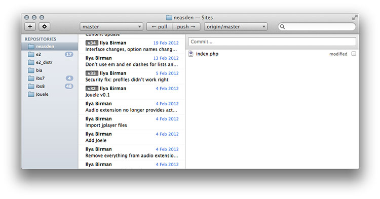
I was lucky enough to get the author of Gitbox, Oleg Andreev (who I happen to know personally), to spend some time on Skype with me and explain how to start using git with Gitbox. It turned out to be way easier than I had thought. You just drag a folder to Gitbox to put it under its control. Whenever something changes, it shows you the changed files (on the right):

To commit changes, you put checkboxes next to the files you want and write a comment in the field above the list. To see changes inside a file, you double-click its name. The project and its commit history looks like mail. Oleg explained to me how to “link” the project folders on the notebook and on the main machine: I had to set up the two copies as remote repositories for one another. This was the only non-obvious thing. Still, done in the UI with drag and drop.

So if you are like me and want to continue hating source control but still use some of its benefits, try Gitbox. Or if you are not like me and you’ve been a source control fan all your life, try Gitbox. You’ll love it.

Linking to where I already am

Every web designer knows that no hyperlink should ever reference a page where I already am. Ah, not true! For some reason, many web designers think it’s fine to use such hyperlinks. It’s the stupidest thing ever.

For example, there’s a great post by Jeff Atwood on pagination. I was trying to copy the title of the post, but failed twice. Should be easy: select text and press ⌘C. So I double-click “Pagination” and move the mouse to select the rest of the text (that’s how text selection works: after double clicking you select by words instead of by characters). Oops, the page is now reloading. What happened? Turns out, the title is a link to the post which I’m reading already! Not just is it absolutely useless, the link is not even underlined, it’s not even blue. So there’s no logical reason for it to be a link and no logical reason for me to even expect it to be a link. Why on Earth would anyone design stuf this way? Still, great post on pagination there.

Maybe Jeff is just a bad designer? No, that is clearly not the reason. Welcome to apple.com, another example of this mistake by some of the best designers. See that  in the menu on top? It’s a link to the front page. But wait a minute, I am on the front page! Click ”iPod”, and things gets worse: now the “iPod” button looks pressed and does not change when you hover it, but it’s still a link to where you are. Notice, by the way, that the first button was not pressed when you were on frontpage. Apple is famous for its attention to detail, but this design is lousy and makes no sense. Sure, it’s better to be right than to be consistent. But there’s nothing good about being both wrong and inconsistent, I suppose.

Rule: Never link to the very page you are at.

SIM cards must die

So, Apple still fighting for smaller SIM card standard for future iPhones. What? Why isn’t Apple fighting to kill the SIM cards? In the future, there won’t exist any SIM cards, and we will choose carriers like we choose Wi-Fi networks.

The phone presents me with a list of available carriers. I pick the one I like or select to learn more about it (coverage, service plans etc). If I choose a new one, the phone asks me to choose a plan and other details. Then it asks me if it’s fine to share my payment information with the selected carrier. I confirm. Done. Something like this:

Carriers don’t want that because it will prevent them from locking in customers. But who cares? How many things the carriers used to like Apple has already killed? It’s about time to kill the most clumsy and archaic one, the SIM card.

Earlier Ctrl + ↓