Selected

Later Ctrl + ↑

Matching the typography of the three languages in Israel

In Israel, many signs are given in three languages: Hebrew, Arabic, and English. The three writing systems are very different, but sometimes designers try to find somewhat similar fonts to make all three work together.

The idea is good in itself, but the result is often poor.

The first picture is of the light rail station in Tel Aviv:

Everything seems to be equally low-contrast, straightforward, and close to pure grapheme. But the line heights and the stroke widths are all different, so it looks very sloppy.

The second picture is of a beautiful sign at the Rehovot police station:

Each writing system is being true to itself instead of trying to mimic a foreign one, but the whole thing still looks very consistent due to the same range of stroke widths.

One spinner is enough

In user interfaces, a spinner is a normal indicator of thinking or loading. However, the modern web is often build from blocks that could be loading independently. As a result, you got multiple spinners spinning:

Not good.

The application architecture should account for the fact that multiple things could be loading at once. Where would the spinner be displayed? In the case of multiple instances of the same block type, it’s enough to show the spinner in lieu of the first one. When the blocks are diverse, in general it’s best to put the spinner in the largest or the top-most block.

The classic iPhone used to have a loading indicator right in the status bar:

If memory serves, there was an API for an application to tell the status bar: “Hey, I already have an indicator in my interface, so don’t show yours”.

But the art of thinking of how to avoid rubbish on the screen, has long been forgotten even at Apple, so you can’t expect this level of care from Twitter.

Using timezones in Calendar in remote teams

Those who have remote colleagues and clients sometimes struggle with timezones and don’t know how to use Calendar.

Here’s what you do. Turn on timezone support if it is off for some reason:

When you add a meeting, specify its timezone (unless it’s the one you are in):

In the toolbar, select which timezone to display your calendar in and create events by default:

To be honest, I have no idea how come this “timezone support” is an option and what happens when it’s off.

How to do Offset Path in Figma

I’ve learned how to do Offset Path in Figma. Say you have a path, and you need to make another one parallel to this one at an offset x:

You copy the first path and give it a stroke width of 2x:

Then you do Outline Stroke (⌘⇧O) and adjust the stroke to your liking:

And then you remove the unnecessary points:

Done! Crazy, but better then “you can’t do it”.

Resizing Mac Windows

If you start dragging a window’s border, the window will start to resize horizontally or vertically in that direction. And with the Option key pressed, it will resize symmetrically in the opposite direction as well (like in Photoshop, yes).

If you start dragging a window’s corner, the window will start to resize both horizontally and vertically in that direction. And with the Option key pressed, it will resize symmetrically in all directions.

If you double click a window’s border, the window will grow from that side to the edge of the screen. If you double click a window’s corner, the window will grow to the corresponding corner of the screen.

Therefore, to make a window cover the whole screen (but not go into the dumb full-screen mode), just alt-doubleclick any of the window’s corners.

See also:

How to trim text the right way

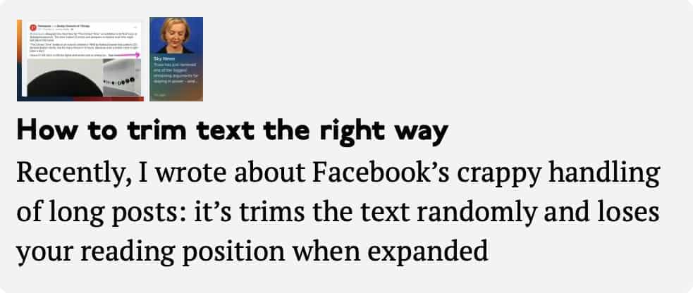
Recently, I wrote about Facebook’s crappy handling of long posts: it’s trims the text randomly and loses your reading position when expanded. So how should it be done? Let’s deal with the trimming first.

Trimming text in a random place is disrespectful to the author and the text, and is a further proof that Facebook doesn’t care what you write. It’s also an example of deep technology dependence: it’s easier for a machine to trim to a certain number of characters, and so it does.

There could be an aesthetic rationale behind trimming text, i.e. to make it fit into a certain design element. Of course this is also disrespectful to the author and the text, but at least the motives are humanistic. However trimming after a fixed number of characters is not even this: the physical size of lines of equal character length is usually variable: compare “iii” and “WWW”. Even in my Facebook example, a few more words would fit in the same box:

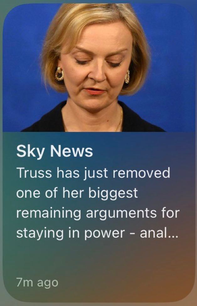
Sometimes trimming randomly not only ruins the meaning of the text, but changes its to something indecent:

So, if you can’t do without trimming, you have to trim carefully. How does Aegea do it?

The character limit is considered a rough guideline, not an exact value. If you need to fit in 140 characters, and the text is 143 characters long, then Aegea just won’t touch it. If the text is noticeably over the limit, then Aegea will divide it into sentences and try to take as many full sentences as it can fit. Here, for example, is the snippet of this post:

However, if the result is too short (or no whole sentence fits at all), Aegea will look for other signs of safe trim positions: semicolons, dashes, commas, brackets. Only if none of these are present will it trim at a word boundary. And only if there are no word boundaries, will it trim by the number of characters. The absence of word boundaries is a sure sign that the author themselves didn’t care about the meaning, so it’s fine if neither does Aegea.

In general, Aegea will try to make it as close to the desired length as possible, but so that the meaning does not suffer.

If I can code this, what would stop Facebook from doing it? I think it’s that it hadn’t even crossed anyone’s mind. Why would Facebook even care about doing anything well? What a nonsense. There is no such metric.

Tiles, balance, and harmony

Like all normal people, I have an OCD about sidewalk tiles. I have to step on the seams the same number of times with each feet. Or, if I step over a drainage canal with my left foot, then I have to step over the next one with my right foot. I take delight in balance and harmony in my life.

When I was running today, the peculiarities in the tile pattern occurred once every ten meters or so. It goes without saying that my feet should have had an equal share of them. But who would intentionally mess up their running pace just for that? I want everything to be smooth and natural, otherwise it’s hardly balance or harmony.

To my surprise, I didn’t actually have to think or analyze anything. My body perfectly adjusts the stride length so that everything flows seamlessly (no pun intended). As I see another strip of red tiles seven meters away, I somehow know how to run so I can step on the next one with my other foot. Turns out, balance and harmony come easy to me.

Selecting country to enter your phone number

Here is an example of a dumb user interface. You can’t just enter your full phone number, you have to select a country from the list first:

It is especially tough when you have +44 number. I don’t know what to look for: UK? United Kingdom? Britain? Great Britain? England...? Even if there is a correct answer to this question, it is not necessarily the case that the authors of the form have the same idea.

To make thing worse still, it’s a custom dropdown instead of a system one, which means — of course! — that nobody bothered to implement keyboard support, so you have to scroll back and forth in this tiny area.

May I notify you

Notifications often appear at the wrong time: while I am trying to finish a sentence or to listen to my colleague on a call. However, in many cases there is no reason to be notified at a certain time to the exact second. The reminder to take a pill this morning popped up while I was running! Clearly, I’m not going to take it while I’m running, so why not hold the reminder until I finish?

In real life, there is a way to notify without interrupting: by raising your hand. The interface actually has different degrees of “intrusiveness” of notifications as well: red badges, temporary banners, modal windows, sounds. But in real life, if I’ve raised my hand and I don’t get noticed, I can raise it higher after a while, then wave it, or even stand up. If nothing helps, I can say “Excuse me!”

Notifications in the interface lack this kind of progressive persistence. Given the urgency of the message itself and how busy I am, the interface can either tell me everything right away, or start with a little neat dot in the status bar (“raised the hand”), then animate that dot (“waved the hand”) and only if I am not paying attention for very long, bring up a full interface.

Here is how I want it

Imagine yourself preparing for difficult negotiations not knowing how you’ll express or defend your position. You already have a hundred scenarios in your head, ninety of which are horrible. What if they perceive my proposal as impudence and turn me away without giving me a chance to discuss the options? What if they get offended by my offer and our relationship goes sour? What if they don’t expect this and expect that? What if... Your brain explodes from trying to think out a “plan” in different cases, and at some point you don’t even know where to start the conversation.

In this case, I have a simple recipe: start with the words “Here is how I want it”.

You don’t know the outcome of the negotiations and you don’t know what the other side has in mind. You can’t make the other side do anything. But you know what you want, and you can say it clearly. It’s okay to want something. The key is to speak in a way that doesn’t make the other party feel pressured or manipulated. You’re just sharing a wish, as if you were sharing an observation about the weather.

Someone struggles to come up with a justification for a salary increase and makes a list of their merits. But sometimes you can just write, “I want to double the salary starting with the next project” and get a “Deal”. Some people spend months wooing or using pick-up tricks to someone they have a crush on. But sometimes you can just write, “I want to go to bed with you”, and get an “I’m in”.

Earlier Ctrl + ↓