Blog

Later Ctrl + ↑

Designing the “Badge” feature for Sayve

 6 min

In Sayve 1.3, we added the ability to display a badge with the number of unsorted audio recordings:

Designing the “Badge” feature for Sayve

This is for those of us who don’t like their audio recordings to pile up. Actually, we wanted this in 1.0, but it didn’t get there. Why? It wasn’t that easy to design.

OK, this must be laughable: what even is there to design? The badge is a system feature that has a fixed look, just take it. But you can’t.

This is going to be a long and boring post, by the way.

Since iOS 10, displaying a badge requires an app to have asked user’s permission for sending notifications. So if we just tried to just show it, the user would see the system dialog asking for the permission.

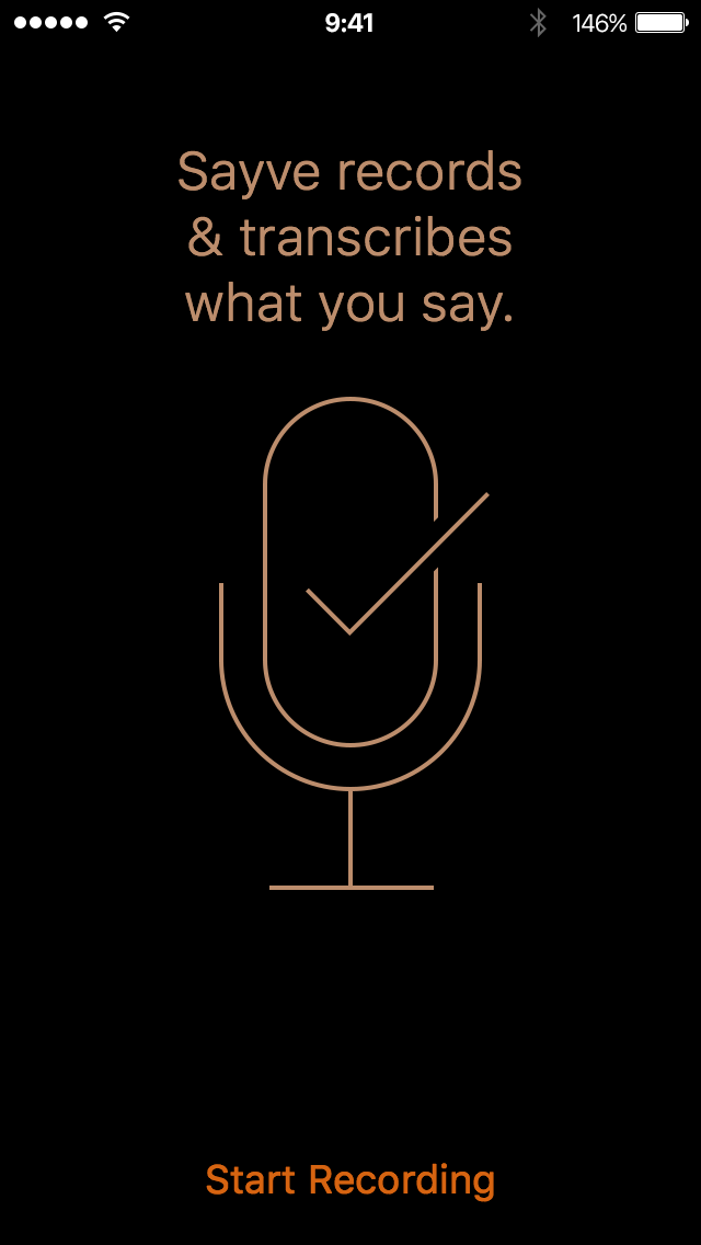
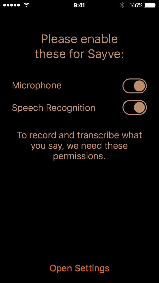
We already ask for two permissions on first open: microphone and speech recognition. For iOS these are two separate things, unfortunately. Before asking, we show this screen:

Sayve First launch

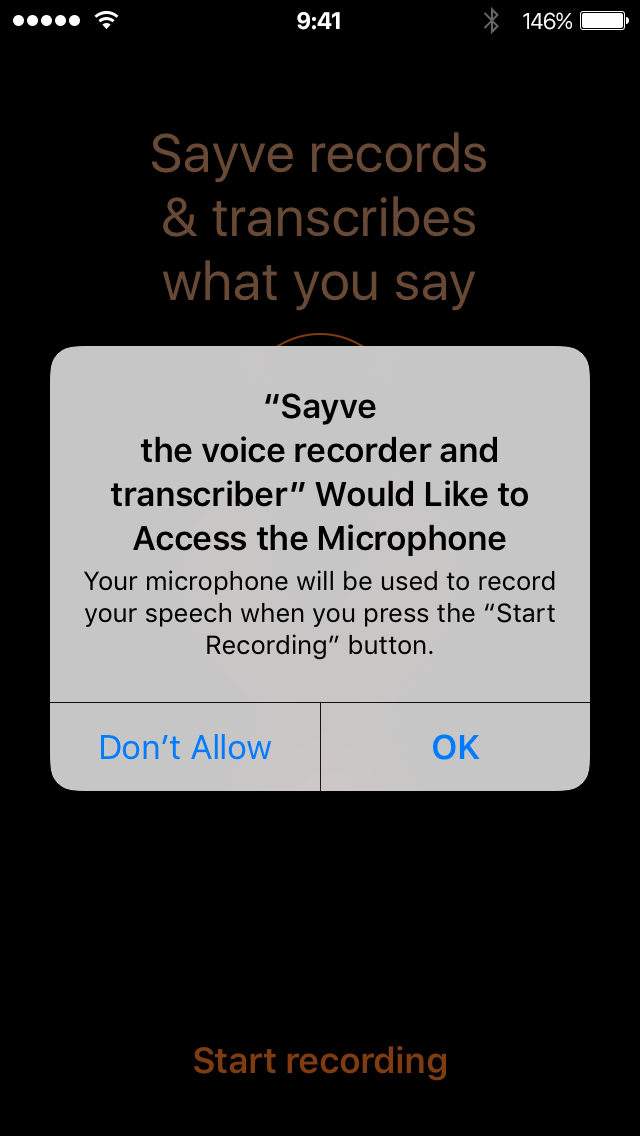
This prepares the user for the system questions and helps us get a “Yes”. Microphone:

iOS asks for microphone permission for Sayve

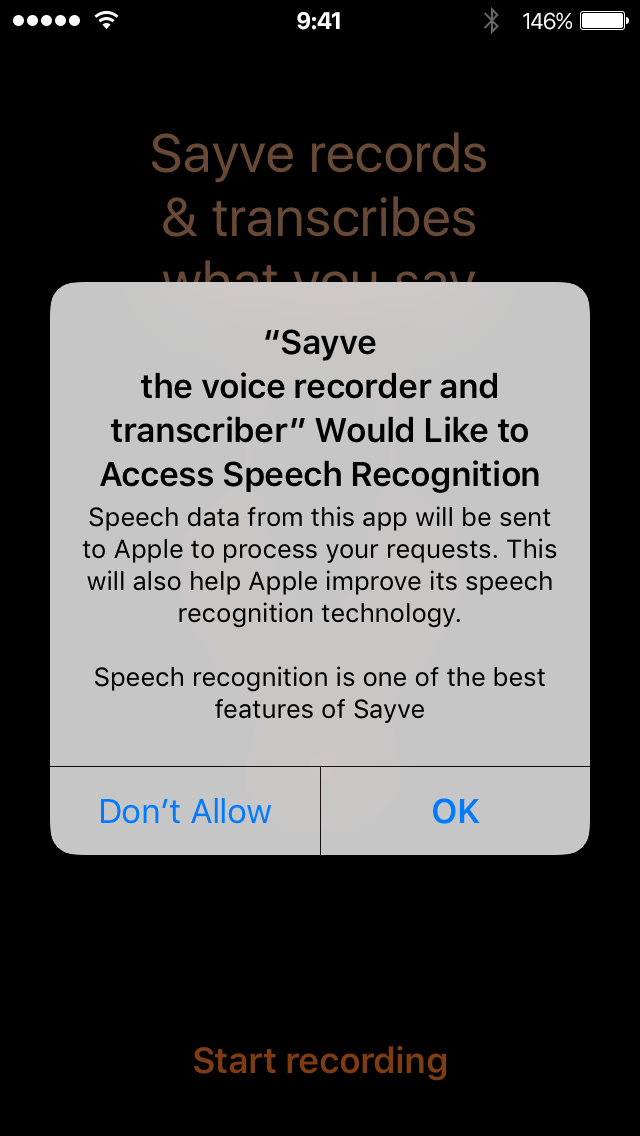
Speech recognition:

iOS asks for speech recognition permission for Sayve

Notice that we can also add some of our own text in these dialogs to explain why we are asking for these permissions.

We could add a “tutorial” screen before asking about notifications: explain that we are going to display a badge and only then ask for permission. But adding another such screen and third permission question would make the first-launch experience really clumsy. And what’s more important, many users would still presumably press “Don’t Allow”, because at first launch they have no idea about how they would use Sayve and why a badge might be useful to them.

And what should we do if the user answers “Don’t Allow”? You can ask for a permission only once. How would the user even know they could change their mind later? For comparison, when the user answers “Don’t Allow” to any of the two sound-related questions, Sayve just cannot work, and we show this screen until both permissions are given:

Open Settings

We can’t do the same for the badge permission, because the badge is not necessary, it is just a preference. Some users would like it, others would not. So if the user says “Don’t Allow”, we would need to explain how to enable the badge later. But where and when? We don’t even have an About or Settings screen.

We could go and add a Settings screen just for this one setting. See how this is getting complicated?

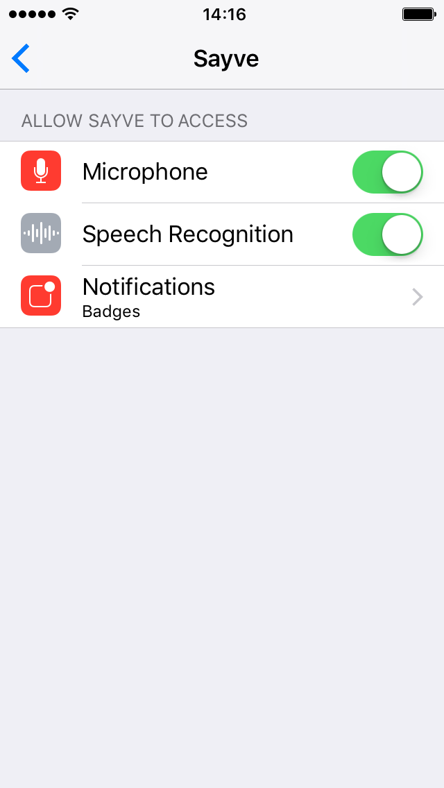
Adding in-app Settings screen makes little sense: iOS already has notifications settings, and this is the only “notification” feature we use. So the next idea was to make this setting configurable only in the Settings app:

Sayve Settings

Let’s just display a badge when the user has enabled notifications. And we could explain this option in the app’s description.

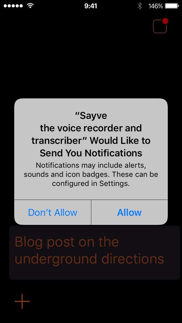
This also didn’t work. Turns out, you can’t just put this “Notifications” element to the apps settings screen quietly — it would only be added there after your app has asked for a permission. So we have to ask for a permission even to get a “No”! By the way, the question starts with the text “Sayve Would Like to Send You Notifications”, which is not true:

iOS asks for notifications permission for Sayve

We would not like to send any notifications, and we don’t even have them. As to the badge, we just can, but not would like to use it. To make things even worse, in this dialog, unlike the two previous ones, you cannot even put your explanatory text.

But this is not something we can change: the question is asked by iOS, not us.

So we added this icon to the top right corner:

Sayve badge icon

The idea was: when the user taps this icon, we would first ask if the user would like to see the badge, and if yes, we’ll ask for the system permission to enable notifications. And we would remove the icon then.

Do you think this worked? Of course not. What would we do if the user declined the first time? There would no way to add the notification permission setting to the system Settings app then. So we cannot ask the user if they want a badge, we must just tell them that the notification permission dialog will follow and it is there to display a badge if they want.

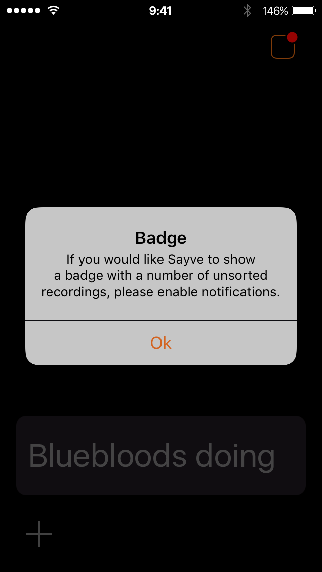
So, in 1.3, when you tap the icon in the top right corner, you’ll see:

Sayve talks about the badge

And after you press “OK” (which is misspelled as “Ok”, unfortunately), you see the actual, system notification permission dialog where you can decide whether you want the badge or not.

After having shipped this, we see that it’s better to say “Continue” instead of “OK” in the box above, otherwise it may seem to the user that they have no choice.

Is this the best design of a feature? I don’t think so. But that’s the best that we could come up with given the system limitations that we have.

We hope you like Sayve (we are Mihail Rubanov, the developer, and myself).

The button:

Get in the App Store

Monument Valley 2

During WWDC, the new Monument Valley was released. It’s the most splendid game ever. I’ve finished it, having made some screenshots:

Monument Valley 2

But the pictures show only a small part of the game’s beauty. In reality, everything is live and the sound is amazing. Go buy and play it.

Apple WWDC date

Apple says:

Why do they want me to decrypt the date? It’s OK to shorten the dates this way when writing by hand or when there is no space. But here, the word “June” should be written in full.

The revolution in the mobile user interface

It’s about time to flip the mobile user interface vertically.

The revolution in the mobile user interface
I have no idea what language this is

It was easy to tap “Back” or “Edit” with your thumb on the original iPhone. On iPhone 5, it became harder. Since the 6, it’s almost impossible.

Apple has added two features to make things less bad. The first was a gesture where you slide from the left edge of the screen to get back. The second was Reachability, where you double tap the Home button to make everything on the screen shift down so you could reach the top row of buttons. This already felt like a duck tape fix.

The question is: why put buttons on top and then add obscure gesture to reach them when you could just put the buttons on the bottom in the first place?

Windows Phone has the browser’s address bar on the bottom:

The revolution in the mobile user interface
On some screenshots it’s actually on top, so I’m not sure. Anyway, it should be on the bottom

Apple, when will you do the same?

It’s interesting that the revolution has already happened in Maps. Before and after:

The revolution in the mobile user interface

The search field and results have moved to the bottom. Why did this change only in one app?

We’ve designed Sayve, the smart voice recorder so that all the important controls are reachable. A couple of intermediary user interface layouts:

The revolution in the mobile user interface

At first, the audio controls were on top (the left layout). Then it moved down (the right layout).

Finally, all the user interface changed to gravitate towards the bottom:

The revolution in the mobile user interface

I’m hopeful that Apple will do something similar throughout iOS 11.

When you turn the things upside-down, you may not like the result aesthetically at first. But our idea of what’s beautiful is largely formed by the technology.

The rule: in the mobile user interface, put the controls on the bottom.

The letter x is not a multiplication sign

The letter x is not a multiplication sign. Use the times sign (×) to denote multiplication:

Notice how the proper multiplication sign is aligned with other mathematical operations signs. Using x in place of × is as sloppy as using programmer’s quotes (") in place of actual quotes (“...”). Also, when you write 5x, it means 5 multiplied by x or 5×x. Probably, not what you were trying to say.

Emerge 1.3.1

I’ve updated Emerge to version 1.3.1, where I’ve fixed a couple of bugs. One is related to the display of the spinner. The other, to console errors when using CSS images. If you aren’t bothered but these, there’s no need to update.

If you’ve bought Emerge, you get the updates for free. Just re-download using the same link you got when you bought the script. Or drop me a line if you have any questions.

Unstable alignment

Sometimes my students would come up with a layout like this:

Unstable alignment

It may seem that things are aligned, but they are not. Can you see what’s wrong? I would ask, how is the heading positioned? They would say, it’s centered:

Unstable alignment

How is the text aligned then? They would say, it’s left-aligned:

Unstable alignment

And how was the left margin chosen? They would say, it’s aligned with the heading. But this means that the position of text depends on the length of the heading. What would you do with this if the text changes on another screen?

Unstable alignment

This doesn’t work as a system, because this structure is unstable. It reminds me of the fragile Windows Start menu:

You must be careful enough not to breathe, or the whole thing will fall apart.

So, generally, do not align a piece of text to an itself-unaligned part of another text:

Because when you translate this text into a different language, really weird things will happen:

iPhone passcode keyboard rendering bug

Years pass, but Apple just wouldn’t fix this bug in iOS. When the iPhone asks you for the passcode, it shows the keyboard where system keys’ borders aren’t semitransparent:

You may think that it is so by design, but no: if you touch the keyboard, all keys’ border re-render normally, with thin borders.

And sometimes the keyboard is rendered fine initially:

Does nobody in Apple use alphanumeric passcodes? The numeric ones you usually see others type from three-meters distance. Since there is Touch ID and the passcode is rarely asked for, there is no reason to use the numeric ones.

Transport map design. Part 3

 6 min

In part 1 I’ve covered the difference between the Beck’s London underground map, our Ekaterinburg metro map, and the Vignelli’s and Hertz’s maps of New York subway. In part 2, I’ve highlighted the more subtle details specific to the transit maps of Barcelona, Paris, Oslo, Moscow and London.

All these differences in maps were because of the differences in the cities or their transportation systems. But there is another reason for the maps to be different: aesthetics.

The transport map is not only a tool, but also is a notable object of graphic design in a big city. So even if you can make do with the Beck’s design language, you will get a London map, no matter what you depict. The transport system must have a face, and aesthetics is as important as logic.

The main feature of the Moscow metro map is the Circle line. It doesn’t fit the Beck’s language, but it’s very important to Moscow. This is not Moscow:

Transport map design. Not Moscow

This, on the other hand, is:

Transport map design. Moscow

London also has Circle line, but it has never been depicted as a circle. Today, it’s not even a closed loop:

London also has Circle line

These Circle lines are large elements and form the overall image of the map.

But little details also influence the perception of a map.

In London, the black rings of the transfer stations are noticeably thinner than the lines. The “corridors” are of the same width. The stations’ ticks are square, stick out at 2/3 of a line’s width. The names are typeset with blue New Johnston:

Transport map design. London

In Moscow, the fat rings of the transfers are coloured with their line’s colour. The “corridors” are much thinner and have a gradient. Some transfers are circular. The station ticks stick out at full line’s width. The names are typeset with black Moscow Sans:

Transport map design. Moscow

Look at this tram map:

London Tramlink

It’s obvious that it’s a London tram map, not some other one. It follows the London transport graphic design standards — the rings, the ticks, the captions.

When we see the beige background, the particular palette of the lines, the filled station disks and the distinct designation of the transfers, we immediately recognise the Paris map:

Transport map design. Paris

Jug Cerović follows an unusual 18-degree angle grid in his Luxembourg map. If you saw it once, you recognise it every time:

Transport map design. Luxembourg

For the Chelyabinsk trams map we’ve come up with these 3D terminals:

Transport map design. Chelyabinsk

Why are they like this? The only reason is that we wanted this map to look special.

It is not enough for a good transport map to just answer the question “how to get there”. Since it is used everywhere, it is part of a city’s image. And if its design is powerful, it influences the city in other ways.

The Moscow’s Circle line in has inspired designers to create these beautiful wayfinding steles:

Transport map design

The round designations of the New York subway train routes are used in all the signage and have even made it to the dots above i in the pedestrian city maps (in the classic Helvetica these dots are rectangles):

Transport map design. WalkNYC

And in London, the Tube Map has given birth to the graphical language of all the transport-related signage:

Transport map design. TfL posters

This graphical language is so iconic that you can even buy all sorts of souvenirs with its elements: t-shirts, umbrellas, shower curtains. This design has spread not only beyond the Tube, but beyond London. There are all sorts of maps done in this style:

Transport map design
A playful depiction of cities listed in Mark Ovenden’s “Transit Maps of the World” book

Strong graphic design of the transport systems makes them more attractive. This helps cities get rid of private cars. People spend more time outside, interact with each other. This gives small businesses a boost and makes cities more pleasant to live in.

How to use Emerge to make your website load nicely

 5 min

Most web pages don’t load pleasantly. Loading takes time, images and other elements appear in a random order. Content jumps when new elements load above it. Some things are unreadable before a font or a background is loaded. We are used to this.

Desktop apps are different: an app’s user interface would appear only after it’s loaded. The apps that are slow to load show splash screens.

The desktop approach looks more polished. But on the web, we can start reading and even using a page before it’s fully loaded.

How can we take the best of the two worlds? We can gradually show a page, but make sure it looks fine at every step of this progressive loading. And we’ll try to minimise the jumping. I call this “coordinated loading”.

Emerge is a JavaScript library that I’ve created to help add coordinated loading to your website. Normally you would need to manually write a lot of code to do this. But with Emerge, you just specify the desired behaviour with HTML attributes. Let’s see how you can use it on your website.
Prepare: provide boxes for images and other external objects

Before we even start using Emerge, let’s fix one thing. Consider this code:

<img src="some.jpg" />
<p>Text</p>

Before the browser has loaded the image, it has no idea how much space to provide for it. So it first just shows the text as if there was no image. When it starts loading the image and figures out its size, the layout changes for the image to fit. So the text jumps down.

To avoid the jumping, specify all images sizes:

<img src="image.png" width="200" height="300" />
<p>Text</p>

Here’s how you can do this with PHP (5.4 or later):

<img src="image.png" <?= getimagesize ('image.png')['attribute'] ?> />
<p>Text</p>

But what if you want an image to be flexible, i.e. occupy 100% of the container width?

<img src="photo.jpg" width="100%" />

In this case, to avoid the jumping, you’ll need a container with fixed proportions. Let’s say you have a 3:2 photo. Here’s a way to do it:

<div style="position: relative; padding-bottom: 66.67%">
<img style="position: absolute" src="photo.jpg" width="100%" />
</div>

Paddings’ percentages are always percentages of width, even for vertical padding. So the div will have 3:2 proportions even before the photo is loaded. PHP code:

<?php $size = getimagesize ('photo.jpg'); ?>
<div style="position: relative; padding-bottom:
	<?=round (100*$size['height']/$size['width'], 2) ?>%">
<img style="position: absolute" src="photo.jpg" width="100%" />
</div>

The same can be done with videos.

Figure out which elements of the page make no sense unless they are fully loaded

OK, appearing images will no longer cause jumping. That’s a win already.

But with the Emerge script added to your page, you can do more. Use class “emerge” in an image to make it fade in (“emerge”) when loaded:

<img … class="emerge" />

What if your image has a caption which makes no sense unless the image is loaded? Actually, you can wrap elements in divs with class “emerge”:

<div class="emerge">
  <!-- Text, images and what not -->
</div>

You can put multiple images and videos into such div. The div will emerge only after all images and videos inside it are loaded.

Add a loading spinner for large elements

Some of your emerge elements may be quite large and take considerable time to load. The user may be confused by a large empty space on a page. So you can ask Emerge to display a loading indicator while such elements load:

<div class="emerge" data-spin="true">
  <!-- Show spinner while this is loading -->
</div>

Emerge has a built-in spinner with variable size, color and spin direction. If you want a custom spinner, Emerge supports them too. The documentation explains spinners in detail.

Make sure things appear in order

It may happen that an element which is lower on a page loads and emerges before the one which is above it. This may look strange and you may want to make sure the element load in a particular order.

Here is the easiest way to make an emerge element wait for the previous one to load:

<div class="emerge">
  <!-- Some content -->
</div>
<div class="emerge" data-continue="true">
  <!-- This will wait for the previous element to emerge first -->
</div>

The attribute data-continue means that even when this element’s images and videos are ready, it would emerge only after the previous one. You can chain many elements this way. If document order is not what you want, there is also a way to make one element wait for a particular other element by its id.

Select effect that make your site look best

By default, elements emerge by just fading in. But this is also adjustable.

Here are some examples of what you can do. You can make an element slide horizontally or vertically while it emerges:

<div class="emerge" data-effect="slide" data-up="20px">
  <!-- Stuff that will slide up 20px while emerging -->
</div>

Use data-down, data-left or data-right to change this. You can combine a horisontal and vertical parameters for diagonal motion.

Or you can make an element zoom-in:

<div class="emerge" data-effect="zoom">
  <!-- This will zoom in while emerging -->
</div>

Tune the original size with data-scale=“0.8” (or another value).

You can control an animation duration with data-duration (in ms).

There are other effects, which you can read about in the documentation. You can also provide an exact CSS for initial and final animation states.
Experiment and have fun

Since Emerge does not require you to write JavaScript, it’s very easy to experiment with. Find the way for your website to load in the best possible way.

But make sure you use the effects to improve the way your site loads, not make it too flashy and distracting. Don’t wrap the whole page into an emerging div: the user won’t see anything before everything is loaded, and your website will feel very slow.

The idea is to find elements that make sense only as a group, and make such groups appear in a single fade-in animation when ready. And then coordinate the order and motion for these groups.
Earlier Ctrl + ↓