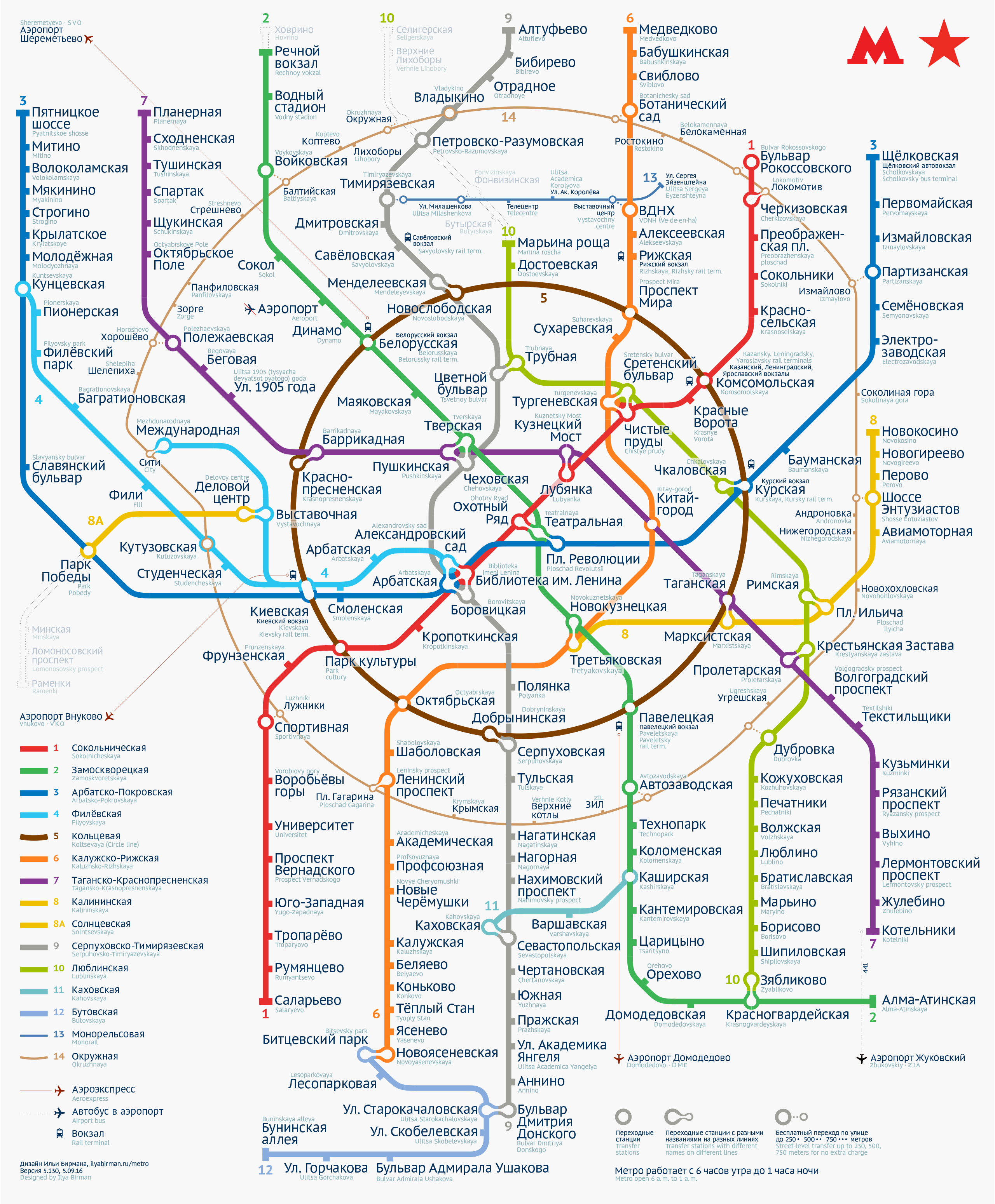
I made my first Moscow metro map in 2007. The official map was disgusting then, but nobody cared. My work inspired many designers to try to design their own map. I know several designers who gave up after they’ve appreciated how hard the task actually was. I had two major revisions of my map including the one for the official 2013 competition for the new map to be used on the system. In that version I’ve solved the problem of the Biblioteka imeni Lenina junction and invented the Compass (more on that on the 2013 map’s page in my portfolio). I took the second place. It took most of the 2015 to design the next version of the map: it used space more efficiently and the overall graphical design was improved.
Here is the new version, with the new Circle Railway (Line 14) added:
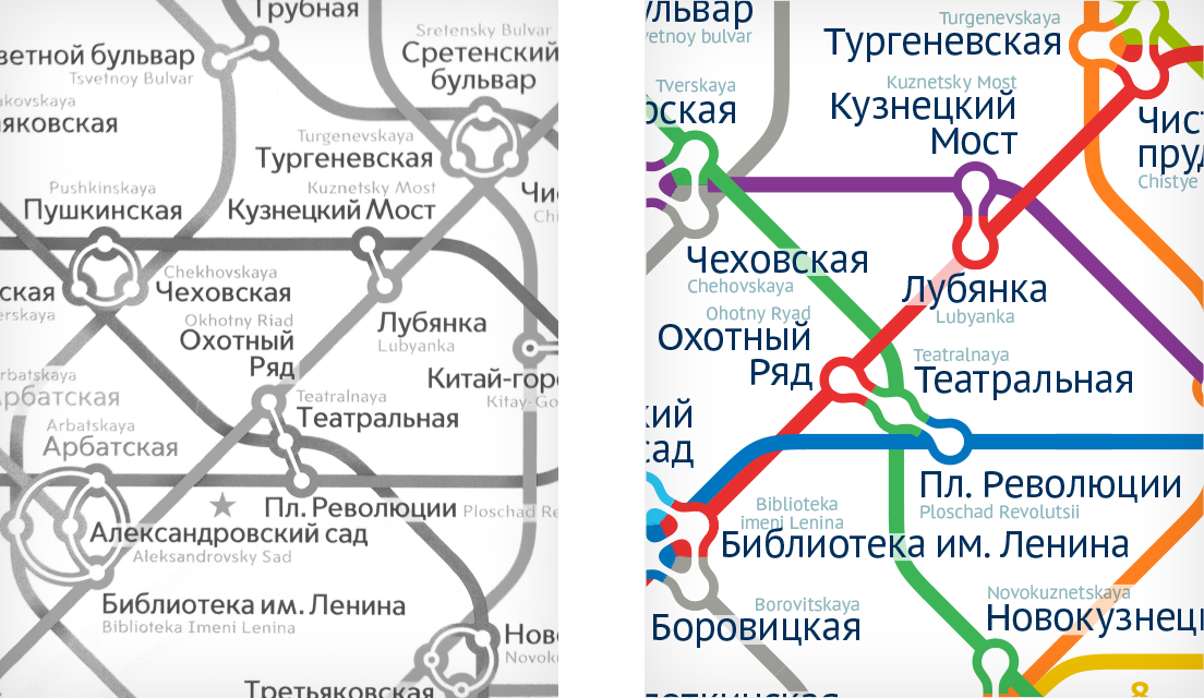
Compared to the official map, this map has almost 35% larger font when printed as same-size poster:
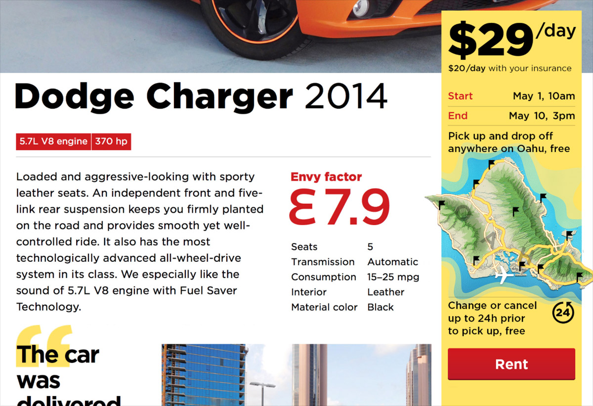
On a car page, there is a yellow price tag with a “Rent” button:
A typical way to get to this page is the following. On the front page a client chooses the desired rent dates, clicks “Find”, then selects from available cars. It is possible though, that by the time the client selects a car, somebody else books it already. Or the client reloads the car page in a couple of days, and the car is gone. One way or the other, a client can end up on the car page with the pre-selected rent dates, for which the car is no longer available, and they won’t be able to rent it.
Also, on the front page we show the best cars we have. A client can click any of them and get to its page, having skipped the dates selection altogether. In this case, the dates won’t be specified, and the client also won’t be able to rent the car. We didn’t want the client to be confused by the disabled “Rent” button, so in addition to the front page, we put the dates selectors to this price tag itself.
I presented the design of the car page to Ilya Sinelnikov (co-creator of Envy) and was talking about the price tag.
I said, we didn’t like that the “Rent” button is disabled sometimes: the website is there for the people to rent cars. But how can you rent a car which is taken by someöne else? At first, we thought that we could automatically change the dates to the nearest available ones. But it can result in a disaster: what if the client doesn’t notice the change, pays for the rent, comes to pick-up the car, and learns that we don’t have it? I said, we were also thinking about some tool to explain the problem and help the client change the dates, but there was no chance to make it on time for the website launch. So, I said, for now I suggest just disabling “Rent” the button in this case.
Also, I said, a car could become unavailable while the clients looks at its page. Therefore we needed to re-check the availability after the “Rent” button is pressed, and inform the client of a problem, if it occurs. For now, I said, we’ve designed this error page. In the future it would be better to suggest a date change or offer another car. But this is also not going to be implemented by launch...
Ilya interrupts: “To hell with the dates, let’s just make the button always enabled.”
What? There can be no car for the client when they come.
“The client is willing to pay us money”, Ilya says, “and you prevent them from it by disabling the button. This is inefficient. Let them pay, and we’ll sort it out”.
And then Ilya enlightens me. Envy as a business must be able to sort this out anyway. It is possible that a booked car is not available for the client, say, if the previous client breaks it, or whatever. In order to make the client happy, Envy offers them a better car for the same price.
For Ilya, it all appeared as if I was trying to stop his client from paying him money with my UI. But from the business perspective my UI consistency hurdles are insignificant. Dates have accidentally overlapped? Oops, sorry, here’s a Mercedes instead of a Ford, no big deal. In the worst case, if there’s a super-picky client who won’t take anything but the very car they’ve chosen on the website, we’ll return the money and apologise.
So we made the “Rent” button always enabled. If by the time the client clicks it, the car becomes unavailable for the selected dates, the manager gets a notification about a problem, and it is their job then to contact the client and agree on a new car or dates. And if the dates are not selected at all, clicking “Rent” moves the focus to the dates fields and opens the calendar, so that the client knows what to do.
Here is one detail that brings me joy. It’s the calendar where the client selects the rent dates:
Notice how the sticky part works. The heading moves up and fades out, the weekdays come to stop, and the ruler under the weekdays stretches to touch the edges, thus separating the sticky part from the moving part. There is also a nice time slider.
The calendars for start and end dates drop down simultaneously. This is counter-intuitive, but very convenient.
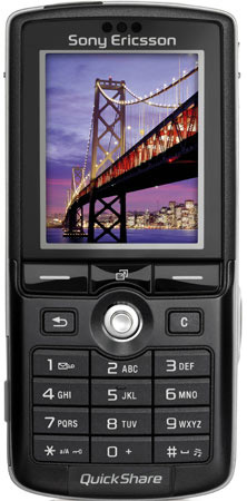
In user interface design, we define a Karaoke button as a button which exists solely to highlight the existence of some feature, often a gimmicky one. The button is visible on a product pictures or screenshots, so it’s more likely that the users will notice it and buy the product.
QuickShare, an example of a Karaoke button
Since Karaoke buttons do not solve any user problem, they do not make a product better. Actually, sometimes they make it worse, for they occupy space which could have been used better. But apparently they help sell the product.
On top of that, a particular class of Karaoke buttons is worse still: those that make product universally better when you press them. An example would be my air conditioner’s Quiet button. If it’s technically possible to do the same job quietly, why not just do it so all the time?
A large metropolitan underground train network might as well be a teleportation device: People don’t care how it gets them from A to B, just that it does. In London, Paris and Moscow, the map of the metro does not show surface geography, because there is not much empty space on the sheet.
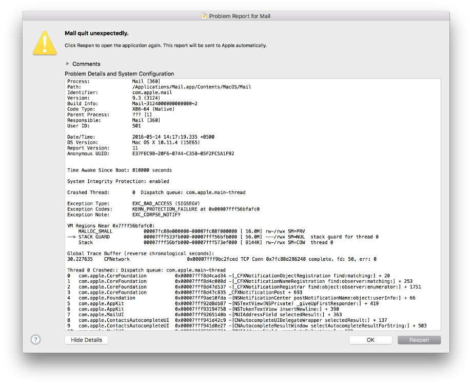
When an app that I am using crashes, I reopen it immediately. And in several seconds the OS is, like:
It has always been this way, both on Windows and on a Mac. The system is too slow to figure out that an app has crashed. This window is thus useless, it just amplifies the irritation I get because of the crash. It would be much better to just let me agree on always sending these technical reports and never bother me again.
It also happens that an app crashes when you close it. In this case suggesting reopening it is even more out of place.
Remember my old post with London Underground voice announcements? I’ve found many more recordings in my collection, including the announcements on the Bakerloo and Jubilee lines. So here is another update.
Some of these were sent to me by Pavel Shadrin. Thank you!
There is no Norther line on Oxford Circus, but it’s mentioned nevertheless, presumably due to its importance (the Hammersmith & City was mentioned only at King’s Cross).
I have updated the original post with the new recordings, make sure to check it out for my whole collection.
That original post started with this text (no longer does):
I have recently returned from London where I had recorded a number of voice announcements on the Underground. Here I’m sharing this small collection for those interested. Sound quality may vary.
Check out the train operator announcements on the Circle line; the Victoria line announcements for a red signal, doors opening on a right-hand side, final destination; the London Overground announcements.
By the way, still missing is Bakerloo, Metropolitan, Waterloo & City lines and DLR. If you have any recording in your collection or would like to make some, do not hesitate to share them with me. Thank you!