Selected

Later Ctrl + ↑

Emerge.js with a new spinner and scrolling support

In 2013, I’ve released Emerge.js, a framework for coordinated page loading:

Normally, when a complex web page is loading, images appear in random order, causing unpleasant flashing. To replace it with nice and coordinated animations, programming is required. Emerge.js simplifies the task by removing the need to write any JavaScript code. The framework uses a declarative approach, where you specify a desired behaviour for each element and do not think about the implementation.

See also the introductory blog post. I’ve since updated it with new features.

Spinner stuff

In version 1.1 I’ve added a built-in loading spinner. Emerge.js no longer requires spin.js for that. But you can use a custom spinner, including spin.js, if you like.

As before, to display a spinner while an element loads, use data-spin="true". Use the new attributes data-spin-size, data-spin-color, data-spin-direction to control the appearance of the spinner (see documentation on the Emerge.js’s page).

To use another indicator (i.e. one of the nice ones by Sam Herbert) just wrap it into a named div and tell Emerge.js to use the contents of the div as an indicator:

<div id="cool-spinner" style="display: none">
  <svg> ... </svg>
</div>

<div class="emerge" data-spin-element="cool-spinner">
  <!-- while this loads, the cool spinner will be displayed -->
</div>

To use spin.js, make it run inside your div and align as necessary:

<script src="/path/to/spin.js"></script>

  ...

<div id="spinjs-spinner" style="display: none">
  <div style="position: absolute; left: 50%; top: 50%; margin: -8px"></div>
</div>

<script>
  var spinner = new Spinner ({
    lines: 12,
    length: 4,
    width: 2,
    radius: 8,
    corners: 0,
    rotate: 0,
    color: 'rgba(96, 96, 96, .75)',
    hwaccel: true
  })
  spinner.spin ($ ('#spinjs-spinner div')[0])
</script>

  ...

<div class="emerge" data-spin-element="spinjs-spinner">
  <!-- while this loads, spin.js will be displayed -->
</div>

Scrolling stuff

In Version 1.2 with the new data-expose attribute you can make an element emerge only when the user scrolls enough for it to get into view.

<div class="emerge" data-expose="true">
  <!-- this will emerge only when within view -->
</div>

Of course you can combine it with other attributes and effects. This div will emerge with a zoom effect in a quarter second after the users scrolls enough for it to become visible:

<div class="emerge" data-effect="zoom" data-hold="250" data-expose="true">
  <!-- this will emerge quickly after getting into view -->
</div>

For an example, see my Projects page. The data-hold value varies slightly between elements there to add a nice randomness effect.

Update for free

If you’ve bought Emerge.js, you get the updates for free. Drop me a line if you have any questions.

Promo mix: Domino

Here is my new promo mix, Domino:

The cover says “techno”, but half of the tracks I would rather describe as tech house. Tech house and techno play together well though.

Tony Kairom, Axel Karakasis, Sam Paganini, Florian Meindl, Nicole Moudaber and others. Places I dig: 9:54, 19:16, 28:11 (Sam Paganini: Domino), 31:18, 37:37, 54:04, 1:04:43, 1:10:14, 1:21:15. The mix is also available on Mixcloud.

Hand holding as a web design approach

To create a successful web page about a product, try hand holding. In addition to saying what product you have, help the reader start using it: explain, guide, convince, clarify, warn.

Let’s say you are a bank and a you have a page about your savings account options. There are people who don’t know what deposits are or why they might want one. Others are afraid of having large amounts of cash on them and don’t want to go to the bank with it. Or they are just unsure which office to go to, what documents to have and how long the thing will take. Your job is to alleviate their anxiety, to raise their self-confidence and to help them make an informed choice. To get clients, help people become clients by hand holding. Explain why a deposit may be useful. Visualise the interest rate. Say how to transfer the money online from another bank. Show the nearest office on the map (include the business hours). Publish the contract with useful comments on the margins. Acquaint the reader with your managers.

Or suppose you install windows and you have a page with options for fittings and glass coating. Well, most people have no idea on how windows are installed. Or even what elements they consist of. What should I consider before ordering windows? How to gauge a window opening? Who will disassemble the old windows? How long will it take to do the whole house? Can this be done in winter? What if a new window does not fit? Can I pay with a Visa? To get clients, help people become clients by hand holding. Explain the whole process from step one to step done. Connect the options to real-life cases (the inner windowsill for kitchen could be made of a heat-resistant material). Say in advance what can go wrong and how to avoid it. Publish the contract with useful comments on the margins. Acquaint the reader with your managers.

Or maybe you are a web hosting provider and you have a page that lists services, plans and options. This may be good for an experienced web administrator. But if someone makes their first website, they probably don’t even know that a domain name and web hosting are separate services. They have no idea if they need CGI, SSL or mod_whatever. They have no clue how to make email work. To get clients, help people become clients by hand holding. Help them figure out which set of services will fit them depending on why they came. Explain what steps are necessary from subscribing to a hosting service to opening the website. Help understand and configure DNS, choose and set up an FTP-client. Publish the contract with useful comments on the margins. Acquaint the reader with your support team.

Yes, the answers can be found online. But if you rely on that, you didn’t do your job well. Your website should work like an experienced and attentive manager, not like an indifferent price tag.

Many people suffer from professional deformation: they think everybody understand their technical terms and work principles. I’ve even heard an opinion that such “hand holding” shows disrespect to a client by treating them like a child.

This is an error. Everybody likes feeling taken care of. If your hand holding feels patronising, your are just not caring sincerely enough.

Ångström: the Watch and dictation

The new version of Ångström codenamed Plato is available. We now support the Apple Watch. You can talk to your Watch about all the stuff related to unit, currency or timezone conversion. A picture from our lab:

Ångström: the Watch and dictation

We don’t have a Watch, so it’s all theory. If you do, let us know what you think.

For this to work we’ve improved dictation significantly. This works on the phones, too. Press the mic button on the keyboard to try the magic.

Say “five kilograms in pounds” or “seventy-eight Fahrenheit in Celsius”. Ask a question: “What time is it in San-Francisco when it’s five o’clock in London”. Or even: “What time is it now in Beijing” (we had to support this for the watch).

We also no longer automatically paste stuff from pasteboard (this confused many people). Tap the from value to get the Paste option. We will show the popup automatically if there’s anything new in the pasteboard when you open the app.

If you are not yet using Ångström, you should:

Download in the App Store for free

The future of the web and native apps

Apple loves native apps: they are faster, interact with the system better, work offline and feel real. Google loves web apps: they don’t require installation, work on any OS and get all the browser features for free.

In the future, there will be no distinction between native and web apps. The two worlds will merge.

Google is heading into the future much faster than Apple. Apple, it seems, doesn’t even see what’s wrong with native apps. Google, on the other hand, does see what’s wrong with the web, and gradually fixes it.

While I mostly prefer native apps to web apps, I feel like this is about to change. One should not be blinded with the current state of the web. I believe, it will become the universal platform of the future, and native apps will die.

Performance and access to system

Native apps are fast because they are written in a low-level language and work with the hardware in a more direct way. The web is slow because of the multiple layers of abstraction (it’s especially bad when reflow hits).

But these are just historical limitations. We will get over them. Performance-critical parts of the web could be written in C instead of JS, if needed. The same way as performance critical parts of server code could be written in C instead of PHP (or whatever).

The web will gain access to the system. It will use my camera and gyroscope the same way as native apps do. Insecure? But how is it less secure than for the native apps? The risks are the same. Apple is dealing with it with sandboxing and by asking for your permission before letting an app see your photos. The web will work the same way.

URLs

URLs are the power of web. The browser address bar will die, but the URLs will not. They uniquely identify (ok, locate) the resource. This makes linking, the main navigation tool, possible. The links could be open in tabs, saved to bookmarks, found by robots, sent to friends. Native apps can’t do anything like this unless specifically programmed to.

When developers of native apps start to develop for the web, they have hard time figuring out how to manage all the application states in a consistent manner. The user can open any URLs in any order regardless of the developers plan. “How do I pass a variable from a page to the next one?”, a web novice would ask. The very question shows that the person has no idea what they are doing. And then we get the stupid websites where you can’t just press Back or Reload: the browser asks you if you want to resend the forms data. It takes years of experience to appreciate and embrace the beauty of the web technologies and start developing with full understanding of them.

Native apps try to support deep linking, but this is very inflexible in comparison to the web.

Tabs

Tabs are a great invention of human interface. They let you use the app the way you like. You can open multiple states at once or group related things together in a free way.

The developers of native apps often can’t even make their app capable of running multiple copies. Some online banking sites, too, suffer from dumb limitations like an inability to open a link in a new tab. This is probably due to the fact that they were developed by the developers from the native world.

Apple has added tabs to the Finder, but I can’t even open a folder in a new tab in a reliable way. And it’s crazy that the Finder has to explicitly ”support tabs”. Facebook and Wikipedia also support tabs, no big deal! Only for the clumsy native apps tabs are an accomplishment. The web just uses URLs and gets tabs for free.

I very much miss tabs in Lightroom, iTunes, Mail and Evernote. It may well be that these apps will learn to support tabs some day, but each one will have its own unnecessary limitations. Tabs must be a responsibility of the OS. Also, if iTunes and Evernote do eventually support tabs, I still won’t be able to group them in one window, like I do with Facebook and Wikipedia without them even noticing.

Bookmarks and history

Bookmarks, as well as tabs, are just an effect of having URLs. Every UI window is identifiable, and thus we can save the identifier for quick access. I don’t understand why I can save a Google Docs document on a bookmarks panel, but can’t do the same with iTunes search results. Actually, I do understand why: it’s because iTunes is a stupid native app. It works only in a limited set of pre-defined ways.

The same thing with history. I can always find what I’ve been doing yesterday or a week ago, and websites don’t have to “support” it. The best we can get from the native apps in this regard is a list of recently open files (very short, not searchable). You can only dream about the ability to search for an obscure Photoshop checkbox that you’ve enabled last week. For this to work, Photoshop has to implement search and history in preferences, which is obviously an overkill. I’m not sure any of Facebook developers have even thought about such a feature for their product, but Facebook does have it anyway.

Installing

Installation is an example of UI evil, as website registration is. I just want to buy a book, why do I need to register in an online store? I just want to edit a photo, why do I need to install Photoshop? Today, this question may sound strange to some, but in the future people will not understand this ritual of “installing an app”. It’s just a meaningless waste of time.

I hate the need to keep hundreds of icons in iPhone folders. Why would I need an app of my preferred airline? Can’t I just buy a ticket by typing “air” into the search box? In the world of native apps, no, I can’t.

Meanwhile on the web: thanks to history sync, I can easily open on my laptop something I’ve been doing on my iMac three days ago without even thinking about what’s “installed”.

Accessibility

On the web, you can copy any text or save any image by just dragging it to desktop. Again, a website doesn’t need to do anything to enable this, it is just how it works. A native apps would not care when you try to select a text in a dialog box, unless this is specifically programmed.

On the web, you can zoom. On the web, you have full text search on any screen.

On the web, you can do automatisation: any service can go to any other one and do something with it.

Offline

For web apps to work, you need to be online. While native apps don’t require that, they become less and less useful when used offline. If a native app can’t sync with the server, the fact that it launches may not be particularly useful. But it’s important that a native app starts and shows at least something when offline. You see your calendar as it was when you were online the last time. You cannot send or receive mail, but you can read and reply. This is much more useful than seeing the “You’re offline” message in the browser.

Web apps are now almost capable of working offline as well as the native apps. See Jake Archibald’s talk on ServiceWorker (it can even do push notifications). Google supports this in Chrome.

Browsers

The biggest problem the web apps face are the browsers. Seriously. When you use a web app, you feel its webbiness (?) every single moment. It’s not real. You almost see the tags and scripts behind the pixels.

The browsers are bad. It’s 2015, and they still cannot fight the white screen of wait. This screen is particularly effective at saying “hey, it’s the crappy web, and if your Internet connection is down, well, tough luck!”

I want any app to have a Dock icon, so that switching to Facebook would look like switching to Photoshop.

The future of the OS

In the future operating systems, there will windows capable of displaying web content and merging into one with tabs. The same way as nobody is thinking about the WindowServer process on the Mac today, nobody will think about “the browser”. That’s why a browser vendor would never make an ideal browser. Only an OS vendor would.

Under Windows, Chrome can save web pages as “standalone apps”, but this feature didn’t get much traction. That’s because the web apps are not designed to make use of it. They assume there is a browser around them. It’s unclear what a “standalone” Gmail app should do when I follow a link in a mail. Also, these app wrappers usually hide the pages’ URLs, which is a shame. You can no longer do any of the stuff the web is good for.

While the term “browser” will gradually die, the Back and Forward buttons will become a part of any window in an OS, as the close and minimize buttons. All windows will learn tabs. The address bar will not be constantly displayed on the screen, but there will be a way to copy or edit the address of any window.

That will be cool.

Autocomplete with and without selection

The inventors of classical autocomplete cleverly used text selection to denote the suggested word remainder:

Autocomplete with selection

As you type, you overwrite the selection and the system updates the suggestion. If you press Enter, the whole text is submitted. If you press the right arrow, the suggestion remains in the field, unselected, and you can refine the input before submitting. This is how selection has always worked. There is no need to modify its behaviour for the suggested text.

This solution may seem obvious, but I’m not sure it came easy. At least, my first call would be to overload the text input with a support for a special kind of text: the suggestion. It would take an aha moment to figure out you could make do without it.

Still, recently it became common to show the suggestion as just grey text:

Autocomplete without a selection

This design is better aesthetically, but is not as elegant logically since it does indeed add an extra kind of text. It is also unclear whether the suggested part will be submitted with Enter or not.

One popular Russian classifieds website uses this design and frustrates me with its search. Say you type “sno” and it suggests “wboard” with grey text. You press Enter — and get no results for “sno”. The classical autocomplete would not do that to you.

It takes years for controls’ behavior to settle and become standard. So far, the implementations of this modern autocomplete design vary. But I suspect that you can recreate the classical behavior by just changing the selected text styles with CSS.

Alex Babaev, with whom we make Ångström, suggested that we switch to the modern autocomplete design, and so we did In a recent update:

Autocomplete in Ångström

Works the same, looks better.

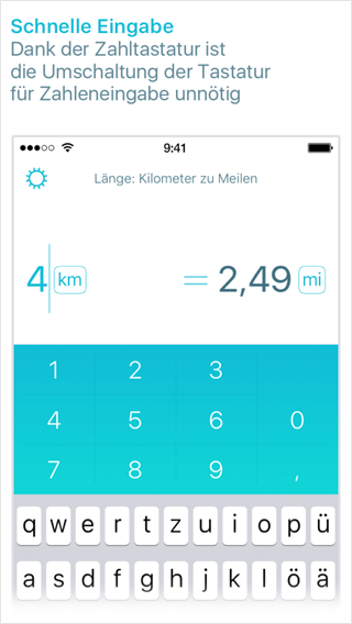
Ångström: improvements to input and iPhones 6 support

We’ve updated Ångström to version 1.4 for you:

This is a clean-up update after not-so-smooth 1.3. We didn’t even come up with a codename: were too busy fixing everything that was broken.

Unfortunately, we had to remove the Today widget. We rushed to add it in the fall, but had really hard time making it fast and reliable. We don’t want gimmicks in our app, so for now, no widget. We will get it back as soon as we figure out how to make it up to our standards. Sorry.

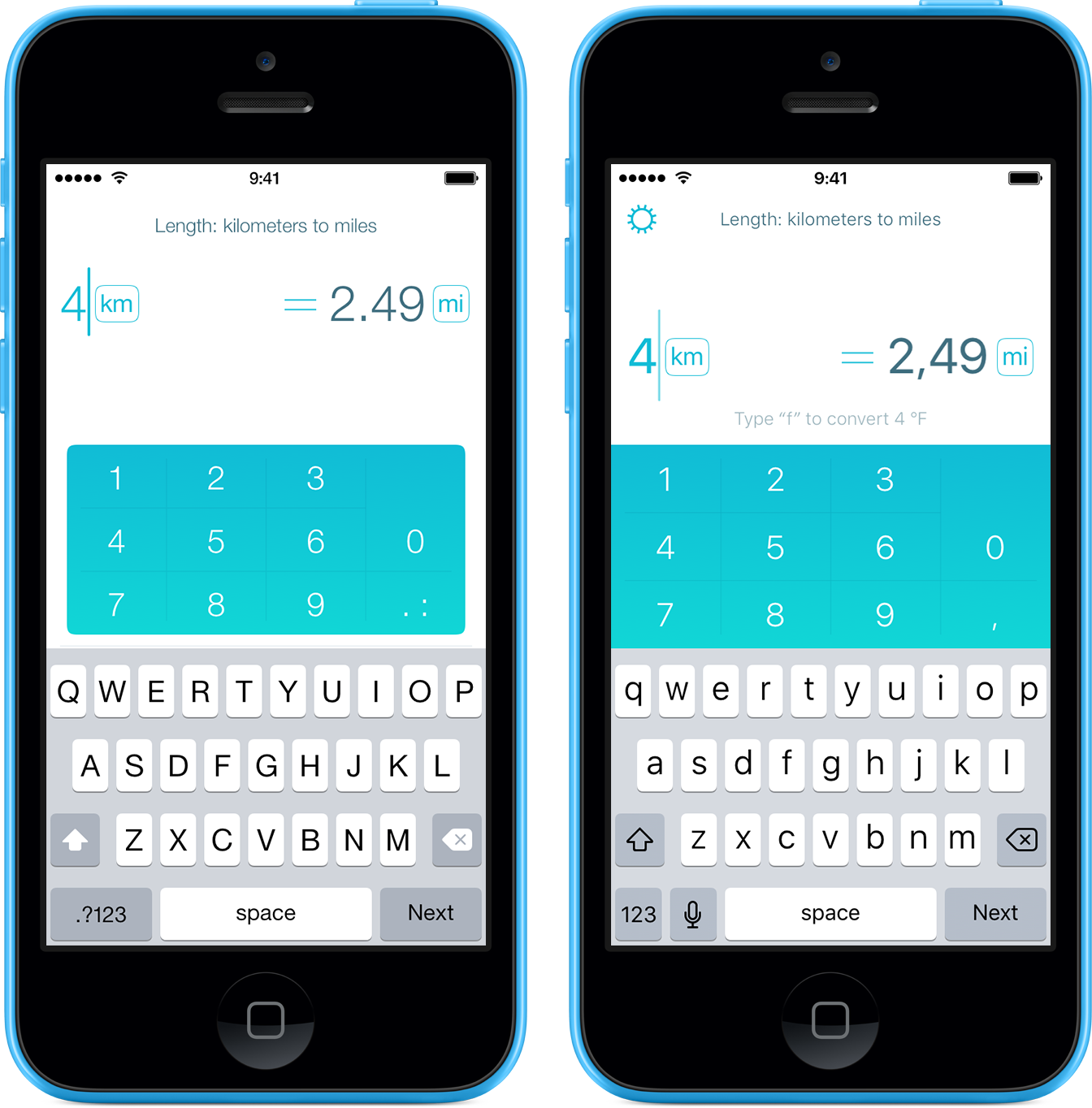
Also: numerous improvements to input. When changing a unit from “meters” to “Moscow time”, 3,57 would turn into 3:34 before, will now be 3:57 (tried to be smart, but it was useless). 357msk will also be automatically be treated as 3:57 msk. You can also type 007 without a decimal point now, it will be interpreted as 0,07 or 0:07 depending on the unit selected. Less taps, we like that.

People with large iPhones 6 and 6 Plus, we will use your screen real estate better now.

The Ukrainian currency, Hryvnya is now included in a free unit pack.

If you are not yet using Ångström, you should:

Download in the App Store for free

Spanish state graphic design

I will later publish the stories from Barcelona, Tarragona, Valencia and Sitges. Now, several examples of graphic design of Spanish official bodies.

The symbol of Barcelona city hall:

Barcelona city hall symbol

Street prohibition sign with it:

Street prohibition sign in Barcelona

Sometimes it is used on a “big B” label:

“Big B” label in Barcelona

Museum of Picasso:

Museum of Picasso

Red on black looks cool (above the entrance):

Red on black Barcelona city hall symbol

This one is probably a simplified version of the same:

Another sign

The grilled variant of the “big B” is used on everything that has to do with garbage. Garbage can:

Garbage can

Garbage truck:

Garbage truck

Ministry of home affairs and police:

Ministry of Home Affairs

Barcelona city council:

Barcelona city council

The symbols of city halls of Tarragona and Sitges aren’t too interesting (here to complete the picture). The symbol of Tarragona city hall:

Tarragona city hall symbol

The symbol of Sitges city hall:

The symbol of Sitges city hall

The symbol of Valencia city hall:

The symbol of Valencia city hall

On a manhole cover:

The symbol of Valencia city hall on a manhole cover

Government of Valencia is the coolest:

The symbol of the Government of Valencia

Just great:

The symbol of the Government of Valencia

The shield:

The shield

On a beach in Vinaròs:

On a beach in Vinaròs

The government of Catalonia:

The government of Catalonia symbol

On a police car:

The government of Catalonia symbol

On a tax authority building:

The government of Catalonia symbol

With all the symbols of Catalan councils:

The government of Catalonia symbol with all the symbols of Catalan councils

The urban transportation in the future

Cities have many means of transportation with fixed routes: underground, trains, buses, trams, jitneys. This is ineffective. Some buses run empty because at a particular moment nobody wants to go where they go. Some directions are not served at all when needed. City administrations try to minimise these issues by carefully planning the routes, but this process is too inert.

This system should become dynamic.

You tell your watch where you want to go. The data goes to the special city software. The software analyses the data of the citizens in real time and comes up with the optimal current routes so that everyone gets where they need to. The watch then tells you when to leave home and taps your wrist when your bus arrives.

An auction system will emerge: the more you are willing to pay, the quicker the system will get you where you want.

The system will be open for new players. Some will be just drivers who have a spare hour (Uber). Others will anticipate a long-lasting demand and build a whole underground line. There will be a continuum of the means of transportation, from buses (spacious, rather slow, cheap to ride, popular) to taxis (compact, usually fast, expensive, custom). The will be no route numbers for buses as there are no for taxis.

The route-planning software will want to forecast the demand for its services. So it will request access to your calendar. At some point you will no longer need to tell your watch anything, the system will just know where you want to go.

If you don’t feel like sharing your calendar with the transportation system, that’s not a problem. It is just that the rides will be more expensive for you, as the planner will not have enough data for optimisation. The majority will prefer to share in exchange for a discount, as it does prefer giving up some privacy to get the free Google services.

Since there will be no place for transport officials in this system, they will oppose it vehemently.

Earlier Ctrl + ↓