Selected

Later Ctrl + ↑

The mystery of Tufte’s stem-and-leaf plot

 4 min

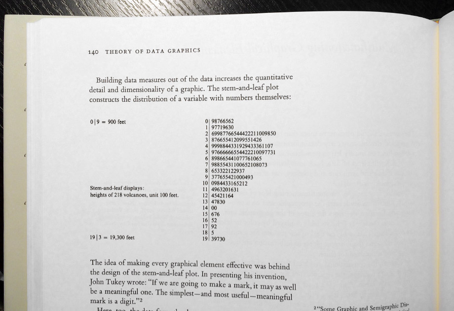
In his books The Visual Display of Quantitative Information (page 140) and Envisioning Information (page 46) Edward Tufte shows a stem-and-leaf plot of volcanos’ heights:

Stem-and-leaf plot of volcanos’ heights

As Tufte says, this plot “constructs the distribution of a variable with numbers themselves”. Numbers to the left of the stem represent thousands feet. To the right, hundreds, for each volcano. For example, 17 | 92 represents two volcanos of heights 17 900 and 17 200 (rounded).

This diagram has confused a lot of designers.

Usually, in a stem-and-leaf plot the values to the right of the stem are ordered. In the Tufte’s example, however, they don’t look so:

13 | 47830

On his own website, Tufte answers a question about this oddity, emphasis mine:

In the late 1960s John Tukey made the stem-and-leaf graphic by hand from an almanac that showed the volcano heights listed probably alphabetically. And so after finding the range of the data, and settling on intervals, John simply wrote down the next signficant digit on the leaves. Nowadays we would ask to the computer to sort the leaves in each bin in order.

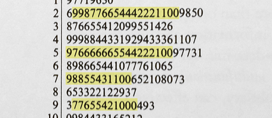
However this answer is doubtful. The order of digits does not look completely random. Notice these descending ranges:

Stem-and-leaf plot of volcanos’ heights: descending ranges

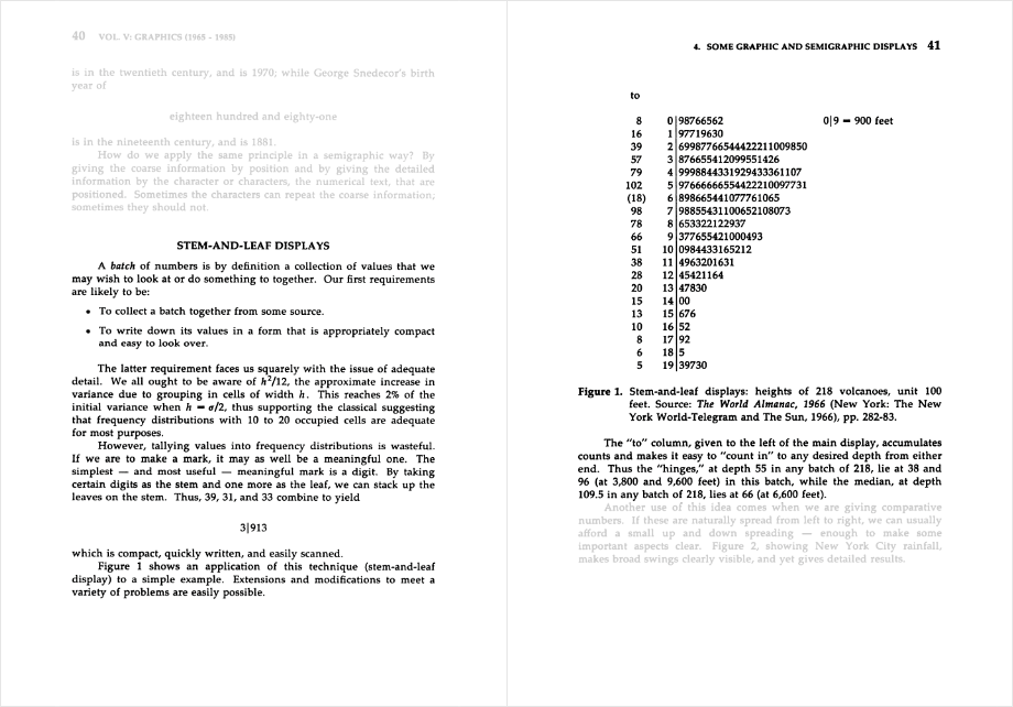
This diagram is also shown in another book, William S. Cleveland’s The Collected Works of John W. Tukey, as found by my colleague Vadim Yumadilov:

The Collected Works of John W. Tukey by William S. Cleveland

Here we see the full name of the almanac from which Tukey took his data: The World Almanac, 1966. Even the pages numbers are given. Unfortunately, I wasn’t able to find it online. It’s available for sale on Amazon, but I did not want to buy it, pay for shipping to Russia, wait for a month for it to arrive.

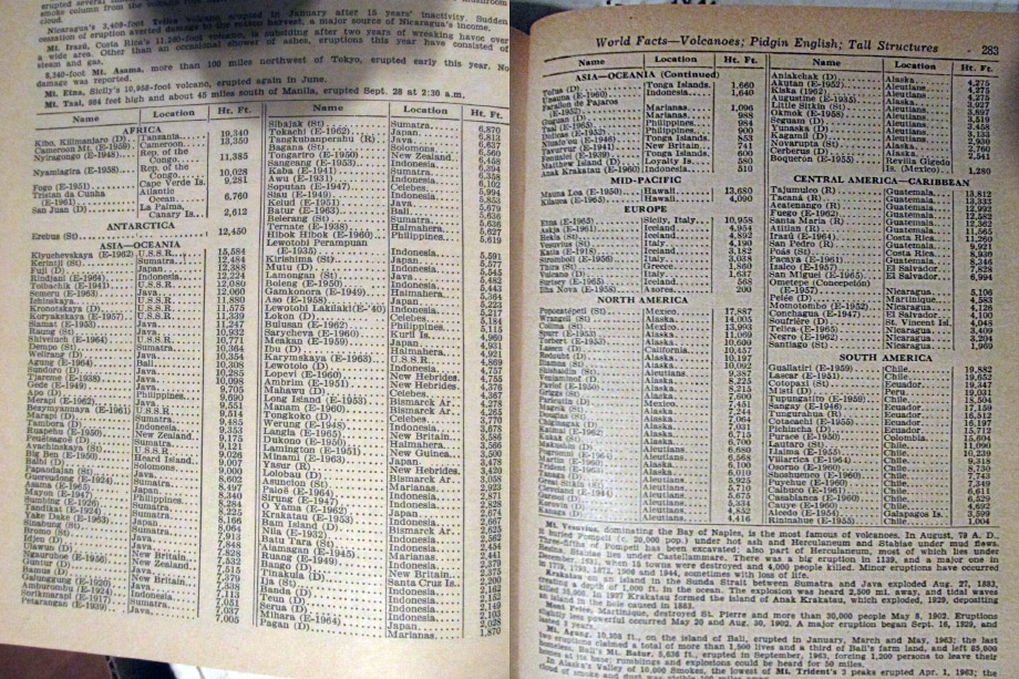
Luckily, I’ve found a couple of these almanacs on sale on Ebay and Abebooks. So I wrote to the sellers and asked them to send me the pictures of the pages 282 and 283. Soon, I got a response from Barbie Berquist:

I have attached 2 pictures of the pages on the volcanoes. I hope they help.

Yes they do.

The World Almanac, 1966, pages 282, 283

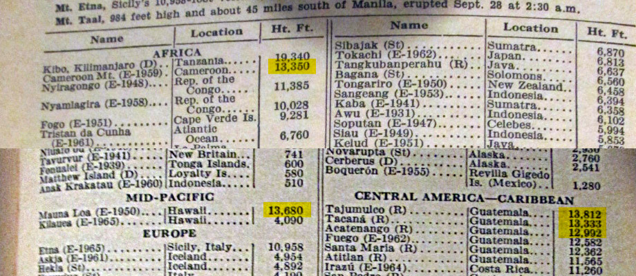
So in the almanac the volcanos are not, in fact, ordered alphabetically. They are ordered by height, but also grouped by region. Hence the descending ranges in the Tukey’s diagram.

Here are, for instance, the volcanos corresponding to the line 13 | 47830 — in Cameroon, Hawaii, and three in Guamemala:

The World Almanac, 1966. The volcanos of 13 to 14 thousand feet

Mystery solved. But I am still confused by lack of curiosity by Tufte. How could he ignore the oddity twice in the books and then content himself with “probably alphabetically” in the forum?

On iPhone sizes

In September, Apple introduced iPhones 6 and 6 Plus, both bigger than iPhones 5s and 5c. I’ve tried holding the new phones in my hand and found even the 6 to be way too big.

I would prefer an old-size phone but faster, with a better camera and with Apple Pay. I am not alone. But there are no new phones at the old size. If you don’t like the new size, you will have to get the last-year model.

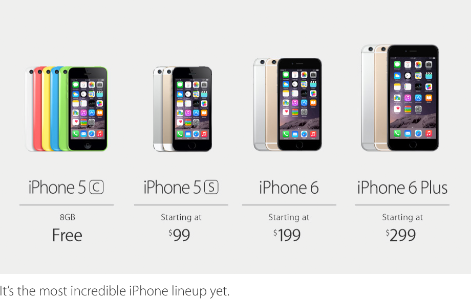
Maybe Apple is saying goodbye to the 4-inch screens and we will have to accept this. But I am not sure that’s what Apple is doing. Look at this picture from the September event blog:

There is no clear separation between the last year models and the new models. This is simply “iPhone lineup” with the phones of three sizes: 4-inch, 4.7-inch and 5.5-inch. Showing three new devices at the same time could be just too much for one event. But Apple could update the 4-inch models next year.

A phone is a device where the size is a matter of preference, like a laptop or a TV. There is no “right” size: bigger screen shows more (good), but takes more space (bad). Apple has now accepted this truth. So maybe in the future when you buy a new iPhone, you will be asked not only “what color?”, but also “small, medium or large?”

How Apple Pay could work on Apple Watch without Touch ID

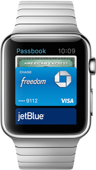
When Apple revealed Apple Pay, they first showed it on an iPhone with Touch ID and later mentioned that it would also work with the Apple Watch. But how does Apple Watch know that you are you without Touch ID?

How Apple Pay could work on Apple Watch without Touch ID

Here is an idea.

Apple Watch requires the iPhone. It would make sense if Apple Pay on the Watch required the iPhone with Apple Pay support. The only such phones are the 6 and the 6 Plus. Both have Touch ID.

Apple Watch can tell if someone is wearing it using its heartbeat sensor. When no one is wearing the watch, it will not work with Apple Pay. When you put the watch on, it will still not work with Apple Pay, as it does not know who is wearing it. As soon as you use Touch ID for the first time to unlock your phone in a close proximity, the Watch will enter a “secure state”: now it knows that it is put on your hand. From that moment Apple Pay will work until you take the Watch off or the phone gets too far away from it.

The chance that you are trying to buy something before you’ve unlocked your phone for the first time during a day is almost zero. And in this rare case the Watch can just ask you politely to confirm the payment with Touch ID.

Ångström: convert time and time zones

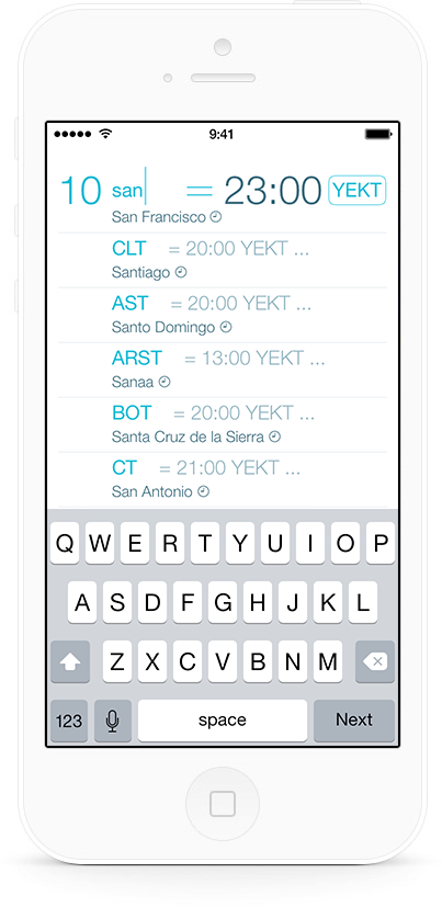
The new version of Ångström codenamed Greenwich is now available. Everyone can now convert hours to seconds, weeks to minutes etc. Paid users also get timezone conversion:

Ångström: convert time and time zones

What time is in New York when it’s five o’clock in London? Now it is as easy as typing “5lo”. We know when and where daylight savings time is in effect.

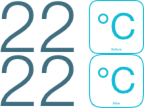
Also, we’ve finally done the rounded corners right:

We’ve finally done the rounded corners right in Ångström

Ah, so much better now! It took effort on Alex’s side to make this work fast and reliably on all supported devices.

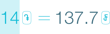
We’ve added more currency symbols, including Turkish lira, Cambodian riel and Armenian dram (by the way, we’ve always had Bitcoin):

We’ve added more currency symbols to Ångström

And finally, we do a little bit better job explaining what you get with an In-App Purchase. Instead of listing unit symbols, we spell out the whole names.

Thanks to Federico Viticci of Macstories for a great recent review:

The result is an incredibly fast conversion process that only takes a few taps and doesn’t require you to scroll long lists or bookmark favorites for quick access. For me, typical usage of Ångström goes like this: I open the app, type a number, insert the first letter of a unit, and I’m done.

If you are not yet using Ångström, you should:

Download in the App Store for free

Stay tuned.

Stopping

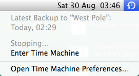
When you cancel a Time Machine backup, it takes some time to stop:

Stopping Time Machine

Actions of programs have no inertia, they can be stopped immediately. If stopping something would leave a system in an inconsistent state, and you need to clean things up first, that’s what the user interface should say. But “Stopping” makes no sense. Just stop.

This problem is not uncommon, and I was thinking about writing a post about it for some time. But here is what happened recently. Mail in Yosemite Beta had already been “Disabling” my account by “Closing” something for several minutes, so I decided to cancel it — and got this:

Stopping Closing Disabling

I had to force quit it after a couple of minutes.

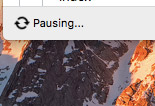
Added in August, 2016: And here, Dropbox is “Pausing”:

Dropbox Pausing

Promo mix: Crystal Smile

Here is my new morning psytrance / full on mix, Crystal Smile:

Promo mix: Crystal Smile

The tracklist is:

  1. Analog Pussy: Angels
  2. Mr. Peculiar: African Soul
  3. Fatali: Ocean View
  4. Safi Connection: Hello Houston
  5. Cyber Cartel: Subway Get Away
  6. Safi Connection: Human Lights
  7. Ion: Fingerz
  8. Spectra: Hi-Fly (Mr. Peculiar remix)
  9. G-Light: Planet 604
  10. Mr. Peculiar: Brainsnake
  11. Cyber Cartel: Fallout
  12. Mungusid: Safari
  13. Audiomatrixx: Anandamide
  14. Opium Of The Masses: Tunnel Of Energy
  15. Ion: Reality
  16. Mr. Peculiar: Born On Mars
  17. Fatali: Point Of View
  18. Suria: Izak
  19. Mr. Peculiar: Crystal Energy
  20. Cyber Cartel: Magnetic Fields
  21. Ion: Connect
  22. Talpa: Hidden Smile
  23. G-Light: Dance of The Morning Sun
  24. Mungusid: Crystal Smile
  25. Ninth Of Kin: Wonders (Skin Care, 2006)
  26. Cyber Cartel: Back Form Space
  27. Silver Surfers: Max E Flow
  28. G-Light: Pitch Black
  29. Fatali: Sleep On
  30. The Egg: Angel Of My Soul (Allaby Remix)
  31. Hypersonic: Vida
  32. Suria: Hallucinogirl
  33. Cyber Cartel: Electro Magnetic
  34. Rumble Pack: Back To Basics
  35. Blue Vortex: Simsic Amplifier
  36. Talamasca: Cancer

Good morning.

Form labels vertical alignment

Form labels should be put on a baseline of their fields’ text:

Form labels should be put on a baseline of the fields’ text

If you put a label at the vertical center of a field, as some do, it will jump up when split into lines:

If you put a label at the vertical center of a field it will jump up when split into lines

It gets worse with more lines; here the long label has actually shifted down the field:

It gets worse with more lines

If labels and fields behave this way, a form looks unstable and loosely built, and you start thinking badly of its developer.

The first line of a label text should always stand still:

Same with multiline fields’ text:

A form is an editable table, so the table layout principles apply.

Ångström: the update animation

One of the objectives of the design of Ångström was getting the result as fast as possible. But we’ve confronted a problem with currencies: getting the current rates takes time.

We didn’t want to give up on immediate feedback. So we decided to show the result with the rates we have locally and use an approximate equality sign to hint at it:

Ångström: the update animation

While the currency rates were updated, a standard spinner spun in the phone’s statusbar. When the new rates were downloaded, we updated the result and replaced the sign with the strict equality one.

And then an idea came to our minds to make the process more fun: instead of showing a boring spinner, we have animated our equality sign. The wave oscillates during update, and when the data is loaded, its amplitude gradually decreases to zero:

Ångström: the update animation

This is how it shipped.

We like it how one element performs two functions: shows that the data is approximate and shows that the new data is coming. You don’t see this in the app often, as we periodically update the rates in the background, but it still appears sometimes if you are lucky.

Three states of a website menu item

A website menu item has three possible states.

Unselected:

Three states of a website menu item

We are not at “Swag” and can go there by clicking. The link is underlined, on hover it highlights and the cursor changes to a pointer, the link leads to the main page of the section.

Current:

Three states of a website menu item

We are at the main page of the “Swag” section. The text is put on a background, does not react in any way to hover or clicks.

Parent:

Three states of a website menu item

We are at one of the pages of the “Swag” section, but not on the main one. The link is put on a background and underlined, on hover it highlights and the cursor changes to a pointer, the link leads to the main page of the section.

This is an obvious and logical standard. Highlighting the current section with an underline or reloading on a click the page where the user already is, is an indication of a careless, unreasoned design.

Immediate feedback when data is unavailable

Immediate feedback is one of the core principles of good user interface design. But what if the data is unavailable for the feedback?

When you increase the zoom level in Google Maps, you see the enlarged view of the data you had already downloaded:

And a couple of seconds later the view updates:

While blurry maps suck, having to wait for several seconds before seeing anything would suck much more.

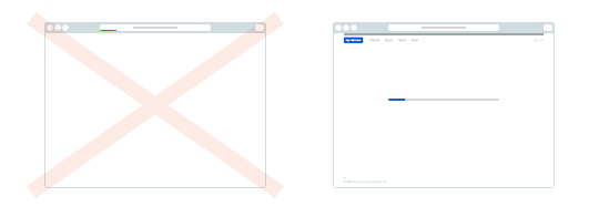
Another example would be Apple’s Safari on the first iPhone. The device had so little memory, it could not fit a whole webpage into it, so it had to render only the parts you were currently looking at. When you scrolled past the rendered area, you saw a checkerboard pattern:

And a couple of seconds later the page rendered:

While the pattern is not much fun to look at, this design is significantly better than if the browser would have to wait until the data was ready before responding to your touches.

Lesson learnt: when you cannot respond with a precise result immediately, show an approximation immediately, then the precise result a moment later.

Earlier Ctrl + ↓