In Map and reality: distortion I talked about how distortion is inevitable on a map and the question is what to distort given a particular task.
Now let’s talk about layers. What properties of land should a map display?
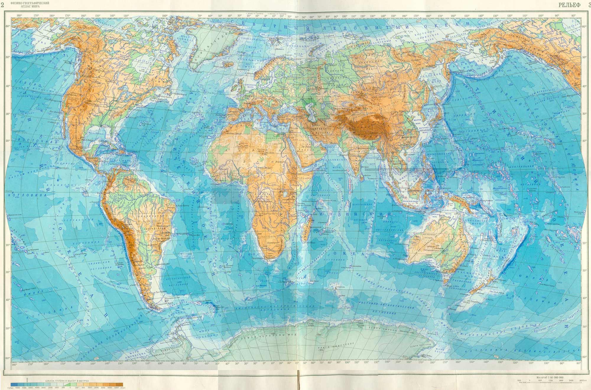
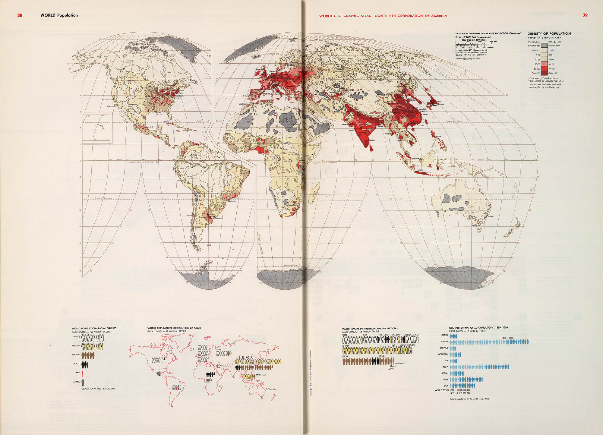
Physical and geographical world atlas (1964)
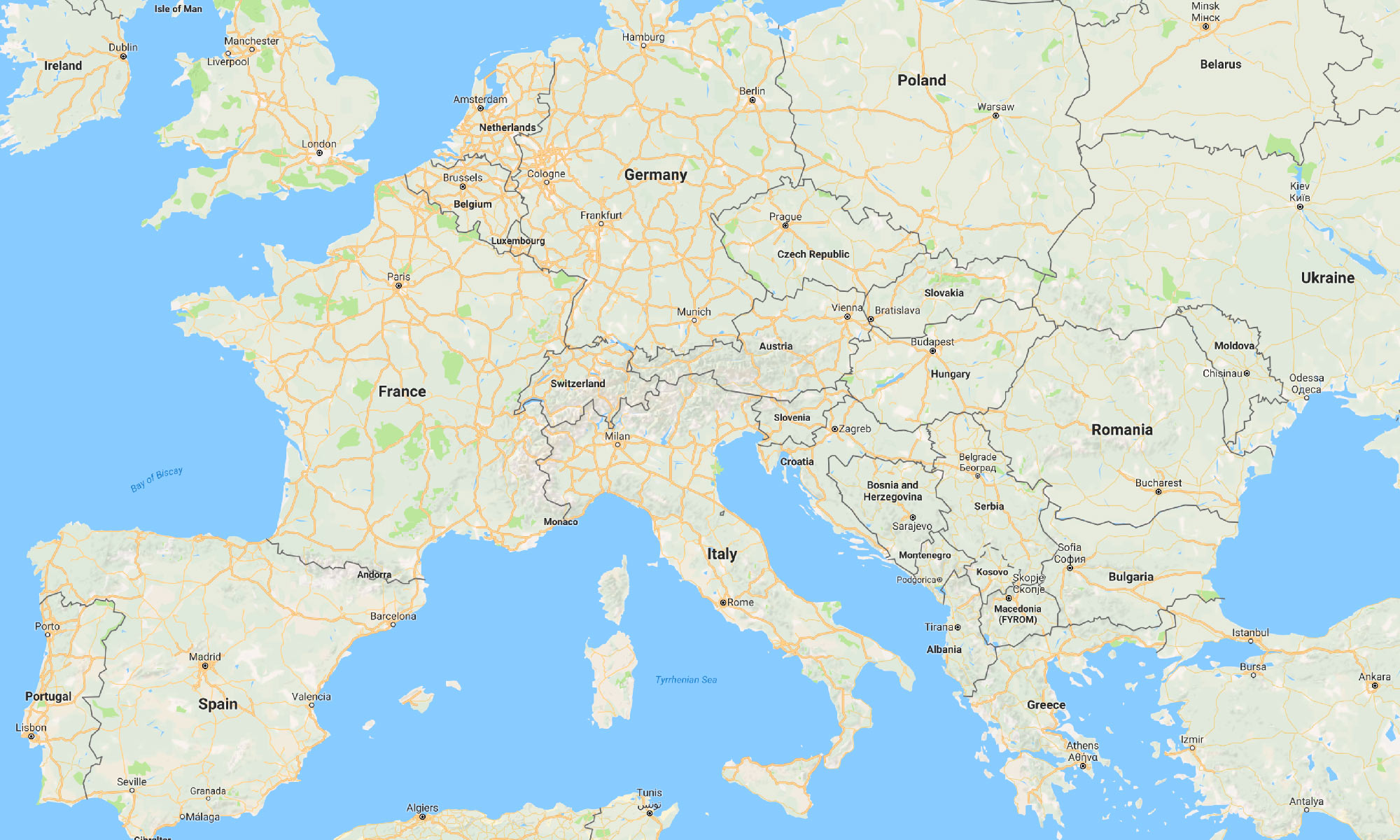
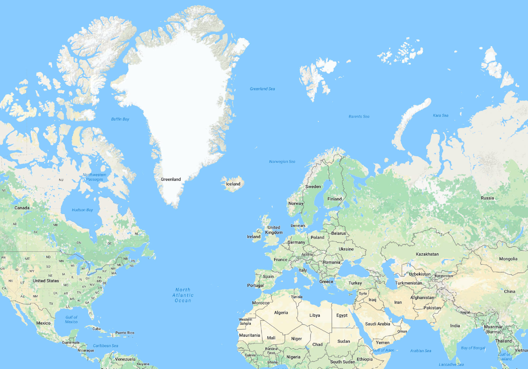
A physical map shows terrain: oceans, trenches, plains and mountains. On a political map, the land is divided into countries and states. A mineral resources map is covered with the symbols of mineral deposits and oilfields.
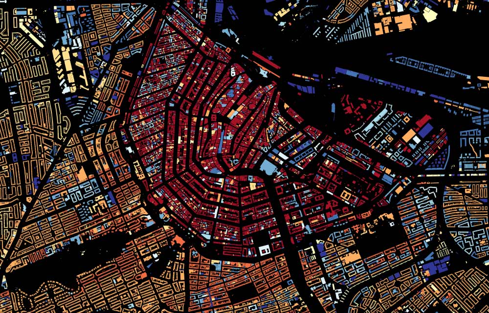
One can’t say that a physical map is “truer” than, say, a railroad atlas. The following map shows the history of Amsterdam’s development, and it’s also true. Red houses are the oldest, the blue ones are the newest:
A good cartographer will find ways to display lots of data on a map:
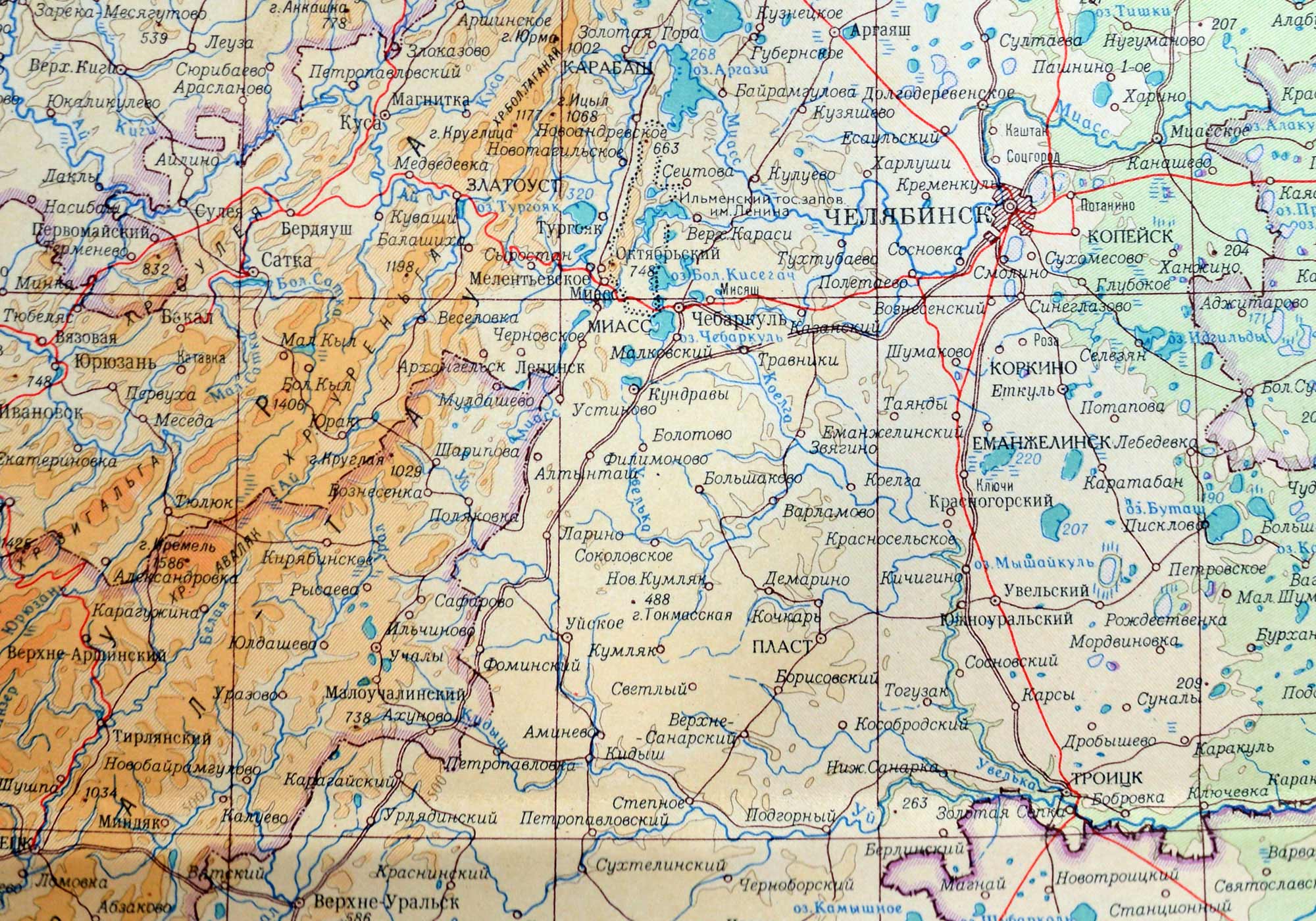
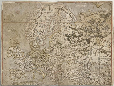
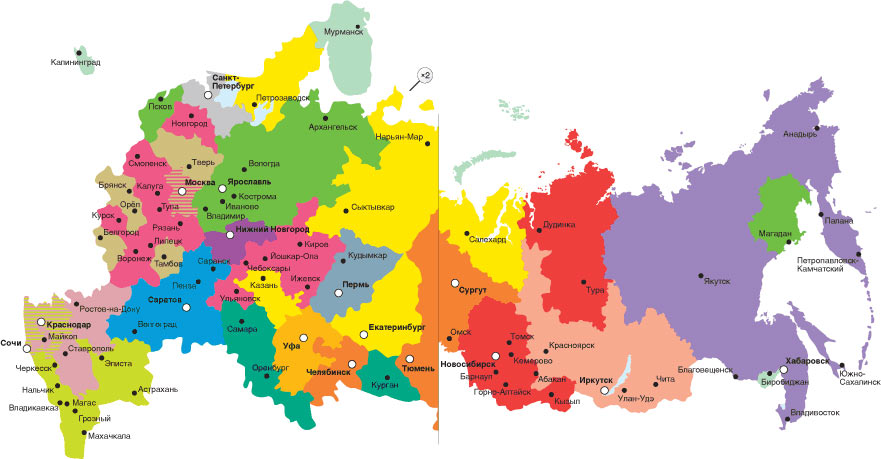
A map of Chelyabinsk region, Russia (1956)
This map displays terrain, the region boundaries, motorways and railroads, settlements, ponds, mountain ridges, height markings, parallels and meridians.
By carefully choosing colour shades, widths and styles of lines, typefaces of text, the cartographer achieves clear separation of visual layers. Background colours that marks the heights are unsaturated to let one see the labels clearly. A particular hatching is used along the region boundaries to make them well distinguishable. The letters У Р А on the left separated by many other designations, are perceived as one label ЮЖНЫЙ УРАЛ (Southern Ural) on the full map thanks to a special typeface.
The more features are shown on a map, the more interesting it is to explore it.
However, there are circumstances that do not suggest an unhurried examination by a curious reader. Sometimes a map should just answer a narrow set of practical questions.
A pedestrian map shows the main landmarks, sidewalks, bike lanes, subway stations, toilets and Wi-Fi zones:
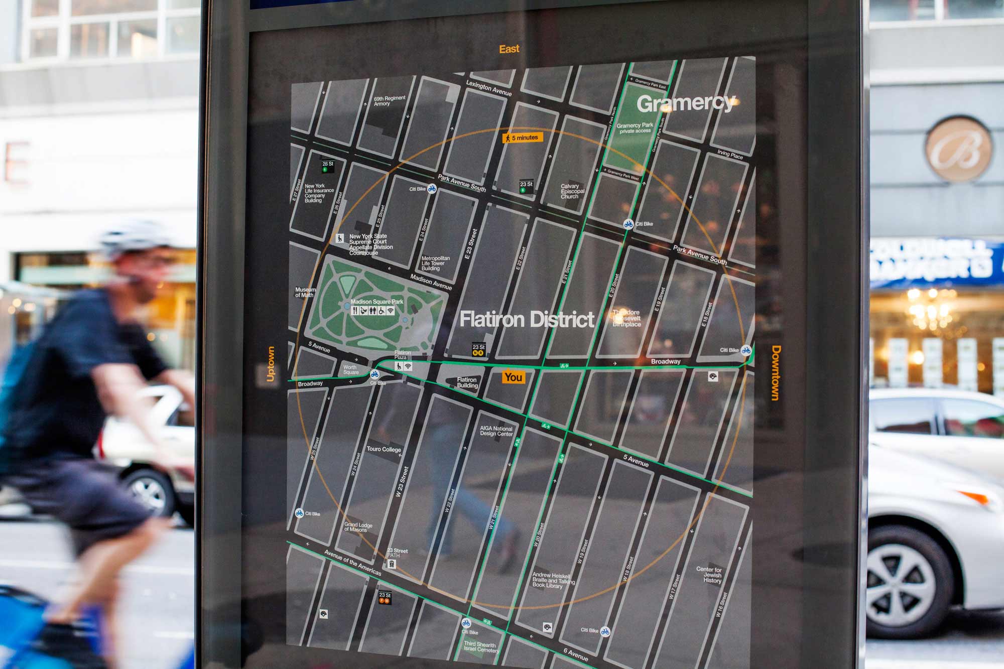
WalkNYC wayfinding system (2013)
A nautical chart displays water depths, navigational hazards, important routes, harbours and the details of the coastline:
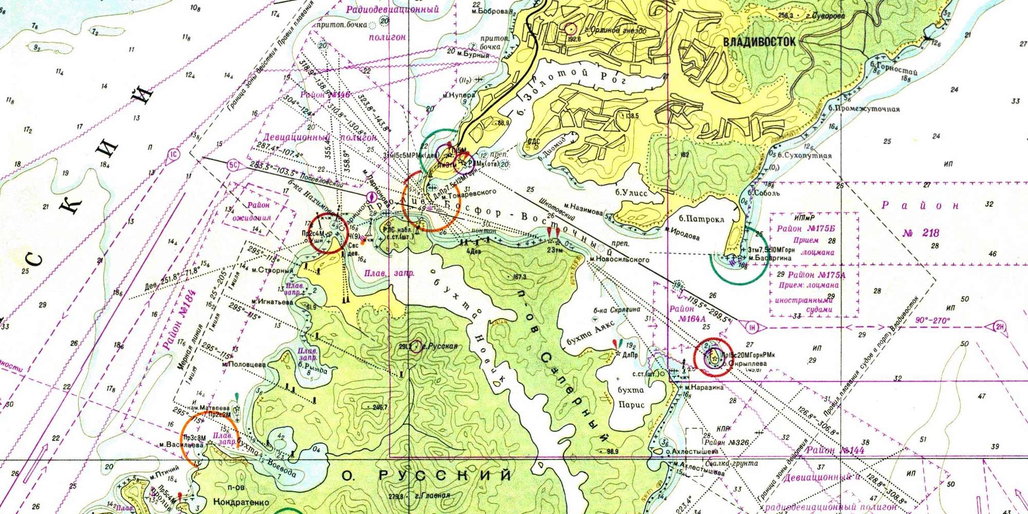
The depths are marked with numbers — while the shades of blue as used on physical maps are more illustrative, a sailor wants the actual values. The dry land gets very little attention.
The choice of the layers and the way to separate them, as well as the choice of appropriate distortion, depends on the map’s goal and supposed use.
Continued in Map and reality: diagrams.