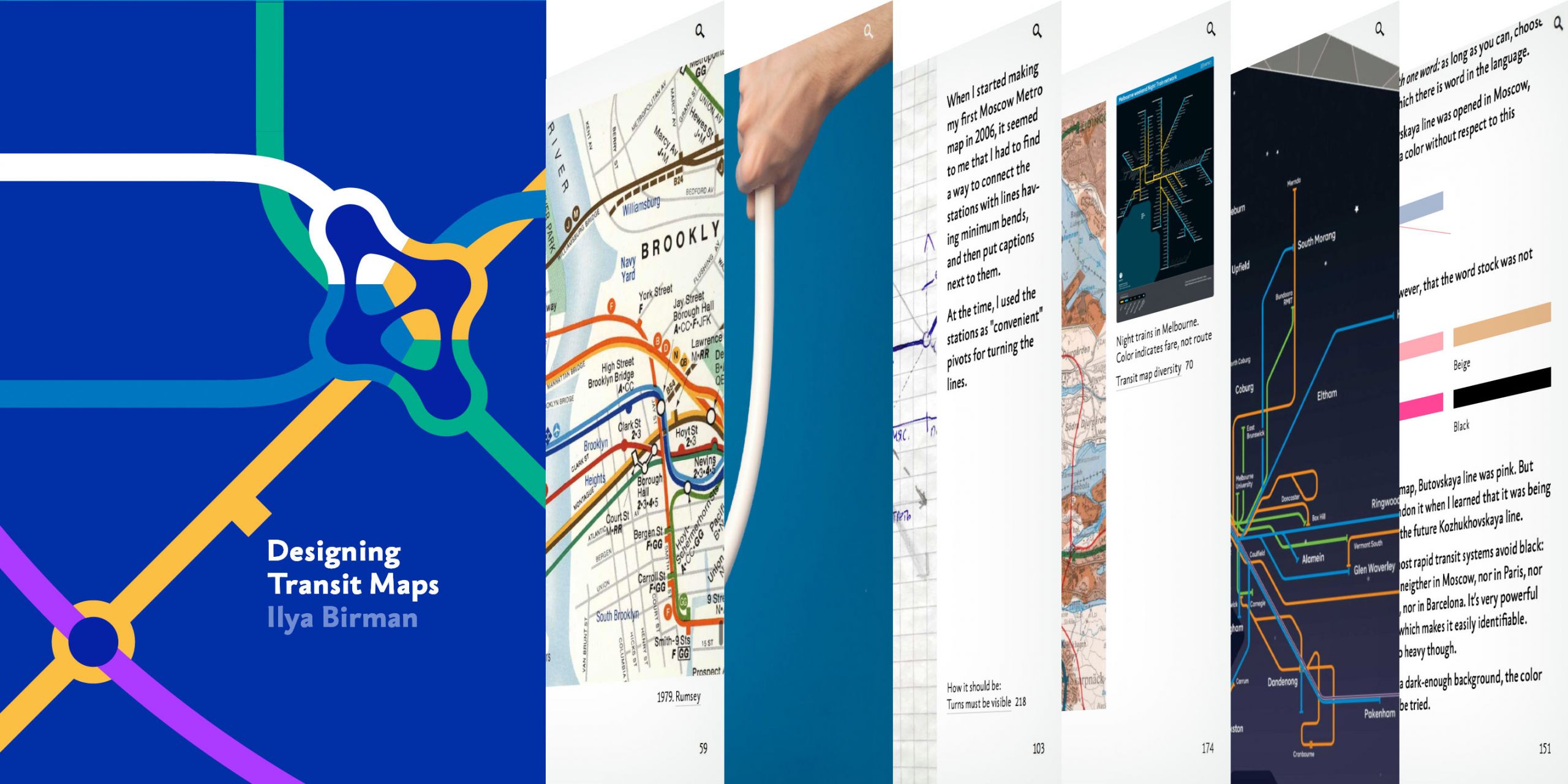
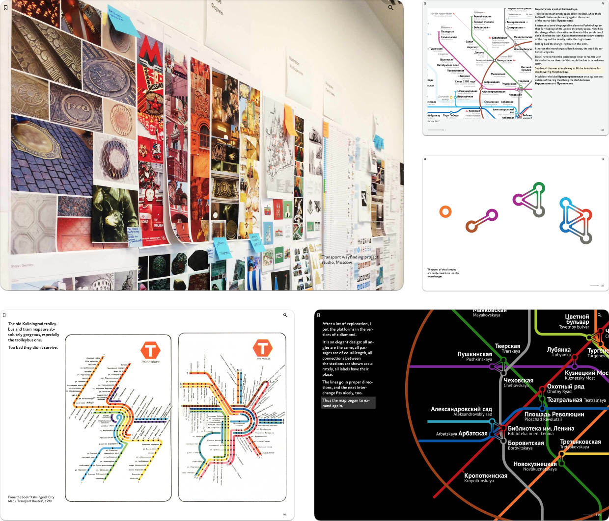
Please welcome my second book, “Designing Transit Maps”. It’s a practical guide to transit map design and probably the most important work of my life so far. The digital book is released by Bureau Gorbunov Publishing. The publisher says:
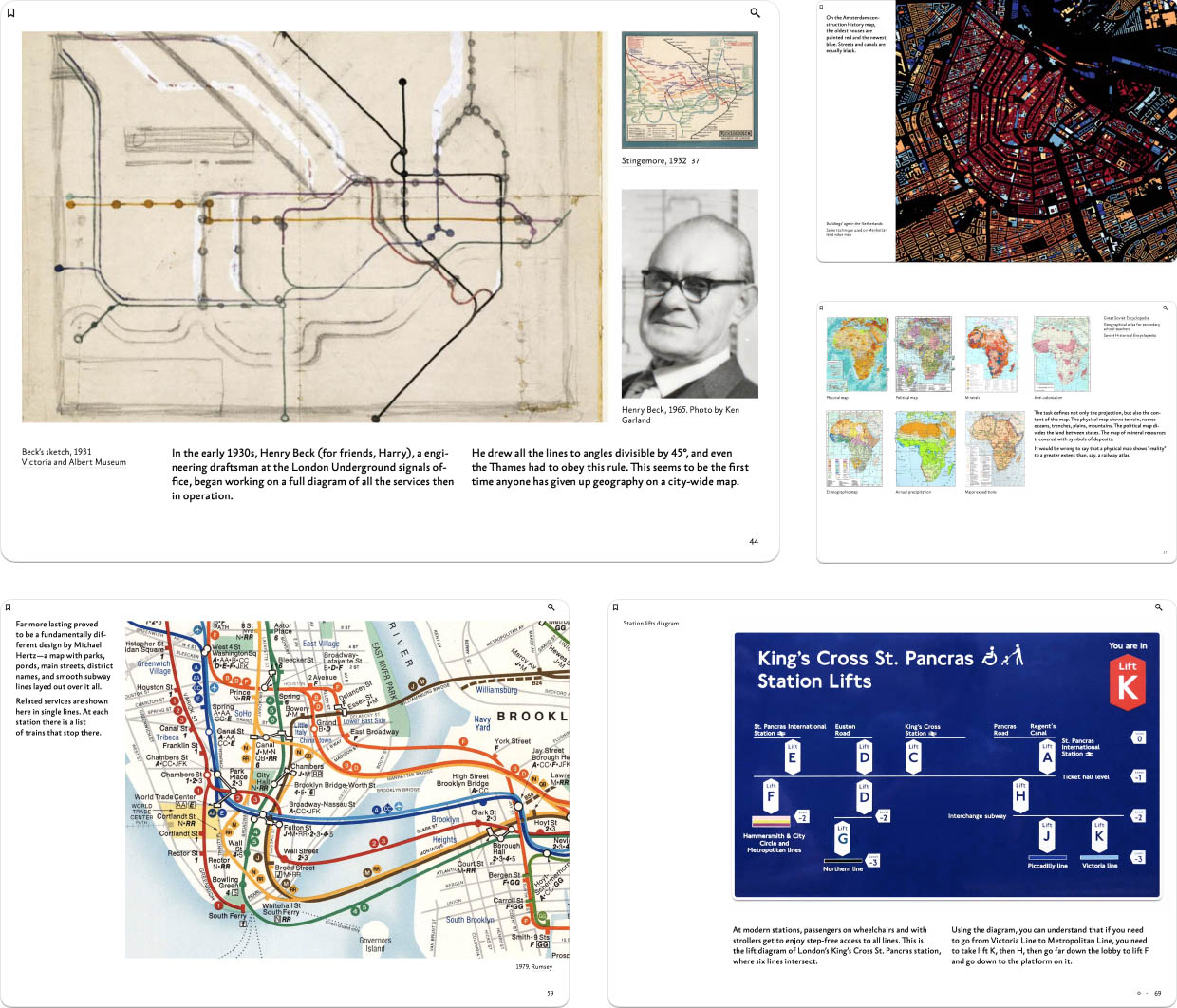
The book speaks of transit maps history, important principles of their design, and how they evolve together with their networks. The author talks about techniques: plotting the lines, denoting the stops, choosing the fonts, and composing the final poster.
Few designers have an occasion to design a subway map. But the principles and techniques discussed are applicable to any tasks of complex information display: org charts, family trees, control-flow diagrams, fire escape plans, military operation plans, project timelines, architectural drawings. The book sharpens the reader’s eye and inculcates attention to detail.
Circuit drawings are beautiful in their own way, but they immediately tell the reader: “I’m for the pros”. This is not an option for public information graphics. The designer has to untangle complex ties, find the best way to represent key objects, correctly position the labels. No matter how sophisticated the material is, it’s crucial to achieve clarity and legibility in display. Transit maps are a great subject to develop this skill.
The book consists of five parts: The challenge, The principle, The layout, The details, and The system. The chapters of the book are being published gradually. We started with the first three chapters, “Maps and Reality”, “The first transit maps”, and “Transit map diversity” in January:
We followed up with “Map as a symbol” and “Finding a solution” in February, completing the first part:
By the way, each part ends with an interactive test covering its key ideas.
In April, we started publishing the next part with the chapters “Correspondence between lines and routes” and “Color coding”:
In June, we released the chapters “Geometry”, “Orientation”, and “Scope”:
Today, we are releasing the closing chapters on the second part, “Granularity” and “Freedom”, and the chapter’s interactive test:
So two fifths of the book are already available for reading, and I very much encourage you to subscribe and read the book. Learn more about the book and its revolutionary digital format on the publishers website. There are also readers reviews and a free sample chapter “Bends” from the fourth part.
Enjoy and tell your friends and colleagues!