Selected

Later Ctrl + ↑

When “optional” means “unreliable”

Some time ago there was a discussion about iPhone’s ring/silent switch and the way it does not mute some of sounds. Namely, it doesn’t mute timers and alarms, music and video. So only the sounds you don’t control and don’t explicitly ask for (i. e. calls, texts, emails, other notifications) are muted. Turns out, some people don’t like this behavior and would prefer the switch to just mute everything. I’m with Guy English here: I don’t want anyone but the alarm clock to wake me up.

But some say, well, if it’s a matter of personal preference, why couldn’t this have been optional? Obviously, there’s already way too much stuff in Settings app and adding even more options is a bad idea. And Apple is famous for not liking options. But there’s a reason, I’ve found, why adding this option would be a particularly bad one.

On a MacBook there’s no way to choose what it does when you close the lid, it just goes to sleep. On Windows notebook this is a matter of user preference. Some prefer their machines to continue working after being closed, and it makes sense if you want to, say, download an HD movie overnight. Why not add this setting on a Mac?

As a Mac user I would not welcome this setting. Having no choice means closing the lid is a reliable way to sleep my notebook. I just close it, I don’t have to double check before putting it into a bag. It won’t drain my battery or overheat just because I forgot to change the stupid setting. It will go to sleep (there are some smart exceptions which are irrelevant in this discussion). On Windows you are never sure. You can’t rely on a notebook to do the right thing. You have to double check every time.

If there were a way to choose whether ring/silent switch mutes all sounds or just calls and notifications, I’d never be sure my alarm would wake me up. I would have to double check this setting every time. And one day I will oversleep and miss an important meeting. Who would be to blame?

So sometimes “optional” means “unreliable”. I wonder if readers could provide more examples of this.

Ilya Birman in English

My name is Ilya Birman, and I’m a designer, writer and what not. I’ve been writing for 9 years on my blog in Russian. Now I’m starting this new blog in English. Why?

My main interests are web and graphic design and making great products. While there are some cultural aspects, I think most of the principles of good design and successful products are universal. So there’s no reason to hide my thoughts and observations from the larger audience.

I’ve also made some products which are of interest to English-speaking world. These include Wireless DJ, the great MIDI-controller app for iPad, Emcee, a small app that displays current song in the menu bar, and Biathlontime, a site on biathlon. More soon! I want to be visible to the current and the future users of my products.

So let’s see how it all works out.

Getwear

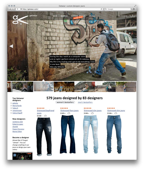
Getwear has launched. It’s an online designer jeans store, a new site made in the bureau art directed by me.

Select from a wide range of models or make jeans according to your taste in the Constuctor. Add embroidery, distress, draw flowers with a pumice, – or merely choose another style of back pockets. Buy the jeans for yourself, then put them on sale in the store. The best jeans get the most votes and end up on the front page, other visitors buy them and you get a cut of money.

The best feature is Custom fit. It’s like having a personal tailor, except that you take the measurements yourself. The site helps you though: it guides you with instructions, pictures and videos. Then you add your special requests and order the jeans. Getwear will change your jeans free of change if they don’t fit perfectly.

Also, we’ve designed the shopping cart right: you specify the delivery address right there and you see the real total below. Not some mythical “subtotal” value that will change after they add delivery later, as they do in other online stores. The real total, straight in the cart.

Try it here: getwear.com.

This was an incredible project. The task was great, the client relationship was great. We’ve used all the best work principles and we’ve followed the plan rigorously, even if it meant sacrificing some of the ideas. And we are content with the result. I sincerely wish Getwear all the best.

The project is another illustration of how pictures aren’t everything. Even after every possible screen have been done in Photoshop, after every possible page has been marked up in HTMLs, we had had meetings several times a week and had exchanged mail like crazy. There were a lot of questions and decisions. The design questions and design decisions.

The time after everything has been almost done and when everything is almost ready for a launch is the time when most of these decisions are made. It’s the time when you want the designers to be there. The clients who end their relationships with designers and think of design as “finished” before this crazy time are making a big mistake.

SOPA and PIPA

The words “SOPA” and “PIPA” make any Russian speaker smile.

“SOPA” sounds like an euphemism for жопа (zhopa) which means “ass”. The word not only names an actual part of the body, but also describes a really bad situation. E. g. “we are in жопа” means we are screwed, we are doomed, we are toast. Or “this UI is жопа” means the UI is a mess where it’s impossible to figure things out.

“PIPA” brings up associations with a diminutive for “penis”. The word “пипка” (pipka), which used to mean a pipe for smoking (and has actually derived from it), now means just about anything small that sticks up. A mum can use it to call her 1-year-old boy’s penis. But it would be odd. And “PIPA” is technically a big pipka. This makes no sense, and that’s funny.

And even if you ignore the possible meaning, both words sound plain stupid. You can’t call laws like this and hope they will pass.

iBooks 2 and the new education

Today Apple has reinvented education. I’ve missed the event. Slipped off my mind. What could be interesting about an education event? iPad discounts for students?..

Oleg Andreev is right:

Today’s Apple announcement is just one more achievement of the human civilization, in addition to iPad, Android, Windows XP, World Wide Web, printing press and alphabet.

Now I want to go back to school. Everything they’ve shown today is just so cool. There’s always no time to watch iTunes U, and now it gets 100 times better. It’s unfair! And I’m scared that Apple does everything. Where are the others? Where is a single competitor? Wake up already.

Postponing a call

After I’ve seen a missed call on the list, iPhone removes the red badge off the Phone App icon. But I don’t always have time to return a call at that exact moment. And later I simply forget to. So I end up not returning some of my calls, and people probably think I’m a bad person. We all mark mail as unread, I’d like the same for calls. But it could be odd. Especially if you could mark a call as “missed” when in fact it wasn’t. Or if it was a call you initiated.

In any case, there must be a way to “postpone” a call. Whenever you see someone calling or you’ve missed a call, just press “Remind in an hour”, and in an hour the phone asks “So, do you want to call John back?” It must be integrated with Reminders for syncing and location support. “Remind me to call back in the evening when I’m home”. On iPhone 4S this is seemingly solved by Siri. But what should the ordinary people (i.e. users of iPhone 4) do?

UI Shadows in Photoshop

The use of Photoshop’s standard Drop Shadow effect is immediately visible. It usually produces unrealistic and dull shadows:

A button with a Drop Shadow effect

Here’s how the shadow is constructed: the object’s mask is put beneath it, blurred and shifted. Here are the parameters of the above shadow:

Photoshop Drop Shadow parameters

However to make a shadow look better, you don’t always have to draw it “by hand”. The “Quality” group of parameters will help.

Number one is contour. You can change it by bending this graph:

Shadow contour in Photoshop

The graph defines the fade of the shadow. For some reason it’s reversed: the point farthest to the object is on the left, the closest one is on the right. In most cases dragging the midpoint down is the right thing to do: you want the shadow to be lighter halfway from the object.

Photoshop includes some crazy contours that make no sense at all. This adds to the relative unpopularity of the feature (see the first two rows):

Shadow contours in Photoshop

The last four contours are mine. Don’t hesitate to save your good ones there so that you can pick them faster. Like this one:

Shadow contour in Photoshop

The real shadow does not fade linearly because there are many light sources. Bend the curve until it looks fine.

Number two is noise. Just add noise at 2 to 3 percent:

Photoshop shadow noise

Here’s the above button with adjusted contour and added noise (other parameters intact):

A button with a better Drop Shadow effect

No doubt hand-made shadows are better (if made by a good graphic designer). But the production cost is also higher, sometimes too high. Here everything remains scalable and you can transform the button, clone it etc.

A possible shortcoming of this approach is that you can’t make this button with pure CSS. In some cases manufacturability is more important than beauty. And of course all this is about UI shadows (as in buttons, toolbars and such). When you want a real shadow of a real object, Drop Shadow is of no use.

When people get a Mac

There are many explanations to the fact that some prefer Mac to Windows. They suffer religious fanaticism. They worship Steve Jobs. They want to impress others with an expensive gadget. After all, no one argues the power of Apple’s marketing.

But the idea that Macs are of higher quality and reliability seems unfounded. Obviously this can’t be true. Those who choose Macs are fooled. Marketers make naïve people buy expensive things with fictional advantages. The members of the Mac sect aren’t intelligent enough to understand that Mac is just a dummy in a sweet box.

In the last couple of years five or six of my anti-Apple friends who loved to make fun of Macs, switched. Quickly their homes became full with Apple gadgets. And now they help their relatives and friends switch too. It’s pain to see how people become dumb and unreasonable. It’s pain to see how they lose their ability to confront the Apple Church evangelism. It’s pain to see them outsmarted and robbed by selfish “entrepreneurs” from Cupertino.

Once we were discussing Macs and fanboys with Evgeny Stepanischev, and he said: “When I used Windows I thought you were a fan, but I no longer think so”. Not long ago John Gruber gave a definition of fanboy: “Someone who began using Apple products before you did”. These are striking examples of previously normal people losing control of their action and mind. How to make these people regain reason and common sense? How to escape the terrible crisis?

Tech specs as a measure of ineffectiveness

John Gruber on irrelevance of tech specs today:

Spec-based reviews of computers and gadgets are inherently flawed, a relic of an era that’s already gone. Movie reviews are about what the movie is like to watch. Is it enjoyable, is it entertaining, does it look and sound good? Imagine a movie review based on specs, where you gave points for how long it was, whether the photography is in focus, deduct points for continuity errors in the story, and then out comes a number like “7,5 / 10”, with little to no mention about, you know, whether the movie was effective as a piece of art.

High tech specs sometimes say just how bad a device is.

CPU clock speed and amount of RAM is a measure of device’s ineffectiveness. Just think about a 350 hp car that gets to 60 mph in 30 seconds. Something is obviously wrong with it.

If some device has too much memory or too fast processor, two things follow: 1) it costs more than it could have, since you pay for unnecessary hardware; 2) the battery life is worse than it could have been, since all this hardware consumes power.

A company should tell us how awesome and amazing “as a piece of art” their new device is, and then add, just for the geeks, that it has just a single-core 500-MHz processor and 128 MB of RAM. Wow, such a cool device with specs this low? That might be interesting.

Earlier Ctrl + ↓