In airports and at public transport stops, you often see screens that need to show more information than can physically fit. The usual solution is to cycle through pages, which is poor design.
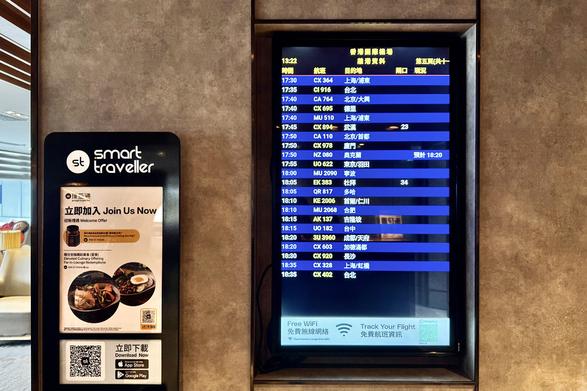
Let’s look at an extremely bad example from Hong Kong International Airport. It is now 13:22, but the screen is showing about an hour of departures starting from 17:30 (as we can see in the corner, this is page 5):
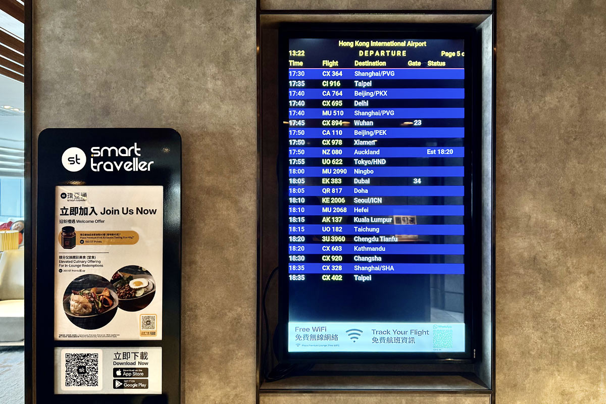
Every ten seconds the screen switches, but instead of showing the next batch of flights, it shows the same ones in Chinese:
Only another ten seconds later does the next batch appear.
The cycling continues all the way to flights departing late at night. The last screen is number 16, which means a full cycle takes more than five minutes. I had to wait almost three minutes for my page. That is unacceptably long for an airport, where every minute may be critical. At the same time, most of these screens contain no useful flight information at all — not even gate assignments; they simply list the flights. By the fifth (out of 16!) page that you see on the photo, already only two flights have thier gates assigned.
Designing such a screen well only requires a minute of thought, but the problem in the design world is that almost nobody does even that. In what situations do people look at this screen, and what information are they trying to find? Obviously, those whose flights are departing soon need the information more than those whose flights are in five hours.
First, the languages should be combined. There is enough space to show both, and if there were not, abbreviations would be preferable.
Second, the screen should be split into two areas: the upper part should permanently show the nearest departures, while the lower part should page through later ones. Also, starting from a certain point, none of the flights have gates assigned yet. Among those, only cancelled or delayed flights are worth keeping visible; the rest should be removed from the list altogether (with graphical indication of the gaps, of course).
Third, the cycling section should have a clear visual indication of which page is currently shown and how many there are in total, with sections filling progressively so it is clear when the next switch will happen.
Fourth, next to every such display there should be a QR code that instantly opens the same display on your phone, so you can keep walking and always know your flight status. Something like what we implemented at Wildberries. I only just noticed there is a QR code on the screen, but it is almost impossible to spot in the footer due to banner blindness and its poor caption.
I would be glad to redesign the wayfinding system and all passenger information displays at your airport.