Blog

Later Ctrl + ↑

London Underground voice announcements

Here is my collection of the London Underground voice announcements. This post has been significantly updated twice (in March 2014 and in May 2016). I still don’t have any announcements from the Metropolitan and Waterloo & City lines, and the DLR.

Car line diagrams source: Transport for London


The “Mind the Gap” announcement

First of all, the famous “Mind the Gap” announcement:


Bakerloo line

Bakerloo line

Only one regular announcement:

And one overlapped with a service announcement:

And a service update on Baker Street:


Central line

Central line

Lancaster Gate — Marble Arch (towards Epping):

Marble Arch — Bond Street (towards West Ruislip):

Just in case you would like to imagine yourself travelling the whole way between the two stations, here is a full recording of that:

Liverpool Street — Bank (towards Ealing Broadway):

Greenford — Northolt:


Circle line

Circle line

Tower Hill — Liverpool Street:

Farringdon:

Baker Street:

Train operator announcement about short delay at Baker Street:

Train operator announcement at Aldgate:


District line

District line

Paddington:

Bayswater:

Chiswick Park:

Turnham Green:

Sloane Square:


Hammersmith & City line

Hammersmith & City line

Great Portland Street, Euston Square:


Jubilee line

Operator announcement at Canary Wharf:

Canary Wharf — North Greenwich:


Northern line

Northern line

Moorgate — Euston (towards High Barnet via Bank):

The Hammersmith & City line is called just “Hammersmith” line in these announcements.

Euston (towards Morden via Bank):

Euston — Camden Town (towards Edgware via Charing Cross):

Goodge Street (towards Kennington):

King’s Cross St. Pancras — Moorgate (towards Morden via Bank):

It is notable that on the Jubilee and Northern lines, they say “this train terminates at S” instead of “this is a L line service / train to S”. I also like the Northern-line expression “This train terminates at Morden via Bank” as a shorthand for “This is a Bank branch train, and it terminates at Morden”.


Piccadilly line

Piccadilly line

Covent Garden — Green Park (towards Rayners Lane, Uxbridge):

Barons Court — Hammersmith (towards Uxbridge)

Osterley towards Heathrow, including announcements for the customers who took the wrong train to Heathrow:


Victoria line

Victoria line

Red signal:

Victoria — King’s Cross St. Pancras (towards Seven Sisters, Walthamstow Central, including announcement of suspended lines):

Highbury & Islington — Brixton (including announcements on a weekend when many services were suspended):

Notice, that the suspended Northern line was not even listed in the “change” section.

Here the Northern Line announcement is shortened. I thought it was because the whole announcement was getting too long, but hold on.

Here, the Northern line announcement is shortened again, but the overall announcement is not nearly as long. So I have no clue.

There is no Northern line on Oxford Circus, but it’s mentioned nevertheless, presumably due to its importance (the Hammersmith & City was mentioned only at King’s Cross).

An operator announcement at Euston:


London Overground

London Overground

West Brompton:

Wandsworth Road, Clapham High Street:

Here are some platform announcements at Queen’s Park:


National Rail


Other announcements

This announcement on Highbury & Islington turned out to be very useful for my own journey planning:

A recording of a train operator explaining a delay with a red signal, the quality is very poor:

More train operator announcements:

On a station of the Bakerloo or District line:

* * *

Do you have any interesting London Underground announcements recorded? Please send them to me at ilyabirman@ilyabirman.net.

This post has been updated on March 17th, 2014 with recordings sent by Yaroslav Eremenko (all the Northern line and some others) and another reader who preferred anonymity

iOS 7, flat transparent toolbars and clarity

Let’s talk about iOS 7 — it clearly has not been covered enough lately.

The new flat transparent toolbars have a curious quality: they create a problem which Apple specifically says they are made to solve.

Apple says nothing should distract you from your content. The user interface should not get in the way. In iOS 6, the website you are looking at or an email you are reading are squeezed between the heavy and overly decorated toolbars. They dominate the view, says Apple.

So in iOS 7 they make the content and the chrome indistinguishable. Before, though the chrome was indeed heavy, I was able to filter it out, because it was so different than the content. But now everything looks the same. It is so much harder to focus on my content.

The new user interface gets in the way.

Group characters in password input fields

When you enter a password, Terminal does not show anything:

This is bad as you get no feedback from the computer.

Displaying a bullet for each character is much better:

No one can see your password, but you can be sure that your input is being received by the system.

But if you password is long and you want to count the bullets to make sure you have entered all the characters, this display may give you a hard time. In most cases if you are unsure it is easier to just erase everything and enter the password again.

This can be improved by grouping the characters visually:

Now it is obvious that the password is 23 characters long. If you password is 24, then you have missed a character.

Alternative design:

If this is used ubiquitously, users will think of their passwords as of groups of terms, which will possibly not only make them easier to enter, but also easier to remember.

Emcee 1.6.1

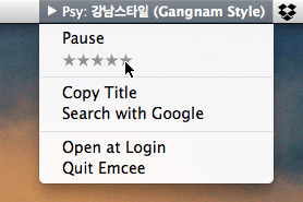
A small update to Emcee is out. It is an app that displays the currently playing iTunes song title in the menu bar.

We have fixed a crash and other bugs related to iTunes 11.0.3 and also fixed an issue which could prevent iTunes from quitting while Emcee was running.

Buy or update in the App Store.

Large click areas for small elements

All user interface designers should know and apply the Fiitts’s law. It says that the larger and the closer the target area is, the easier it is (i. e. takes less time) to reach it. Immediate corollary: make buttons big.

What is not so obvious is that instead of making an element bigger, you can just enlarge the click area. I do this with the main menu on my site.

If I did not care, the click zones could have been like this:

They are actually three times larger:

This makes the links so much easier to click.

As visual designers do not usually denote the click areas, this is a trick for web developers to know.

By the way, making click areas too large does not pay off, as the Fitts’s function is logarithmic.

World

The new section has opened on my website in English: World.

I publish photos from cities and countries I have visited and write short comments about them. My attention gets grabbed mostly by transport, signage and wayfinding, but not only.

Austria:

  • Vienna, where Danube is split into two rivers by a 20-km long artificial island,
  • Hallstatt, a beautiful village in the middle of Austrian nowhere.

Germany: Cologne.

The Netherlands:

More stories to come.

Dealing with legal all-caps

Some lawyers think they should shout at their readers by using all-caps text — this is how they communicate the idea “this is important”. Here’s a fragment of some Apple document:

Why do lawyers use all-caps?

The lawyers do disservice to themselves: all-caps text is much harder to read than normal one. If you are a designer, you are responsible for this, but unfortunately changing it is often beyond your power. So here’s what you do when no one is looking:

Dealing with legal all-caps

And all-caps becomes small-caps:

Here is how you avoid legal all-caps

The text still stands out, but it no longer looks ugly and most importantly it is noticeably easier to read. We’ve used this trick in Getwear’s terms of use and other similar pages. See also: Typography for lawyers.

Earlier Ctrl + ↓