Here is my collection of the London Underground voice announcements. This post has been significantly updated twice (in March 2014 and in May 2016). I still don’t have any announcements from the Metropolitan and Waterloo & City lines, and the DLR.
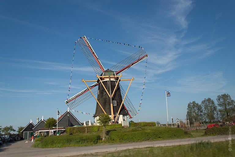
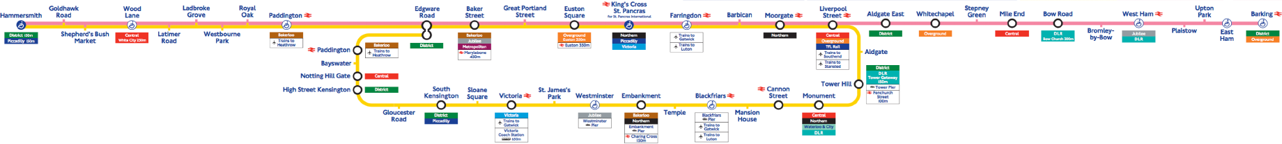
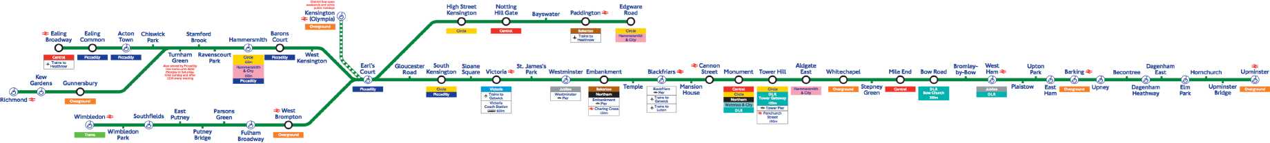
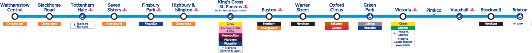
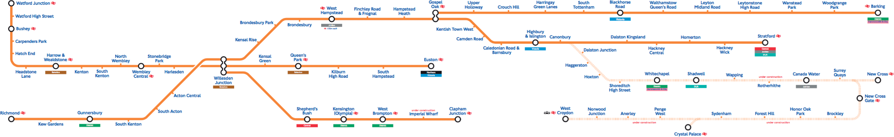
Car line diagrams source: Transport for London
The “Mind the Gap” announcement
First of all, the famous “Mind the Gap” announcement:
Bakerloo line

Only one regular announcement:
And one overlapped with a service announcement:
And a service update on Baker Street:
Central line

Lancaster Gate — Marble Arch (towards Epping):
Marble Arch — Bond Street (towards West Ruislip):
Just in case you would like to imagine yourself travelling the whole way between the two stations, here is a full recording of that:
Liverpool Street — Bank (towards Ealing Broadway):
Greenford — Northolt:
Circle line
Tower Hill — Liverpool Street:
Farringdon:
Baker Street:
Train operator announcement about short delay at Baker Street:
Train operator announcement at Aldgate:
District line
Paddington:
Bayswater:
Chiswick Park:
Turnham Green:
Sloane Square:
Hammersmith & City line
Great Portland Street, Euston Square:
Jubilee line

Operator announcement at Canary Wharf:
Canary Wharf — North Greenwich:
Northern line

Moorgate — Euston (towards High Barnet via Bank):
The Hammersmith & City line is called just “Hammersmith” line in these announcements.
Euston (towards Morden via Bank):
Euston — Camden Town (towards Edgware via Charing Cross):
Goodge Street (towards Kennington):
King’s Cross St. Pancras — Moorgate (towards Morden via Bank):
It is notable that on the Jubilee and Northern lines, they say “this train terminates at S” instead of “this is a L line service / train to S”. I also like the Northern-line expression “This train terminates at Morden via Bank” as a shorthand for “This is a Bank branch train, and it terminates at Morden”.
Piccadilly line

Covent Garden — Green Park (towards Rayners Lane, Uxbridge):
Barons Court — Hammersmith (towards Uxbridge)
Osterley towards Heathrow, including announcements for the customers who took the wrong train to Heathrow:
Victoria line
Red signal:
Victoria — King’s Cross St. Pancras (towards Seven Sisters, Walthamstow Central, including announcement of suspended lines):
Highbury & Islington — Brixton (including announcements on a weekend when many services were suspended):
Notice, that the suspended Northern line was not even listed in the “change” section.
Here the Northern Line announcement is shortened. I thought it was because the whole announcement was getting too long, but hold on.
Here, the Northern line announcement is shortened again, but the overall announcement is not nearly as long. So I have no clue.
There is no Northern line on Oxford Circus, but it’s mentioned nevertheless, presumably due to its importance (the Hammersmith & City was mentioned only at King’s Cross).
An operator announcement at Euston:
London Overground
West Brompton:
Wandsworth Road, Clapham High Street:
Here are some platform announcements at Queen’s Park:
National Rail
Other announcements
This announcement on Highbury & Islington turned out to be very useful for my own journey planning:
A recording of a train operator explaining a delay with a red signal, the quality is very poor:
More train operator announcements:
On a station of the Bakerloo or District line:
* * *
Do you have any interesting London Underground announcements recorded? Please send them to me at ilyabirman@ilyabirman.net.
This post has been updated on March 17th, 2014 with recordings sent by Yaroslav Eremenko (all the Northern line and some others) and another reader who preferred anonymity