Alexey Blinov has updated our app Emcee with Spotify support.
Blog
Later
Ctrl + ↑
The stupid “Compose New Message” Mail.app menu item
Let’s say you’ve right-clicked the Mail.app’s dock icon and want to write a new mail:
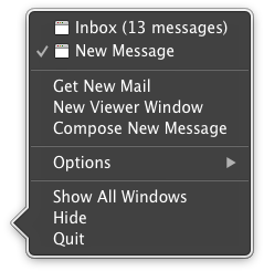
Why, why is the menu item called “Compose New Message”? Why does it say “Compose”? No sane person would ever say: “Honey, I need to compose a message”.
In every other app on Earth there is no verb before “New”. Just “New Window” in Safari. Just “New Event” in Calendar. Heck, in iMessage it is just “New Message”. Who does Apple make me spend several seconds trying to find the line I need in Mail.app? This is one of those things you cannot get used to.
Ångström: no favorites
With Ångström, we were thinking about a way to make the units you use most, accessible more easily.
The obvious idea would be to implement favorites. The user finds a unit he wants to convert, then taps a star. The starred units get into a special list. If a unit gets out of favour, you tap it again to remove it from the list.
But there is a problem. When you’ve got your result, you don’t want to think about adding the unit to a special list to simplify the task in the future. You want to get on with your life. Adding a unit to favorites would require discipline which most people don’t have: few people bother adding websites to Bookmarks, they just google them again and again. Nobody wants to manage their unit converter. User interface is evil.
We focused on the idea of maintaining conversion history and learning the user’s habits.
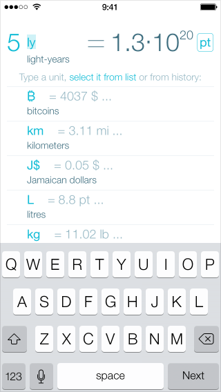
Here are the things we do:
- When you open the app, we use the units from the last time. If you always convert the same thing, you will never need to enter the units.
- If you press space after entering the value, we show the conversion history (see the screenshot above). If you always convert several of the same things, you will be able to see all the possible conversion results at once.
- If you last used some unit long ago and had to actually type it again, we at least remember what you converted it to and use that.
These features let us be as helpful as we can without making the user babysit the app.
Promo mix: Lights
Here is my new atmospheric progressive house mix:
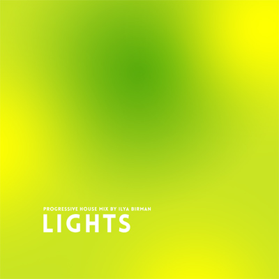
Guy J, Andre Sobota, Dosem, Egostereo, Marcelo Castelli and others. As usual, these are the best tracks of this particular mood that I have found over several years. Enjoy!
Grids with no gutters
The popular way to make grids for your layouts is to account for gutters, like this:
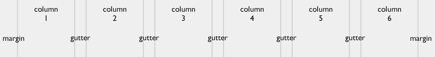
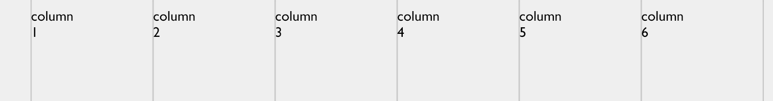
The layout here is 760 pixels wide with six 100-pixel columns, five 20-pixel gutters and two 30-pixel margins.
Now, quick: what will the column width be if we increase gutters to 25 pixels?
This is an overcomplicated, highly impractical way of dealing with grids. Given the overall width and the number of columns, it is hard to calculate the column width. The width of n columns does not equal n × col width. Creating or changing such a grid a work in itself. This is nasty.
The better way is to get rid of gutters:
The layout here is 760 pixels wide with six guides at 120-pixel intervals and a 30-pixel left margin.
But wait, how do you make sure the text in adjacent colums does not collapse? Easy. You add a right padding to the containers:
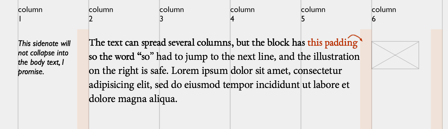
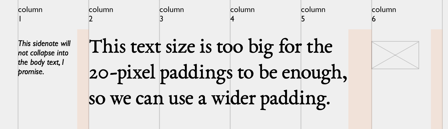
This approach gives you the freedom of adjusting the paddings in relation to the font size. If your main text is twice bigger, the 20-pixel spacing will not be enough, so you can use bigger paddings for its (and only its) container:
Alternatively, you can specify the padding in relative units (i. e. 1.5 em).
Here is another example, this time without any visible guides:
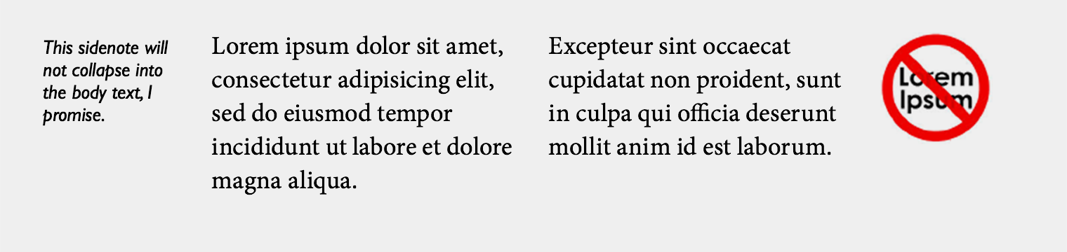
On the web, you almost exclusively use flush left, so viewing the grid as a set of guides instead of as a set of columns makes sense. The only “grid” is the grid of the invisible lines by which the text is aligned. So do not mess with gutters, they are not worth your time.
You should follow me on Twitter, here
Correcting the capture time of your photos
I prefer my photos’ metadata to include the correct capture time, regardless of which timezone it was taken in. But I would never spend time to figure out how to adjust the built-in clock on my camera. And even if that was easy, I would always forget to do it anyway.
So when I travel, I just take photos of clocks and then use those to adjust the capture time of the whole set. Usually there are plenty of clocks on transport systems, and, as you know, photos I take mainly have to do with transport. This one is from the London Tube:
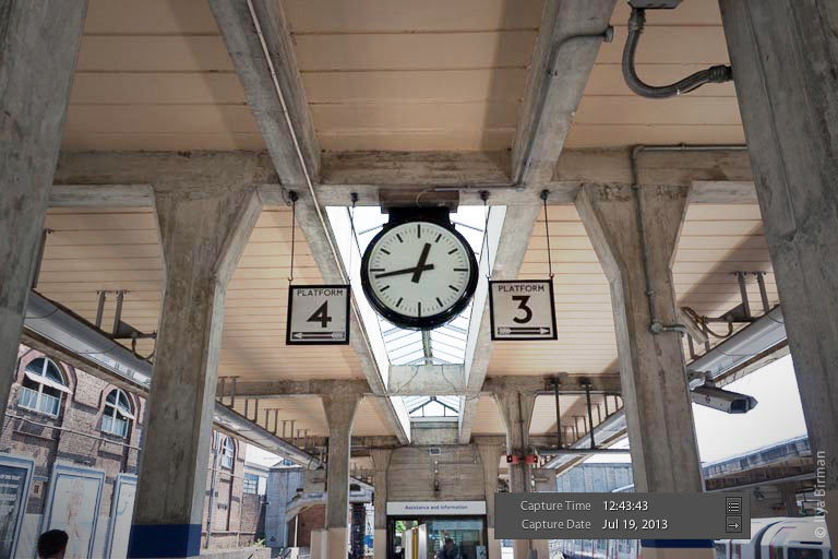
In Lightroom, I select the whole set of photos from some trip, then choose a photo of a clock (this does not void the selection), and then I set the photo’s capture time to whatever the clock displays. This makes Lightroom adjust the capture time of all selected photos accordingly.
This method is great because it does not require any discipline: you can adjust time whenever you want. A couple of days ago I needed a photo from 2005, and it had the wrong capture time. I just found a photo of a clock in that set and corrected the whole set in a matter of seconds.
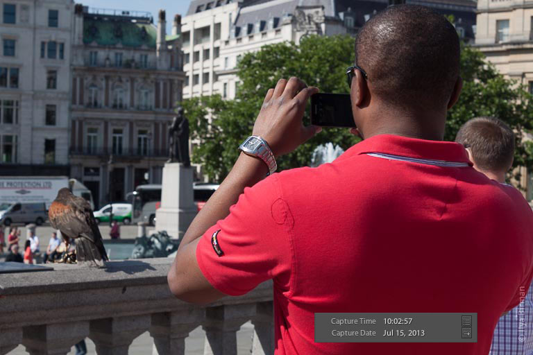
Sometimes І would notice an accidental clock or watch in some photo and just glance at the capture time. Yep, it is all right with this one from Trafalgar Square:
Obviously, the ideal camera should know the time without any action on my part, as the iPhone does. Or, better, the camera should be just an iPhone dock. But this is unfortunately not the case with my Canon.
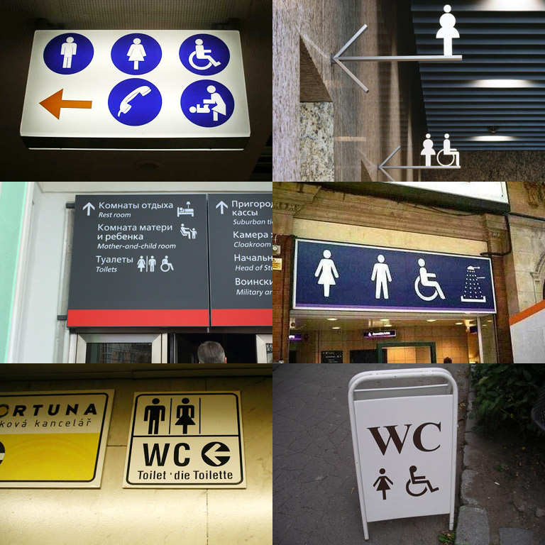
One-legged women and toilets
The eternal mystery of signage design is that women on the toilet signs often have just one leg. They are all over the world:
John Siracusa on vinyl
John Siracusa’s meticulous explanations of the obvious (to you) things are charming. The latest one I took a great pleasure listening to, is on vinyl vs CD in the episode 60 of ATP:
Start listening at 1:52:04, but John’s speech starts at 1:53:35.
Ninth of Kin: Rien ne va plus
I have completed my new track, Rien ne va plus. It is crazy techno-flavoured psytrance at 148 bpm:
More of my music is available in the Music section.
Ångström Style System for Cocoa
While developing Ångström, the unit converter for the iPhone (check it out!), Alex Babaev and I have come up with the Ångström Style System.
ÅSS (hey, why not) is a JSON-driven styling engine for Cocoa with Dropbox synchronization and shake-to-refresh. It is a great way to separate the code of the app from its look and feel. It helped me try out different aspects of the color scheme, the fonts, the spacings and, most importantly the animations, without making Alex rebuild the app every time I wanted to change something.
Playing with the text caret
One of the many things we were obsessing over in Ångström was the text caret animation:
This is an animated gif, make sure to download the app and look at the real thing.
I wanted the caret to stick out much below and above the text. I wanted it to move like an elastic and bouncy string (whatever that is). I wanted to make it stretch and squeeze, not just blink. There was no way I could explain this in technical terms to Alex. How far the line should stretch? How fast the animations should be? Who knows. I needed a way to play with all the parameters until it felt right.
So I wrote Alex a letter explaining my idea in vague terms. I asked for a way to control the length and the opacity of both the long and the short states of the caret and the transition times between them. After having played with this parameters for some time I figured out I could not make the caret behave exactly as I wanted. Six variables were not enough. We have gradually added the variables for animation easing, the delays and the caret width.
This is the final “stylesheet” for the caret, after hours of tweaking:
"cursor": {
  "showTime": 0.2,
  "hideTime": 0.2,

  "color": "@colors.textNumberColor",

  "period12": 0.4,
  "timingType12": "linear",

  "period21": 0.2,
  "timingType21": "easeOut",

  "height1": 48.0,
  "width1": 2.0,
  "delay1": 0.3,
  "alpha1": 1.0,

  "height2": 78.0,
  "width2": 1.0,
  "delay2": 0.1,
  "alpha2": 0.33
},
This fragment is actually about 3% of the whole Ångström’s stylesheet.
Dropbox sync and shake-to-refresh
The two things that make ÅSS particularly awesome are Dropbox sync and shake-to-refresh.
Moving the style variables from the code to an external file is a useful idea all by itself: I could have been playing with the parameters and rebuilding the app having no clue about Objective-C. As far as I understand, this is how Brent Simmons’s DB5 works.
But we wanted to make ÅSS a real pleasure to use (no pun intended), eliminating the need not only to rebuild, but even to restart the app. Here is how the process of refining something looked for me thanks to ÅSS:
- Open the app on my iPhone and go to the screen I want to adjust.
- Open the app’s ÅSS stylesheet from the Dropbox folder with Sublime Text on my Mac.
- Change the parameters in the file and save it.
- Shake my iPhone to see the change immediately.
So this is literally live tuning of a running app.
There is a different approach to styling: put sliders with the parameters to the Settings app during development. While this may look nice, we think it is very counter-productive. You don’t want to be constantly switching between the app you are designing and the Settings app. You don’t want to be scrolling through tens or hundreds of variables on the iPhone screen. You don’t want to struggle entering a color’s #rrggbb value on the iPhone keyboard. Sublime Text on a computer synced with the iPhone via Dropbox works so much better.
Alex has written a post on the internals of the system, check it out. It explains the architecture and features some code examples.
Earlier
Ctrl + ↓