Selected

Later Ctrl + ↑

Remind me of the past

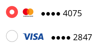
Let’s jump right in to the examples. In an online store, you need to select which bank card to use. You’ve been a client for many years, so a whole bunch of cards are already saved. You need to pick the one that you want to use right now:

It would be great if the store reminded you, which card you used to make the recent purchase. Even better, specify last purchase date next to each one.

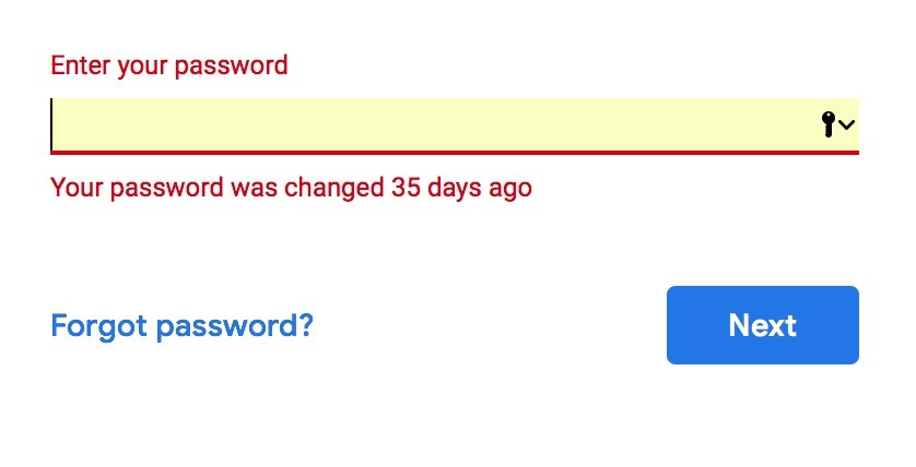
When you make mistake entering a Google password, it reminds you when you set it:

It will only say this if you are entering your old password. If you enter a wrong password that has never been right, it will just say it’s wrong. These “35 days” could be useful, e. g. if they remind you of the circumstances, in which you changed the password, you could remember the password itself.

More examples:

  • when offering the user to sign in with Facebook and Twitter, remind them, what they used the last time;
  • when the user has problems remembering their password, remind them, what password strength requirements you have — this could help them remember how they’ve chosen the password to satisfy them.

Selection anchoring and undo on a Mac

A text selection not only has a beginning and an end, but also an anchor. It is whether I started selecting from the beginning or from the end. It’s not displayed anywhere, but the operating system sets it and accounts for it.

If you select a text from left to right, the selection will be anchored on the left. When you use Shift+arrows, the end of the selection will be adjusted, while the beginning will stay intact. Conversely, if you select a text from right to left, the selection will be anchored on the right and Shift+arrows will adjust the beginning of the selection. This works even if the initial selection is made with a mouse, try it yourself.

In older Mac OS versions this was not implemented well in lists. In Finder, for example, when you clicked a file and then Shift-clicked another one that was above in the list, Shift+arrows would still adjust the bottom end of the selected range, not the top one. That was irritating. At some point Apple fixed it and Finder selections began to work correctly. In text selection, it worked right all the time that I remember.

But even in text, there is still a bug in Mac OS: when Undo restores a selection, it will reset its anchor to left.
At least in Mojave. Select some text from right to left, then try adjusting it with Shift-arrows—everything will work fine, the beginning of the selection will be changed. Then delete the text and put it back with ⌘Z. Now, Shift-arrows will adjust the end of the selection. Why, Apple?

It’s commonplace to praise Apple for their attention to detail. But there is actually a lot of such user interface sloppiness on their part, and always have been. In never occurred to me that there was such thing as a selection anchor when I used Windows, because in Windows, it always worked flawlessly.

New York City Subway voice announcements

My post on London Underground voice announcements turned out to be surprisingly popular. So, here is another one. This time, let’s listen to the announcements on New York City Subway. This post is much smaller, but if you send in more recordings, I’ll be happy to update it.

Brooklyn bound Q Express train

From Lexington Av/63 St to Canal St:

Brooklyn bound L train

6 Av to Bedford Av:

Manhattan bound L train

An announcement on the Bedford Av platform:

3 Av to 14 St-Union Sq:

6 train

An announcement on the 68 St Downtown platform:

A couple of operator announcements on the train:

A usual pre-recorded announcement:

Miscellaneous

These you may hear on any train:

* * *

Do you have more or better quality New York City Subway announcements recorded? Please send them to me at ilyabirman@ilyabirman.net.

The hover and click should match

This principle seems obvious, but there are too many interfaces that violate it. Thus, a blog post.

If an interface element exhibits some hover effect, the element should be clickable. If an element is clickable, it should exhibit some hover effect. The element’s hover and click areas should match down to a pixel.

Here are some of the mistakes I’ve seen:

  • A website main menu is composed of links, each wrapped into a container. The containers style includes a hover highlight. The containers are slightly bigger that the links because of paddings. Within the paddings themselves, the highlighting works, but the links do not.
  • A link underlining is implemented so that clicking precisely at the line itself does not cause the link activation even though there is a hover effect. In some cases, it happens the other way around, too: there is no hover effect, but clicking works.
  • To dismiss a modal popup dialog, you can just click outside of it. When the dialog is shown, the hover effect of the elements around it continue to work, even though clicking them will just dismiss the popup and not trigger the associated action.
  • An element’s action is disabled by a script, but the hover effect remains. For example, a form’s submit button is disabled because of an incorrect value in some field, however is still reacts to a hover as if it worked.
  • A large box with a picture and a heading is clickable as a whole and exhibits some hover effect. In the box’s corner, there is a small icon that does something else, say, adds the object to “Favourites”. When hovering the icon, the box’s hover effect remains, even though clicking the icon will not trigger the action, associated with the box itself.

Jouele Pro

Jouele Pro

Jouele is an amazing audio player for the web. It was built to look simple and beautiful, and to use a simple and beautiful declarative API. With Jouele, you write code like this:

<a href="ilya-birman-use-me-mix.mp3" class="jouele">
  Ilya Birman: Use Me (DJ Mix)
</a>

And you get a player like this:

Playlists, repeating and keyboard control were gradually added in the recent years. But we wanted Jouele to be even more advanced and versatile. And we didn’t want to sacrifice the declarative nature of Jouele’s APIs.

So we came up with something great: Jouele Pro with custom controls. Let me tell you about it.

What you can do with Jouele Pro

I’ve recently started publishing interactive playlists for my DJ mixes. You can click the cover art to start and pause playback. You can click a track’s name, and the mix will jump to that track. And the currently playing track gets automatically highlighted in the playlist when the playback reaches it.

Try it before reading on.

The magic is that neither the cover art, nor the playlist are a part of the Jouele user interface. The are just part of the page, layed out the way I want. But they gain their special abilities by using Jouele Pro’s declarative API.

So I have a player inserted with the code above, by using the CSS class jouele on an HTML a element. And I want the cover image to initiate and pause playback.

Here’s what I do:

<img
  src="cover.jpg"
  class="jouele-control"
  data-type="play-pause"
/>

That’s it. Now, when you click this image, the mix starts to play.

And to make the playlist items clickable, I do this:

<tr class="jouele-control"
  data-type="seek" data-to="0:45:38"
>
  <td>0:45:38</td>
  <td>Tensal</td>
  <td>Achievement 3</td>
</tr>

Now when you click on a track’s name, you go directly to it in the mix.

I also want the cover art to look somehow “active” when the music is playing. Here’s what I do in CSS:

img.jouele-is-playing {
  outline: rgba(255, 255, 255, .2) 10px solid;
}

That’s it. Jouele Pro dynamically sets the class jouele-is-playing on each of its controls during playback, so the cover art highlighting now works. No JavaScript needed.

The same way the highlighting of the currently playing playlist item works. The actual HTML code for each playlist item is this:

<tr class="jouele-control"
  data-type="seek" data-range="0:45:38...0:48:55"
>
  <td>0:45:38</td>
  <td>Tensal</td>
  <td>Achievement 3</td>
</tr>

This line is not just to jump to a point in time, but it also corresponds to a time range. To dynamically highlight it, I use this CSS:

tr.jouele-is-within {
  background: rgba(255, 255, 255, .2);
  color: #fd0093;
}

That’s it. Jouele sets the class jouele-is-within to all its range controls when the playback is within this range.

If there are several players on a page, the controls control the one that was playing previously, or the first one on the page, if nothing was playing before. You can link the controls to a particular player.

Jouele Pro is $39 per domain name. The free Jouele is available as before.

Links:
  • Jouele
  • Jouele Pro
  • Documentation
    How to use the declarative API and the controls. There is also an example of a full custom player built with the controls
  • Evgeniy Lazarev, the developer of Jouele and Jouele Pro

Announcing the book “User Interface”

I’m very excited to unveil my future book, User Interface, which will be released by Bureau Gorbunov Publishing.

Below are some spreads from the book.

Explaining modes using a great Pioneer’s CDJ-1000 player:

The explanation of Fitts’s experiment opens the chapter on aiming:

Informativeness and the myth of seven elements:

One of the brilliant historic examples of how to provide instant and continuous feedback:

One of the topics is the User Interface Syntax. Here, I’m talking about a notable exception to “command equals verb” rule:

This one is just beautiful:

In the chapter “Windows” I show many examples of thoughful workspace organization:

When the user hasn’t filled a form, the main button is usually disabled. This is not always a good idea:

The beginning of a chapter on using a grid:

And here’s just a small part of the book’s table of contents:

Please go and see the page about the book yourself.

Don’t forget to try the sample chapter!

Leave your email address to be notified when the book is out.

And stay tuned.

Group checkbox setting

Say you have an interface with a column of checkboxes.

It’s a good idea to simplify toggling of multiple checkboxes. When I press the mouse button on a checkbox and move the pointer vertically while still holding the button, all checkboxes that I’ve crossed this way should switch to the same state.

The “same state” requirement is important. If the first checkbox that I’ve pressed was turned on, all the rest should also turn on, not invert their state (as they would if I just clicked them one by one). If you have Photoshop in front of you, check out how the “eye” icons work in the Layers palette. That’s how it should be.

There’s a nuance. The standard checkbox turns on when you release, not press the mouse button. Moreover, if you press on the checkbox, then move the pointer away and release somewhere else, the standard checkbox would not toggle. To implement the behaviour described above, you’d have to change this and toggle the checkbox immediately on pressing. Usually it shouldn’t be an issue. But if the change of the checkbox’s state affects something else, maybe the change should be applied only after releasing the mouse button.

T-Centralen and Stadion Stockholm metro stations

Previously: Rådhuset.

The next station is T-Centralen. It’s the blue line:

Transfer:

Escalator:

Platform:

Compass:

Diverge point:

Now, to the red line. Stadion station:

You’ve already seen this photo in the post about the trains:

Beautiful:

Things:

Things on walls. М:

Left arrow:

Right arrow:

The most beautiful thing:

The pictures are from the trip in June 2016.

Continued

More Stockholm metro:

Rådhuset Stockholm metro station

Previously: Västra skogen, Huvudsta and Stadshagen stations.

This is my second most liked station (after Solna centrum), Rådhuset:

You’ve already seen this photo in the introductory post:

The coolest thing here is this gygantic column:

Wow:

Note the tunnel decoration:

All in all, an ordinary station. With ads:

Some kind of tubes:

Conveniently, there is also a bar:

Continued

More Stockholm metro:

Earlier Ctrl + ↓