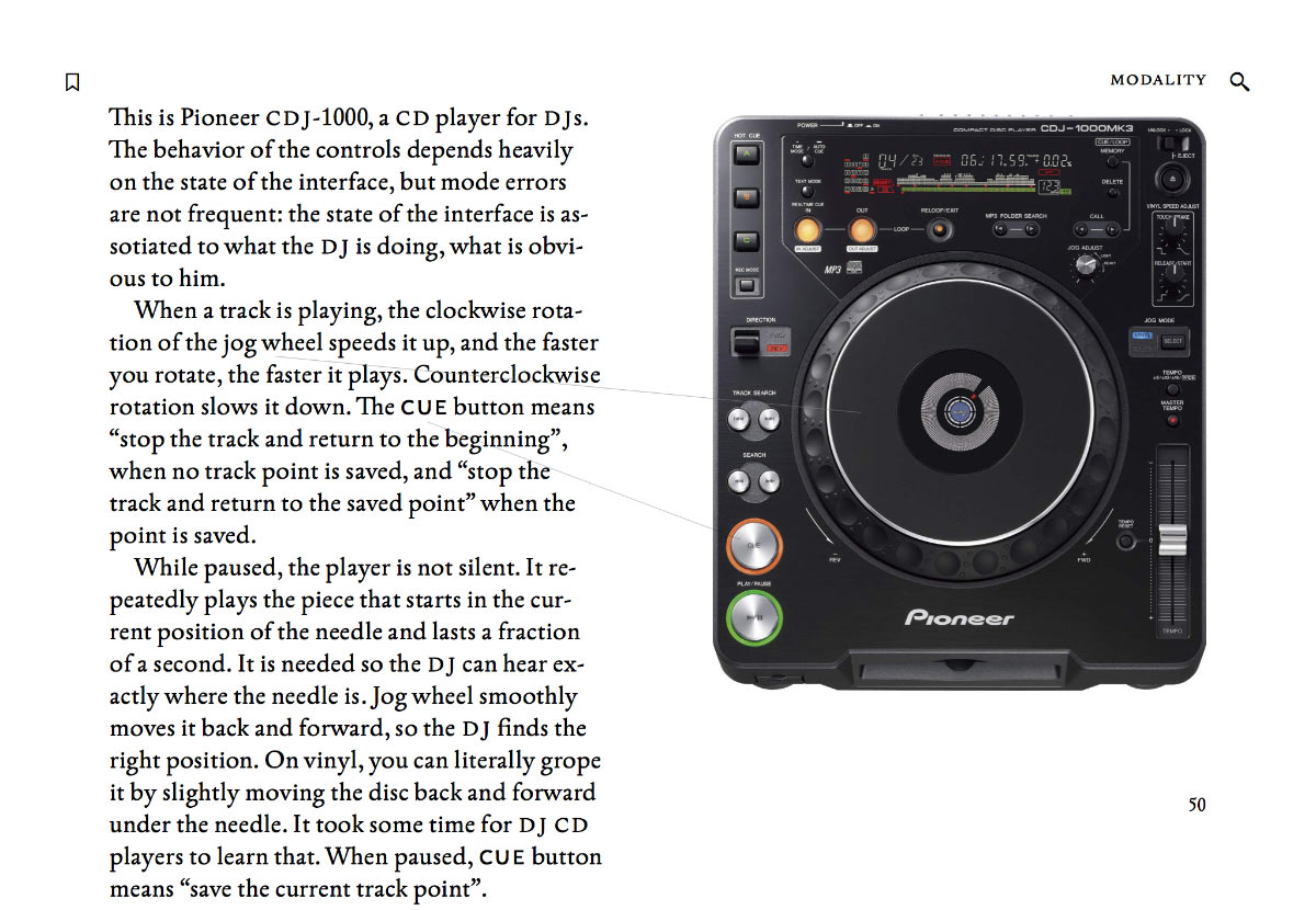
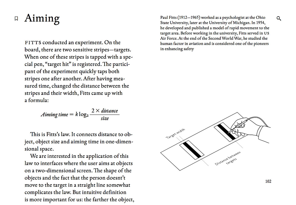
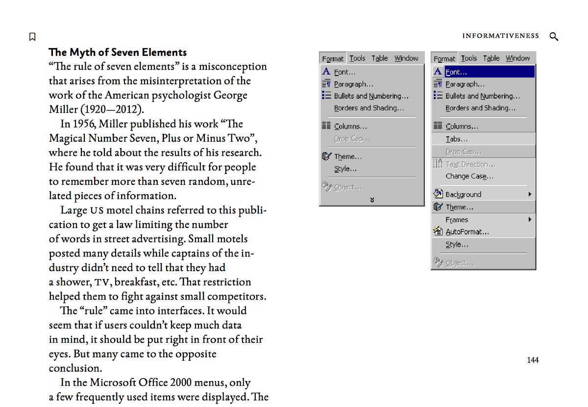
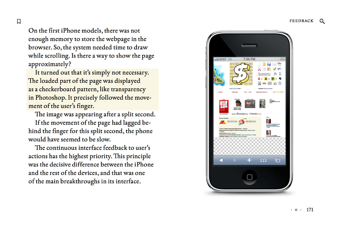
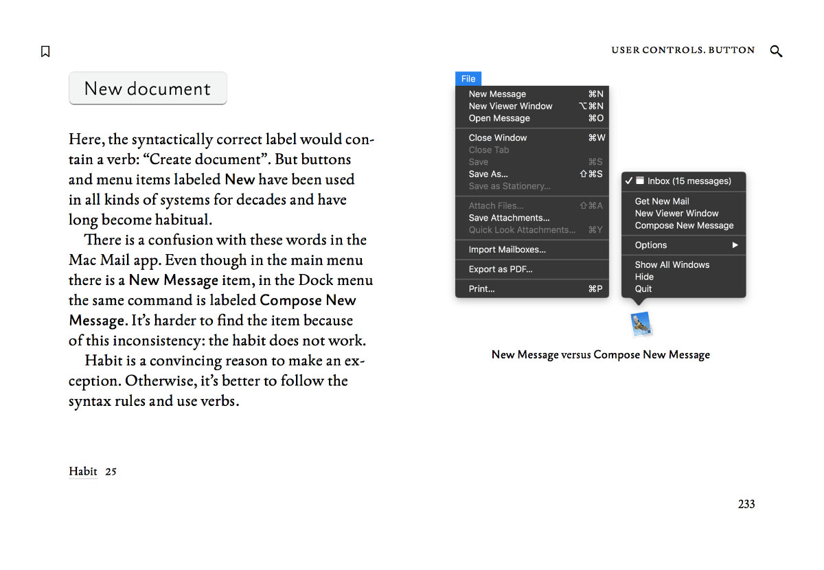
Transit Mapping Symposium has published the video of my February Paris talk, “Map as a symbol”:
Selected
Jouele Pro
Jouele is an amazing audio player for the web. It was built to look simple and beautiful, and to use a simple and beautiful declarative API. With Jouele, you write code like this:
<a href="ilya-birman-use-me-mix.mp3" class="jouele">
Ilya Birman: Use Me (DJ Mix)
</a>And you get a player like this:
Playlists, repeating and keyboard control were gradually added in the recent years. But we wanted Jouele to be even more advanced and versatile. And we didn’t want to sacrifice the declarative nature of Jouele’s APIs.
So we came up with something great: Jouele Pro with custom controls. Let me tell you about it.
What you can do with Jouele Pro
I’ve recently started publishing interactive playlists for my DJ mixes. You can click the cover art to start and pause playback. You can click a track’s name, and the mix will jump to that track. And the currently playing track gets automatically highlighted in the playlist when the playback reaches it.
Try it before reading on.
The magic is that neither the cover art, nor the playlist are a part of the Jouele user interface. The are just part of the page, layed out the way I want. But they gain their special abilities by using Jouele Pro’s declarative API.
So I have a player inserted with the code above, by using the CSS class jouele on an HTML a element. And I want the cover image to initiate and pause playback.
Here’s what I do:
<img
src="cover.jpg"
class="jouele-control"
data-type="play-pause"
/>That’s it. Now, when you click this image, the mix starts to play.
And to make the playlist items clickable, I do this:
<tr class="jouele-control"
data-type="seek" data-to="0:45:38"
>
<td>0:45:38</td>
<td>Tensal</td>
<td>Achievement 3</td>
</tr>Now when you click on a track’s name, you go directly to it in the mix.
I also want the cover art to look somehow “active” when the music is playing. Here’s what I do in CSS:
img.jouele-is-playing {
outline: rgba(255, 255, 255, .2) 10px solid;
}That’s it. Jouele Pro dynamically sets the class jouele-is-playing on each of its controls during playback, so the cover art highlighting now works. No JavaScript needed.
The same way the highlighting of the currently playing playlist item works. The actual HTML code for each playlist item is this:
<tr class="jouele-control"
data-type="seek" data-range="0:45:38...0:48:55"
>
<td>0:45:38</td>
<td>Tensal</td>
<td>Achievement 3</td>
</tr>This line is not just to jump to a point in time, but it also corresponds to a time range. To dynamically highlight it, I use this CSS:
tr.jouele-is-within {
background: rgba(255, 255, 255, .2);
color: #fd0093;
}That’s it. Jouele sets the class jouele-is-within to all its range controls when the playback is within this range.
If there are several players on a page, the controls control the one that was playing previously, or the first one on the page, if nothing was playing before. You can link the controls to a particular player.
Jouele Pro is $39 per domain name. The free Jouele is available as before.
Links:
- Jouele
- Jouele Pro
- Documentation
How to use the declarative API and the controls. There is also an example of a full custom player built with the controls - Evgeniy Lazarev, the developer of Jouele and Jouele Pro
Announcing the book “User Interface”
I’m very excited to unveil my future book, “User Interface”, which will be released by Bureau Gorbunov Publishing.
Below are some spreads from the book.
Explaining modes using a great Pioneer’s CDJ-1000 player:
The explanation of Fitts’s experiment opens the chapter on aiming:
Informativeness and the myth of seven elements:
One of the brilliant historic examples of how to provide instant and continuous feedback:
One of the topics is the User Interface Syntax. Here, I’m talking about a notable exception to “command equals verb” rule:
This one is just beautiful:
In the chapter “Windows” I show many examples of thoughful workspace organization:
When the user hasn’t filled a form, the main button is usually disabled. This is not always a good idea:
The beginning of a chapter on using a grid:
And here’s just a small part of the book’s table of contents:
Please go and see the page about the book yourself.
Don’t forget to try the sample chapter!
Leave your email address to be notified when the book is out.
And stay tuned.
Group checkbox setting
Say you have an interface with a column of checkboxes.
It’s a good idea to simplify toggling of multiple checkboxes. When I press the mouse button on a checkbox and move the pointer vertically while still holding the button, all checkboxes that I’ve crossed this way should switch to the same state.
The “same state” requirement is important. If the first checkbox that I’ve pressed was turned on, all the rest should also turn on, not invert their state (as they would if I just clicked them one by one). If you have Photoshop in front of you, check out how the “eye” icons work in the Layers palette. That’s how it should be.
There’s a nuance. The standard checkbox turns on when you release, not press the mouse button. Moreover, if you press on the checkbox, then move the pointer away and release somewhere else, the standard checkbox would not toggle. To implement the behaviour described above, you’d have to change this and toggle the checkbox immediately on pressing. Usually it shouldn’t be an issue. But if the change of the checkbox’s state affects something else, maybe the change should be applied only after releasing the mouse button.
T-Centralen and Stadion Stockholm metro stations
Previously: Rådhuset.
The next station is T-Centralen. It’s the blue line:
Transfer:
Escalator:
Platform:
Compass:
Diverge point:
Now, to the red line. Stadion station:
You’ve already seen this photo in the post about the trains:
Beautiful:
Things:
Things on walls. М:
Left arrow:
Right arrow:
The most beautiful thing:
The pictures are from the trip in June 2016.
More Stockholm metro:
Rådhuset Stockholm metro station
Previously: Västra skogen, Huvudsta and Stadshagen stations.
This is my second most liked station (after Solna centrum), Rådhuset:
You’ve already seen this photo in the introductory post:
The coolest thing here is this gygantic column:
Wow:
Note the tunnel decoration:
All in all, an ordinary station. With ads:
Some kind of tubes:
Conveniently, there is also a bar:
More Stockholm metro:
Designing declarative APIs
The video of my Piter CSS conference talk “Designing declarative APIs” has been published:
I’m talking about why declarative APIs are great and give examples of their use in my own projects:
At the time of the talk, the new Jouele Pro was still in development. Now it is available.
Thanks to the conference organisers.
The new Chelyabinsk Trams diagram
Over ten years ago I made the diagram of Chelyabinsk trams and trolleybuses. That design turned out to be very successful: dozens of designers used it as a reference for building their own diagrams. It wouldn’t be as good if not for Artem Gorbunov’s generous help.
Three years ago, together with Alexander Karavaev we made a new version of the diagram. It had a lot of design inventions: the “pencil-drawn” layer for buses and trolleybuses, the “watercolour” rivers and lakes, 3D terminals, the new shape of the stops’ ticks. With that diagram, a logo for chelyabinsk trams was born: the city’s coat of arms decorated with a pantograph.
Then Polina Lesnikova joined the team. She re-drew the map to account for the changes in routes. Together with Alexander, they changed a lot of details after testing the legibility of the previous version. Thus we arrived at the new diagram:
Some landmarks were added. The bus-and-trolleybuses layer gave the previous version some visual richness, and it was interesting to scrutinise. Unfortunately, it didn’t provide any notable utility, so we decided to remove it. This helped to simplify the geometry of lines and make the fonts bigger. The new diagram looks stronger.
Designed by Polina Lesnikova and Alexander Karavaev, art-directed by myself.
Västra skogen, Huvudsta and Stadshagen Stockholm metro stations
Previously: Näckrosen and Hallonbergen. Now let’s look at what’s in the other direction from Solna centrum.
Västra skogen station:
The main feature of this station is these colourful mosaic patterns here and there:
More:
If you ask Lightroom to make this photo level, it will turn in at 45°:
Wayfinding:
Transfer:
You may think that it’s a Stormtrooper helmet there:
But it’s actually god knows what.
Huvudsta station:
Seems to be nothing special compared to the neighbouring stations. But there is this stripe along the platform and some ribbons on the ceiling:
And a gigantic green blot, for some reason:
And some cylinders:
Stadshagen station:
In addition to blood stains on the walls, there are these pictures:
Depending on the view angle, you see different things:
Another one:
The escalators are colourfully illuminated:
The pictures are from the trip in June 2016.
More Stockholm metro:
Redesigning Hawaii missile alert user interface
A couple of weeks ago Hawaii residents got a shocking alert on their phones:
It turned out to be false.
A state employee accidentally sent the message while testing the alert system.
It’s natural to blame the employee for impermissible negligence. But here is the user interface that they were using:
Instead of selecting “DRILL-PACOM BLAH BLAH”, they chose “PACOM BLAH BLAH”.
Firing the employee will not help avoid this mistake in the future, another employee is as likely to err.
The user interface is the problem.
Some commenters suggested adding a confirmation dialog. But confirmation dialogs are only good at one thing: forming the habit of pressing “Yes”. Testing the alert system is a daily routine, so after a couple of days the effectiveness of a dialog will be zero. Even if we require confirmation only for the real alert, but not for the test and drill alerts, the error is still quite likely: people see confirmation dialogs too often and are trained to ignore them. Also, sending even a drill message by mistake is probably not desirable.
Here is how to really fix the interface.
Selecting the right option
In the current interface, the two options that the employee has mixed up, look almost the same: just a line of meaningless all-caps text. Instead, the drill options should be clearly separated from those that send real alerts. The text should be edited for absolute clarity. All abbreviations, parentheses and repeated words (“state only”) should be removed.
Ideally, what should remain is the actual text that will be sent, and to whom it will be sent:
If the employee wants to send a real alert, they have to explicitly choose that. Then everything should look really serious:
Undoing the wrong action
But most importantly, undo should be implemented.
How can you undo sending of a state-wide alert? Easy, the same way you undo sending an email in GMail:
For a short period of time, the mail is not really sent, giving the user the chance to correct the accidental mistake.
After the employee selects to send an alert, the next screen should say what has happened in a way that makes the employee’s job look completed, but still leaves the option to prevent the actual alert:
Notice how there is no confirmation button: there is nothing to confirm, the command has been accepted without confirmation. And since there is no way to close this screen before the timeout is over, the habit is not being formed to do it.
***
The problem with the modern world is that there is this stupid separation of “UI” and “UX” design, in which the important stuff gets lost. Good user interface design used to be about understanding how humans operate and helping them do their job better. And now, it’s undefined.
“UI” designers are now supposed to be thinking about beautiful buttons, fonts, and animations. This is too narrow. It’s hard to justify this work if you are designing software for use by a few government employees. “UX” designers are now supposed to be thinking about the user experience, whatever that is. This is too abstract. Caring about how “satisfied” or “engaged” the user is, again, not something a government could afford to think about. The “UI/UX” separation is bullshit. Between “UI” and “UX”, someone has to do the actual work.
See also:
Sources of images:
- Hawaii residents received false emergency alert about an incoming missile. The Verge.
- Pandemonium and Rage in Hawaii. The Atlantic.
- Hawaii Distributed Phony Image Of Missile Warning Screen. Honolulu Civil Beat.
- Bad design in action: the false Hawaiian ballistic missile alert. Jason Kottke.