Blog

Later Ctrl + ↑

Resizing Mac Windows

If you start dragging a window’s border, the window will start to resize horizontally or vertically in that direction. And with the Option key pressed, it will resize symmetrically in the opposite direction as well (like in Photoshop, yes).

If you start dragging a window’s corner, the window will start to resize both horizontally and vertically in that direction. And with the Option key pressed, it will resize symmetrically in all directions.

If you double click a window’s border, the window will grow from that side to the edge of the screen. If you double click a window’s corner, the window will grow to the corresponding corner of the screen.

Therefore, to make a window cover the whole screen (but not go into the dumb full-screen mode), just alt-doubleclick any of the window’s corners.

See also:

Derbent bus map

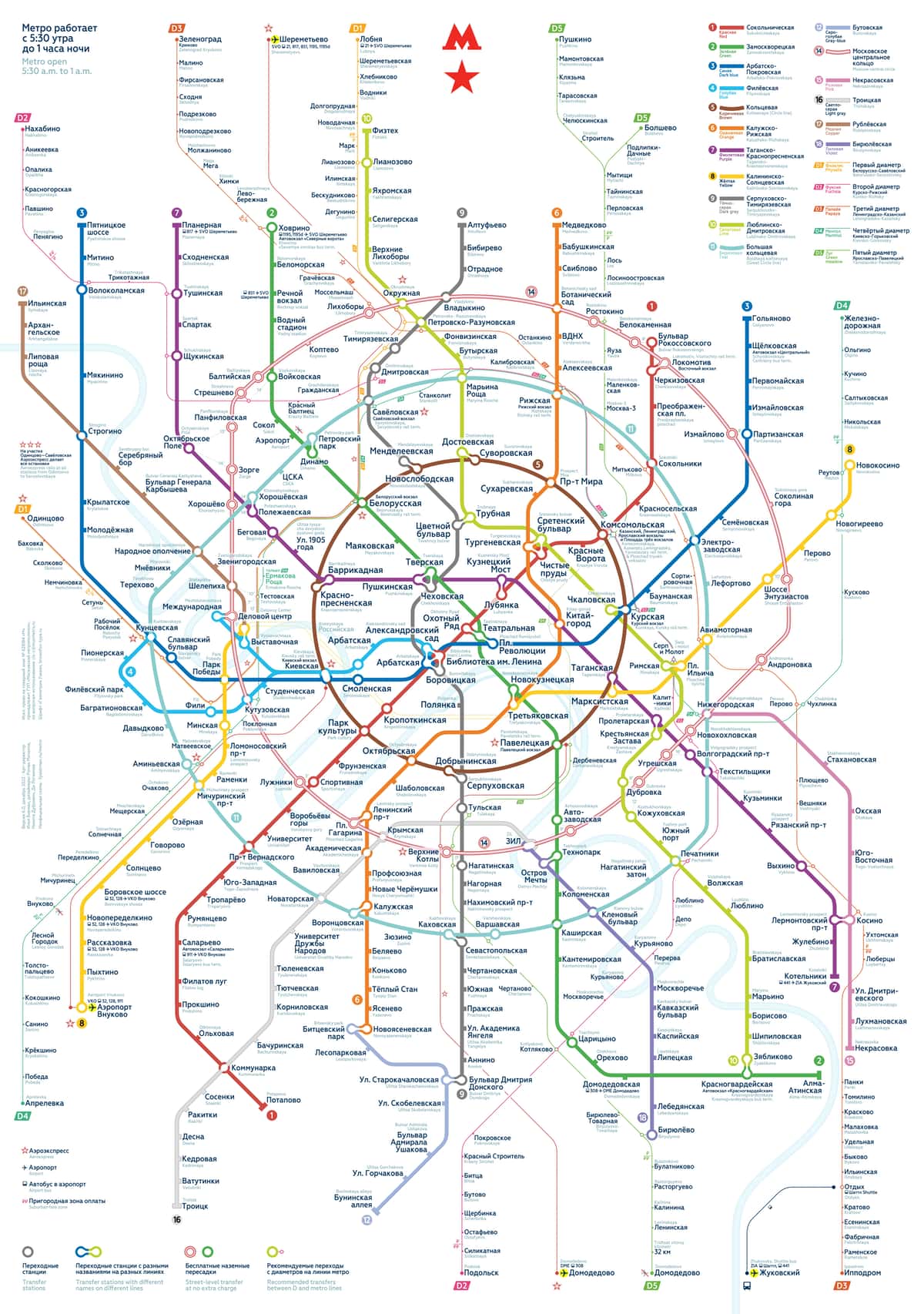
Check out our new transit map. This time it’s Derbent:

We made it with Nikita Dubrovin. The city is undergoing a public transport reform. The first bunch of bus routes have been simplified: 3, 4, 7, 10. The challenge was to lay out the old routes, which are still confusing. In several years, all routes will look reasonable.

How to trim text the right way

Recently, I wrote about Facebook’s crappy handling of long posts: it’s trims the text randomly and loses your reading position when expanded. So how should it be done? Let’s deal with the trimming first.

Trimming text in a random place is disrespectful to the author and the text, and is a further proof that Facebook doesn’t care what you write. It’s also an example of deep technology dependence: it’s easier for a machine to trim to a certain number of characters, and so it does.

There could be an aesthetic rationale behind trimming text, i.e. to make it fit into a certain design element. Of course this is also disrespectful to the author and the text, but at least the motives are humanistic. However trimming after a fixed number of characters is not even this: the physical size of lines of equal character length is usually variable: compare “iii” and “WWW”. Even in my Facebook example, a few more words would fit in the same box:

Sometimes trimming randomly not only ruins the meaning of the text, but changes its to something indecent:

So, if you can’t do without trimming, you have to trim carefully. How does Aegea do it?

The character limit is considered a rough guideline, not an exact value. If you need to fit in 140 characters, and the text is 143 characters long, then Aegea just won’t touch it. If the text is noticeably over the limit, then Aegea will divide it into sentences and try to take as many full sentences as it can fit. Here, for example, is the snippet of this post:

However, if the result is too short (or no whole sentence fits at all), Aegea will look for other signs of safe trim positions: semicolons, dashes, commas, brackets. Only if none of these are present will it trim at a word boundary. And only if there are no word boundaries, will it trim by the number of characters. The absence of word boundaries is a sure sign that the author themselves didn’t care about the meaning, so it’s fine if neither does Aegea.

In general, Aegea will try to make it as close to the desired length as possible, but so that the meaning does not suffer.

If I can code this, what would stop Facebook from doing it? I think it’s that it hadn’t even crossed anyone’s mind. Why would Facebook even care about doing anything well? What a nonsense. There is no such metric.

Selecting from one SIM card on iPhone

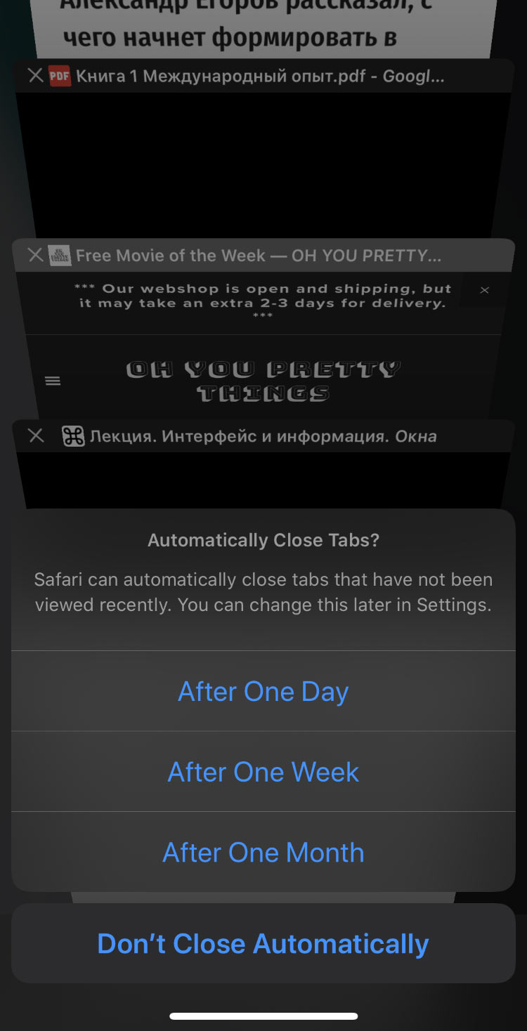
Previously, when I swapped my SIM card, the iPhone more or less immediately asked to unlock it. But now for some reason it shows this interface, in which you can both “Cancel” and “Skip”, but to unlock the SIM card, you must first select the SIM card from the list! Of a single item:

I suspect this was introduced when dual-SIM phones came out. In theory you could insert two new SIM cards at once, and you’d have to unlock both. (It’s still unclear why you have to select them from the list first, but okay.)

In my “User Interface Fundamentals” course I have a lecture “Technology Dependence”. One of its sections is called “1, 10, 10, 1000”. It is about the fact that bad designers make interfaces assuming there will be N items, ignoring the fact that the best user interface for N items depends on the value on N. The interface above is clearly bad for N=1, and here, 1 is the most probable value of N.

The broken “See more” in Facebook

Pinpointing individual problems with the Facebook’s user interface is odd, as everything there is done with contempt for the user. However, I keep stumbling over this nonsense every time, and I just can’t understand why someone would do that.

So, Facebook trims long posts at a random place (moron) and puts a “See more” thing there. If you click it, it expands the full post. But instead of expanding it downwards, it expanding it upwards! The text that you were reading a second ago and hadn’t yet finished reading, jumps who knows where, and now, there is something absolutely unrelated in front of your eyes:

By the way, once in ten times, “See more” would open a post in a new tab instead of expanding it on the spot.

Tiles, balance, and harmony

Like all normal people, I have an OCD about sidewalk tiles. I have to step on the seams the same number of times with each feet. Or, if I step over a drainage canal with my left foot, then I have to step over the next one with my right foot. I take delight in balance and harmony in my life.

When I was running today, the peculiarities in the tile pattern occurred once every ten meters or so. It goes without saying that my feet should have had an equal share of them. But who would intentionally mess up their running pace just for that? I want everything to be smooth and natural, otherwise it’s hardly balance or harmony.

To my surprise, I didn’t actually have to think or analyze anything. My body perfectly adjusts the stride length so that everything flows seamlessly (no pun intended). As I see another strip of red tiles seven meters away, I somehow know how to run so I can step on the next one with my other foot. Turns out, balance and harmony come easy to me.

Selecting country to enter your phone number

Here is an example of a dumb user interface. You can’t just enter your full phone number, you have to select a country from the list first:

It is especially tough when you have +44 number. I don’t know what to look for: UK? United Kingdom? Britain? Great Britain? England...? Even if there is a correct answer to this question, it is not necessarily the case that the authors of the form have the same idea.

To make thing worse still, it’s a custom dropdown instead of a system one, which means — of course! — that nobody bothered to implement keyboard support, so you have to scroll back and forth in this tiny area.

Bus lane sign

Together with Nikita Dubrovin, we made a new road sign:

The text says: “Dedicated lane only for fixed-route transport. In operation since 28th of August. Fine for entry: 1500 ₽”.

In some cities public transit is just beginning to receive proper treatment. Many drivers are yet unaccustomed to bus lanes and may ignore the official sign 5.14 “Lane for fixed-route transport”. Our sign explains the idea of a dedicated lane in words, while also teaching standard signs and markings.

Full list of Aegea features

The website of my blogging engine, Aegea, has been updated with the Features page, where all features are listed. It’s a long list, check it out:

Try Aegea, it’s amazing.

Earlier Ctrl + ↓