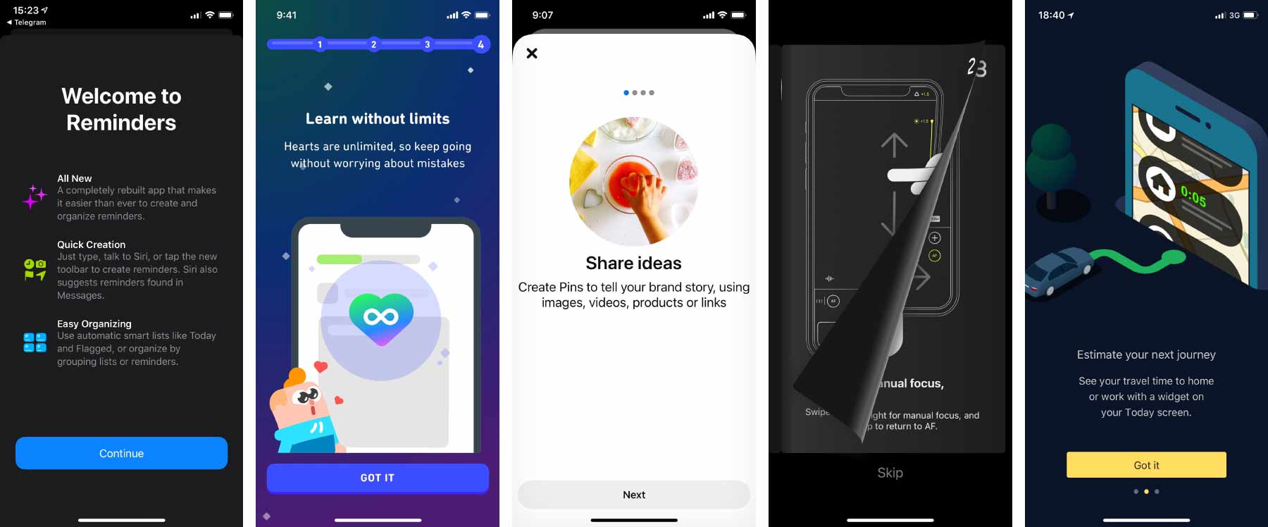
Often when we open an application, we see a screen that tells us about it or about some recently added features. The screen may consist of several pages that you have to flip through one by one. There may be a button to skip it all and go to the main interface of the application. This is commonly referred to as an onboarding screen.
It is bad practice to do so.
The statement may seem ridiculous to you as so many products have onboarding screens. Unfortunately, most of their creators don’t even ask themselves the question “what if we are wrong?” In some occasions I asked them why they do it, and I heard: “well, it’s onboarding”. People don’t even realize that this doesn’t answer my question — the belief that this is the right thing to do is so strong.
Let’s examine what’s wrong with this kind of onboarding, what task it’s designed to accomplish, and how to accomplish that task well.
Summary: The onboarding screen appears at the wrong time, prevents you from using the application, and when you really need the information from it, you can’t find it anymore. This causes frustration and reinforces the habit of skipping messages without reading them. It is better to make tutorial elements an integral part of the interface and allocate a permanent place for information about new features and changes.
Why not introduce the application at first launch
First, consider an onboarding screen that introduces you to the application as a whole.
In the dumbest case, it’s advertising: onboarding pages praise the app and its features. However it is nonsense to advertise an app that the user has just installed and opened: we have already received the desired attention; it is now time to stop seeking it and start converting it into value. The user also has their expectations of the application and wants to start using it. They now have to overcome our annoying obstacle. So advertising should just be removed.
In a slightly less dumb case, onboarding tries to teach you how to use the application: this is how you order a pizza, this is how you make a money transfer. If the user already knows this, it’s again just an annoying obstacle to their goal. If the user doesn’t know this, however, we present them with an uncomfortable choice. They need to read our onboarding screen carefully and memorize it so that they can later apply what they’ve learned to the real interface, which they haven’t even seen yet. But as a user, it’s impossible to estimate how mindful I have to be and how thoroughly I have to memorize. Maybe I will be able to figure it out on my own in the real interface?
Just think how crazy this is. You buy a new washing machine, and they forcibly hand you the owner’s manual and say: “You can throw it away, but if you can’t understand something later, no one will help you”. Uh.. Can one not figure it out without the manual? We don’t know. Well, can’t I just leave the manual in the box and take it later if I need it? No, you can’t: you either have to read it now or throw it away.
It is worth analyzing the main interface carefully. How to make it clear without the initial tutorial? If you can’t do without hints, how can you provide them so that they don’t interfere with the usage of the application? Maybe you need to add explanatory text somewhere. Maybe in the tricky places you need “?” buttons that open the detailed explanation. Or maybe you need your own educational YouTube channel that is easily accessible from the interface.
Why not talk about new features after an update
Now consider an onboarding screen that highlights new features and changes.
The same problems are even more acute here. When somebody opens your application for the very first time, they probably have little expectations. However, when the user is familiar with the application, when they’ve been using for some time already, they launch it with a specific purpose, for example, to check delivery tracking or to pay the household bills. Most likely, they have a “plan”: they remember what corner they are going to tap first, what will appear next, where they are going after that. But suddenly, instead of an interface they expected, they get a presentation of new features they don’t need right now!
In this situation, the urge to skip the onboarding screen is even stronger, and so many users simply won’t learn about your innovations. Again, not because they don’t need them at all, but because they don’t need them at that moment. If your application is being actively developed and updated, the constant talk about changes will be annoying, and the habit of skipping them will become more entrenched each time.
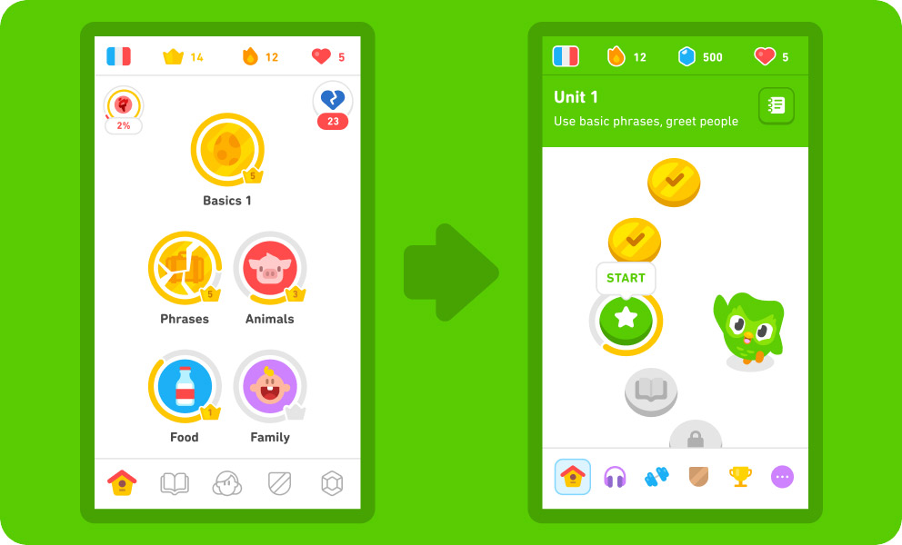
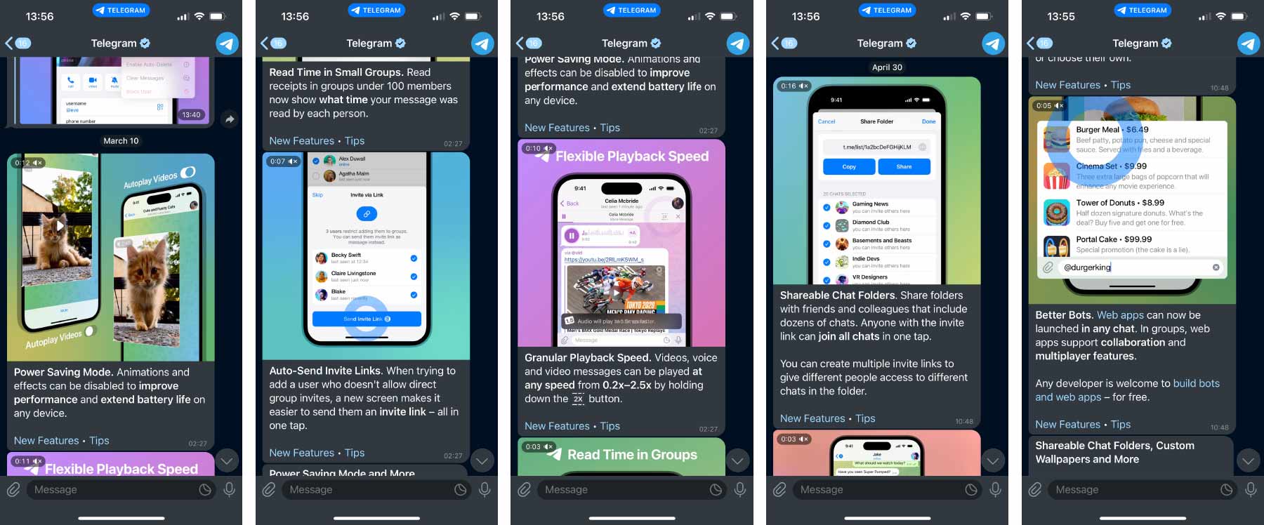
To keep users aware of what’s new, it’s a good idea to provide a permanent place in the application for this purpose. My favorite example is the messenger Telegram:
The designers took advantage of the nature of the application: the information about new features comes as chat messages from a special “Telegram” account. When you open the application, you see these messages on an equal footing with others. You can chat with your friends or respond to important work messages first, then learn about Telegram itself. Each feature is revealed in a separate message with a nice video. The message can be forwarded to someone who, you believe, will benefit from the feature — the advertising effect is amplified for free. And, of course, no one prevents you from returning to these messages at any time later. That’s exactly what I did to take the screenshots.
Even if your product is not a messenger, you can find some permanent place to talk about new stuff. And for people to remember to go there, you can put a red badge when unread items appear. What’s important is that the rest of the application’s features are available even before the user has read everything.
Good user interface and good business
I start my course User Interface Fundamentals with the subject of humaneness: the interface should be for the human, not the other way around. When an interface stands in the way and pisses you off, it’s a bad interface. In the lecture on habit, I talk about the problems with confirmation windows and blocking messages, and onboarding screens are examples of that. They reinforce the habit of reading nothing and agreeing with everything.
Onboarding screens have problems similar to those of confirmation windows, yet both things are very common. The reason is that in product development, the goal is rarely “to make the user happy”. Typically, those in charge of a product look at other metrics. Let’s say the onboarding screen is watched by 10% of users and as a result sales grow by 1%. Who cares then if it disturbs the rest of us? The gain is greater than the loss, so fine.
Reader Egor, who works as an analyst in a large product, once wrote to me:
Do you believe an a/b test would help to settle this debate? Say, we’ll show the onboarding screen to half of new users and skip it for the other half, then look at two metrics: the conversion rate from first session to a completed order and the time from application launch to completed order. If the conversion rate with the onboarding screen is higher while the time to order does not increase (i.e. the time a user spends in onboarding is won back later), would you agree that onboarding screens are justified? And how do you generally feel about validating product hypotheses with a/b tests?
I would agree even without the test. But what this test would prove, at best, is that it is better to tell about the application by onboarding than not at all. And what I’m saying is that there’s a better way than onboarding.
As for validating product hypotheses, it has little to do with a good user interface. Sometimes you can boost the metrics by degrading the interface: by reducing the clarity of options, by nudging the user towards a disadvantageous purchase; by making it harder to unsubscribe. A good interface is only sometimes important to product success, but sometimes it is not. Just look at Facebook or Booking.com. I wouldn’t want to have anything to do with making these very successful products.
In a large product with pragmatic management, adding an onboarding screen may indeed be the most feasible solution. It doesn’t interact with the rest of the application in any way, it doesn’t add any new logical connections, a separate team can even be responsible for it. It is much easier, faster, and cheaper than thinking about how to improve the educational properties of the product itself.
But not all businesses operate on squeezing metrics at all costs. Some have a different set of values, where product quality and user delight matter. Sometimes there’s an opportunity to think carefully about these things, rather than just do what everyone else does.
I find that onboarding is often done because the creators genuinely think it’s a good idea, rather than for the pragmatic reasons mentioned above. They don’t even look at the metrics, don’t compare user annoyance with the gains in conversion rate. They just put up a splash screen because they absolutely want to talk about the new features! In such cases, when I talk about the disadvantages, people are happy to engage in a discussion of alternatives.
Yes, doing things well is usually harder than doing them poorly, but the effect can also be greater.
One more question please
“Ilya, it all makes sense, but there’s a really amazing feature that we’ve been working on for two years. We even made a video about it! We want to put it in the onboarding screen, because it’s important for us that everyone sees it!”
It’s great that you’ve made a feature that you are proud of. I sympathize with your desire to tell everyone. If you put it in the onboarding, you’ll blow the opportunity. How could you communicate about the feature in a way that everyone will love it? Give this question at least a fraction of the care you gave the feature itself.