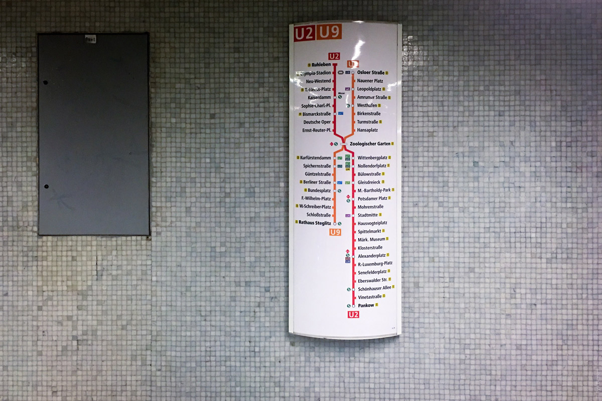
These are words that usually signal problems with the user interface.
Main and secondary
Variants: regular, general, basic, advanced, extended, miscellaneous, more
Examples: main section, basic options, advanced plan, miscellaneous settings
The line between “primary” and “secondary” is not defined. The user is looking for a particular thing and has no idea whether it’s “main” or “advanced”. “More” is usually a graveyard of elements that the designer didn’t find place for.
Useful
Variants: important, notable
Examples: useful hints, important information, notable changes
When you nominate some stuff important, this means all the rest is unimportant. Instead of stating the usefulness, explain the benefit: “How to start snowboarding”.
Article
Variants: post, entry, publication
Examples: add entry, next post
These, again, name the type of the content. The words can be useful among the editorial staff, but meaningless for the reader: there are no newspapers with an “articles” section.
Catalogue
Variants: list, archive
Examples: shoes catalogue, news archive
There’s no need to signal that a list is following. Just put the list with an informative heading: “Shoes”, “News”.
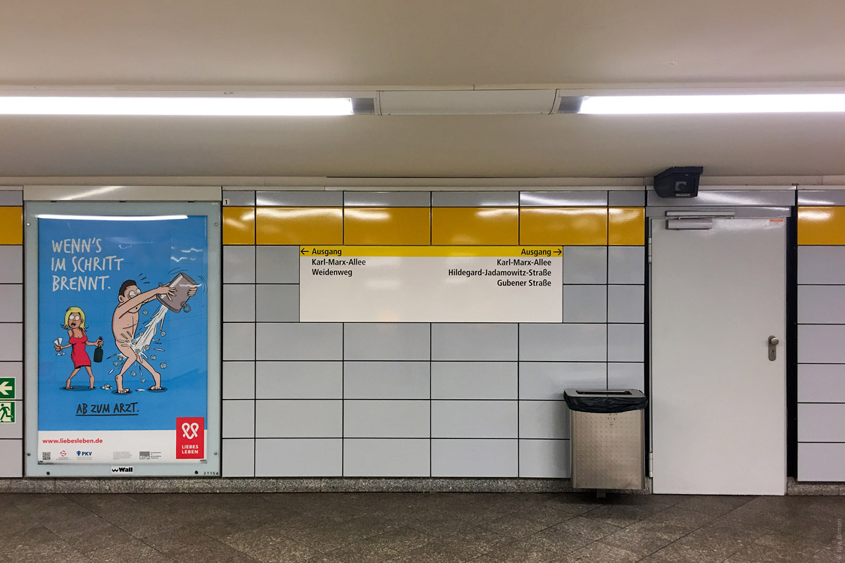
Click here
Variants: enter, select, go, follow, open, launch
Examples: click here to open, enter password, select country, follow the link
There is no need to explain how to use buttons, links, input fields and other standard user interface elements. Links should just name the places they lead to: “iPhone 7 review”. Form fields should just name the content: “Password”, “Country”.
Form
Examples: application form, inquiry form
A form is a table of fields to fill. The word “form” just names a type of screen, but the user already sees that it’s a form. Name it with the benefit in mind: “Job application: designer”.
Required
Variants: necessary, must, please
Examples: required field, you must agree, please specify the phone number
The user doesn’t care if a field is required. If the form doesn’t work without it, they will put in some garbage. Instead of demanding or begging, explain the benefit: “We will call to coordinate delivery time”.
Operation
Variants: process, transaction, request, step, state, module, function, data
Examples: process is not responding, bad request, step 5 of 12, module not installed, wrong data format
These words are handy to describe how something works technically. But there is no point in using them in the user interface: they just complicate the matters for the user. Write as a human being: “Spell check available in paid version”, “Due to an error, the app needs to re-open”.
Authorisation
Variants: authentication, authentification, identification, session, limit
Examples: please authorise, session timeout
Even programmers mix up the autho-whatever-s constantly. Use the verbs “to enter” or “to sign in”, or, even better, name the thing that’s inside: “Shopping history”.
Success
Example: operation completed successfully
If operation hasn’t completed successfully, it hasn’t completed, period. Write what’s been done: “Money sent”, “Update installed”.
If you know why a particular word from this list is not good, but in your case it makes perfect sense, leave it.