I mean it when I say these companies are the complete opposite: Apple sells products it makes; Amazon sells products made by anyone and everyone. Apple brags about focus; Amazon calls itself “The Everything Store”. Apple is a product company that struggles at services; Amazon is a services company that struggles at product. Apple has the highest margins and profits in the world; Amazon brags that other’s margin is their opportunity, and until recently, barely registered any profits at all. And, underlying all of this, Apple is an extreme example of a functional organization, and Amazon an extreme example of a divisional one.
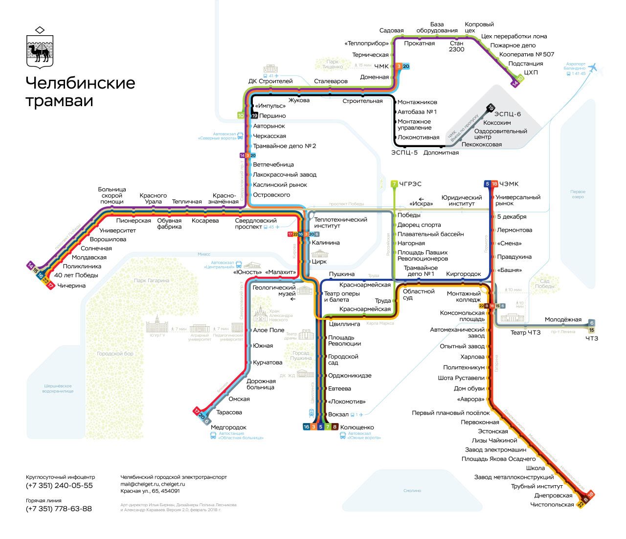
Over ten years ago I made the diagram of Chelyabinsk trams and trolleybuses. That design turned out to be very successful: dozens of designers used it as a reference for building their own diagrams. It wouldn’t be as good if not for Artem Gorbunov’s generous help.
Three years ago, together with Alexander Karavaev we made a new version of the diagram. It had a lot of design inventions: the “pencil-drawn” layer for buses and trolleybuses, the “watercolour” rivers and lakes, 3D terminals, the new shape of the stops’ ticks. With that diagram, a logo for chelyabinsk trams was born: the city’s coat of arms decorated with a pantograph.
Then Polina Lesnikova joined the team. She re-drew the map to account for the changes in routes. Together with Alexander, they changed a lot of details after testing the legibility of the previous version. Thus we arrived at the new diagram:
Some landmarks were added. The bus-and-trolleybuses layer gave the previous version some visual richness, and it was interesting to scrutinise. Unfortunately, it didn’t provide any notable utility, so we decided to remove it. This helped to simplify the geometry of lines and make the fonts bigger. The new diagram looks stronger.
Designed by Polina Lesnikova and Alexander Karavaev, art-directed by myself.
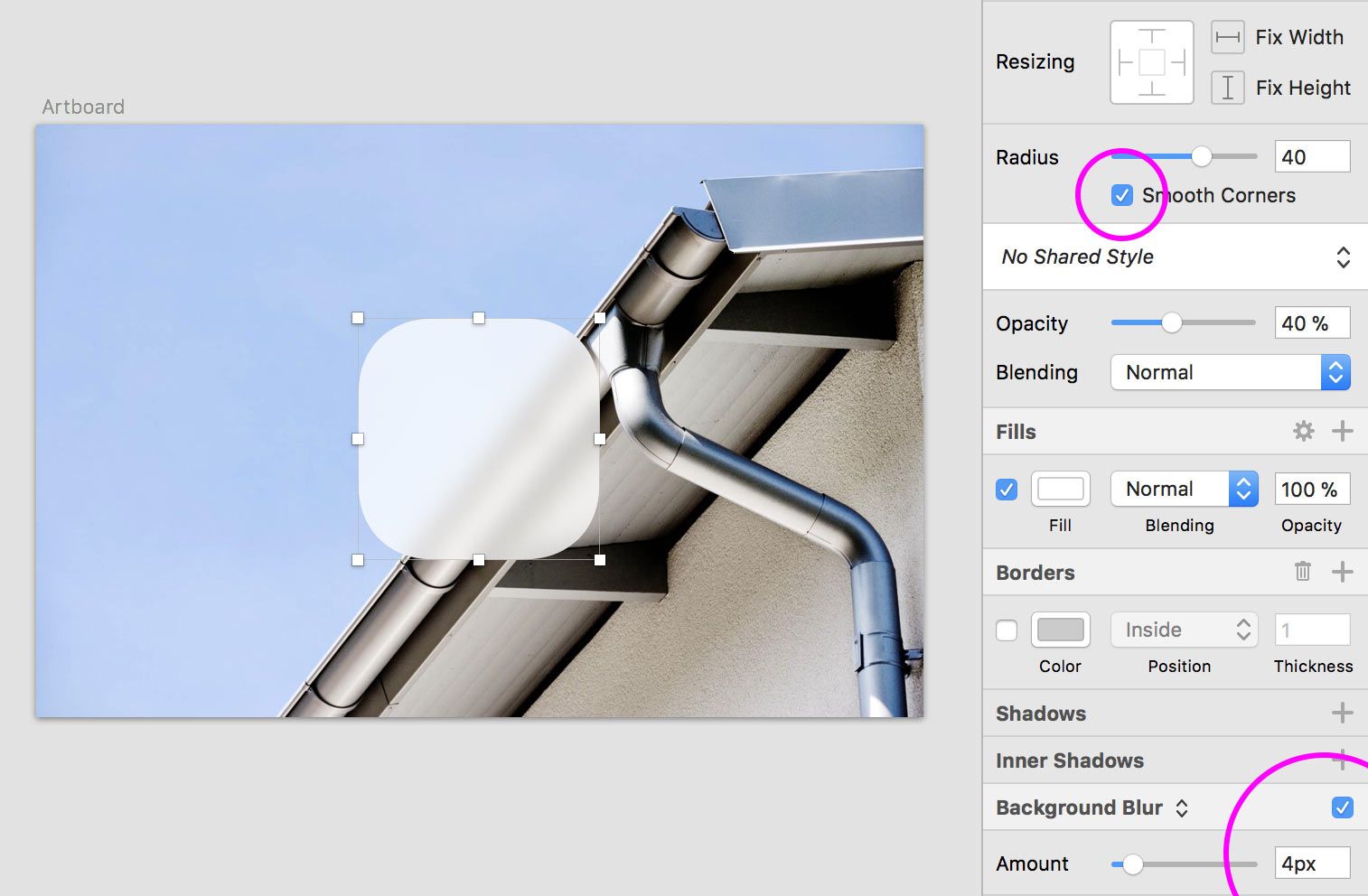
In Sketch, you can easily make smooth round corners instead of radial ones. Or you can easily set a background blur on some surface:
Illustration by Konstantin Dubrovsky
It’s natural to use and love Sketch. The progress should go on, routine tasks should be done instantly. But a designer who is seriously saying that Photoshop is now irrelevant, is second-class.
These features are in Sketch, because some designers had invented them with Photoshop some day.
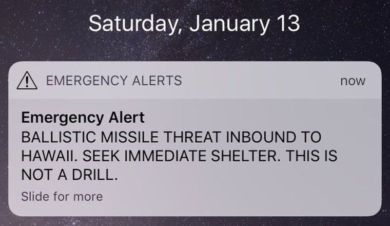
A couple of weeks ago Hawaii residents got a shocking alert on their phones:
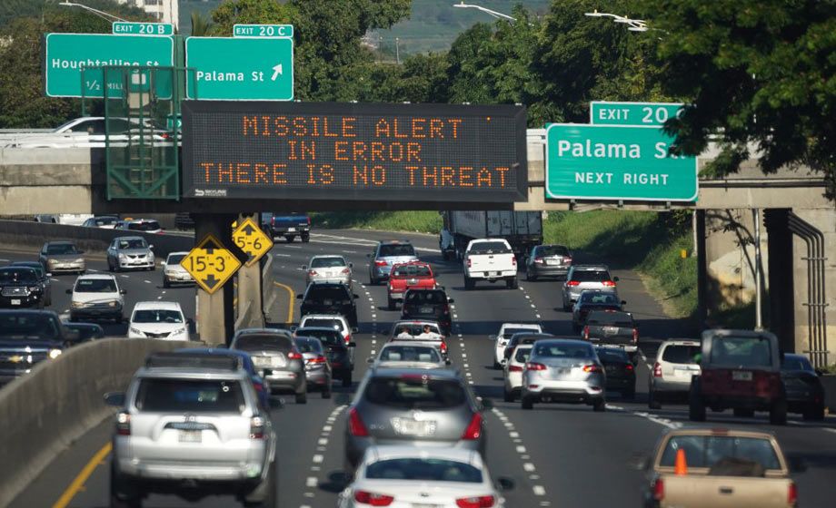
It turned out to be false.
A state employee accidentally sent the message while testing the alert system.
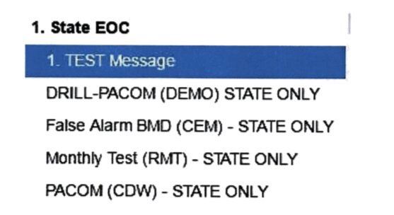
It’s natural to blame the employee for impermissible negligence. But here is the user interface that they were using:
Instead of selecting “DRILL-PACOM BLAH BLAH”, they chose “PACOM BLAH BLAH”.
Firing the employee will not help avoid this mistake in the future, another employee is as likely to err.
The user interface is the problem.
Some commenters suggested adding a confirmation dialog. But confirmation dialogs are only good at one thing: forming the habit of pressing “Yes”. Testing the alert system is a daily routine, so after a couple of days the effectiveness of a dialog will be zero. Even if we require confirmation only for the real alert, but not for the test and drill alerts, the error is still quite likely: people see confirmation dialogs too often and are trained to ignore them. Also, sending even a drill message by mistake is probably not desirable.
Here is how to really fix the interface.
Selecting the right option
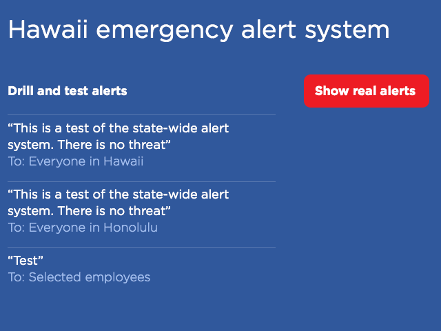
In the current interface, the two options that the employee has mixed up, look almost the same: just a line of meaningless all-caps text. Instead, the drill options should be clearly separated from those that send real alerts. The text should be edited for absolute clarity. All abbreviations, parentheses and repeated words (“state only”) should be removed.
Ideally, what should remain is the actual text that will be sent, and to whom it will be sent:
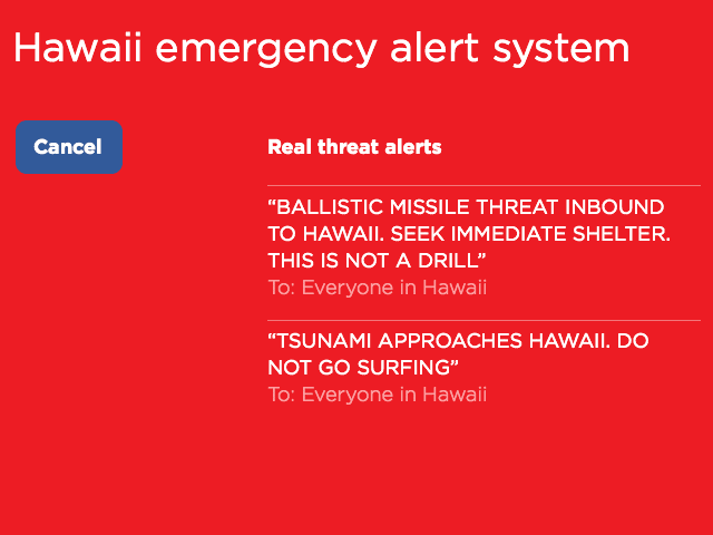
If the employee wants to send a real alert, they have to explicitly choose that. Then everything should look really serious:
Undoing the wrong action
But most importantly, undo should be implemented.
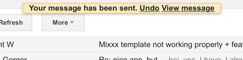
How can you undo sending of a state-wide alert? Easy, the same way you undo sending an email in GMail:
For a short period of time, the mail is not really sent, giving the user the chance to correct the accidental mistake.
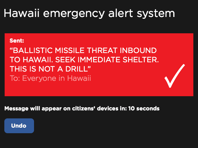
After the employee selects to send an alert, the next screen should say what has happened in a way that makes the employee’s job look completed, but still leaves the option to prevent the actual alert:
Notice how there is no confirmation button: there is nothing to confirm, the command has been accepted without confirmation. And since there is no way to close this screen before the timeout is over, the habit is not being formed to do it.
***
The problem with the modern world is that there is this stupid separation of “UI” and “UX” design, in which the important stuff gets lost. Good user interface design used to be about understanding how humans operate and helping them do their job better. And now, it’s undefined.
“UI” designers are now supposed to be thinking about beautiful buttons, fonts, and animations. This is too narrow. It’s hard to justify this work if you are designing software for use by a few government employees. “UX” designers are now supposed to be thinking about the user experience, whatever that is. This is too abstract. Caring about how “satisfied” or “engaged” the user is, again, not something a government could afford to think about. The “UI/UX” separation is bullshit. Between “UI” and “UX”, someone has to do the actual work.
Has it ever happened to you that Apple’s Notes just stopped syncing reliably via iCloud?
For me it happens like this: the Mac stops uploading local changes to some notes to iCloud, so I don’t see them on my phone. I know that the problem is really in uploading from the Mac because the web version of iCloud continues to sync normally with my iPhone. Also, the new notes that I create on the phone, appear on my Mac.
You may have found several fix suggestions online, most futile. Signing off iCloud and then signing back on helps, but this way you lose all the local changes that haven’t been uploaded to iCloud.
What I’ve found to be a working and safe solution is to select the “All iCloud” folder in Notes, then sort notes by date changed, then move all the notes that hadn’t been uploaded to iCloud to the “On My Mac” account (you must enable it in Preferences) and then move them back to the iCloud account.