Hey, this is my first sponsored post in this blog. My friend Yaakov Karda asked me to tell you all about Chatra, the chat widget.
This is an ad. Text provided by client
A chat widget is one of the most convenient channels for customers to contact the company. However, many live chat widgets are still intrusive, buggy, robotic (in a bad sense) and ineffective. They are wasting people’s time ruining user experience and are just nasty.
Chatra is a different story. It has a nice and ergonomic UI, affordable pricing, it is user-friendly and helps to treat your visitors with love and care, so that they feel connected to your brand and will come back to your website next time. It can be a perfect alternative to Drift or even Intercom.
Have you ever been looking for professional support services that turned out to be inefficient and untimely? I am sure every company could do better using a better chat product.
Chatra is an effective tool to provide support, collect feedback and and avoid unwanted delays when closing a sale. It’s useful for customers big and small, ranging from freelancers and consultants and to online stores, software companies and startup that understand the value of personally connecting with their customers.
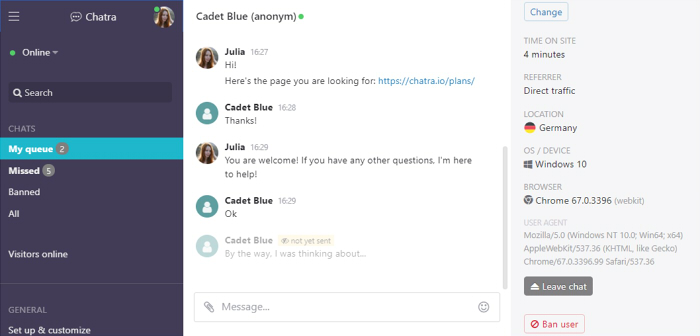
You can chat with visitors in real time (and our apps for Android and iOS help you be in touch with the visitors even out of the office), or use the offline messenger mode to collect messages and leads 24/7 and reply at your own pace.
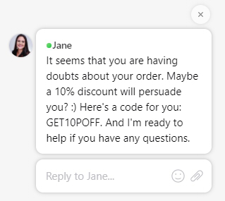
In a messenger mode, Chatra greets visitors with avatars of your team, and our lead qualification bot not only sets proper expectations on when the visitor should expect an answer, but can also collect any required information from them in a much more effective and user friendly way than an old-fashioned contact form.
We integrate with the majority of CMS platforms, and the widget can be added to your website in just a few clicks.
Chatra stores all the visitor information and conversation history forever both for you and your visitors, so when a visitor comes back to your page, they can see previous messages and continue the conversation.
If you have several websites, you can connect them to the same account and handle all chats from a single dashboard, with no extra fee. The visitor information feature will show you which website the visitor is on, and the Groups feature allows you to assign chats from different pages to different agents if necessary.
Chatra allows you to monitor the real-time visitors on your website and initiate a conversation manually, so you won’t miss any potential leads.
You can also initiate a conversation automatically and offer your assistance on difficult pages using the automatic triggers. Triggers can be connected to various conditions (time spent on a current page or website, number of visits or pages viewed, etc.) and can work even when you are offline.
Some users are afraid of being too “intrusive” and don’t use these two features to proactively contact their visitors, and that leads to them missing a lot of potential customers who leave their website without placing an order. But the automatic triggers and visitors online list can become your greatest allies if you use them correctly. Don’t jump at visitors right away and let them look around first, personalize the texts to show the visitors that there’s a real human ready to help, and experiment with the conditions to make sure you contact customers at the right time.
Another cool feature in Chatra is the typing insights, which allows you to see everything the visitors are typing even before they send the message, so you can prepare a reply beforehand.
We also have powerful API with clear documentation, with some of its features available even on the free plan. You can use simple settings like changing the chat window size, button colors or embedding the chat window into a block on the page, or you can use more complicated things like passing custom information into the visitor information panel or integrating Chatra with third-party tools via webhooks and REST API.
So, if you have an online presence, be it a blog or professional website, get Chatra! I’m sure you are going to like it.
Get Chatra