The website of my blogging engine, Aegea, has been updated with the Features page, where all features are listed. It’s a long list, check it out:
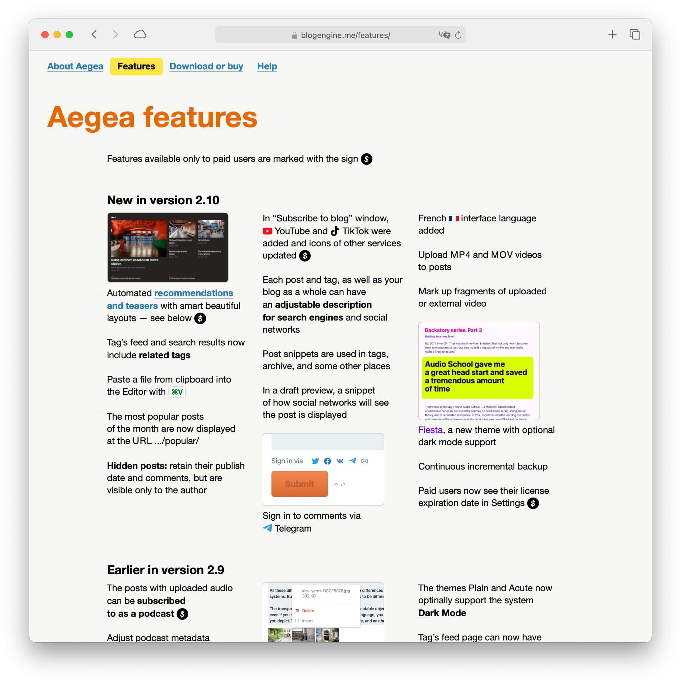
Try Aegea, it’s amazing.
The website of my blogging engine, Aegea, has been updated with the Features page, where all features are listed. It’s a long list, check it out:
Try Aegea, it’s amazing.
Notifications often appear at the wrong time: while I am trying to finish a sentence or to listen to my colleague on a call. However, in many cases there is no reason to be notified at a certain time to the exact second. The reminder to take a pill this morning popped up while I was running! Clearly, I’m not going to take it while I’m running, so why not hold the reminder until I finish?
In real life, there is a way to notify without interrupting: by raising your hand. The interface actually has different degrees of “intrusiveness” of notifications as well: red badges, temporary banners, modal windows, sounds. But in real life, if I’ve raised my hand and I don’t get noticed, I can raise it higher after a while, then wave it, or even stand up. If nothing helps, I can say “Excuse me!”
Notifications in the interface lack this kind of progressive persistence. Given the urgency of the message itself and how busy I am, the interface can either tell me everything right away, or start with a little neat dot in the status bar (“raised the hand”), then animate that dot (“waved the hand”) and only if I am not paying attention for very long, bring up a full interface.
Sometimes you may need to make a text in quotes into a link:
Many designers notice that underlined quote marks look bad, so they exclude them from the link:
However, meaning-wise and in terms of Fitts’s law, the quote marks should be included in the link: they are related in meaning to the text inside them, not outside them, and it’s easier to click a larger link.
So the best way to make a text in quotes into a link is to make the whole thing a link while underlining only the text:
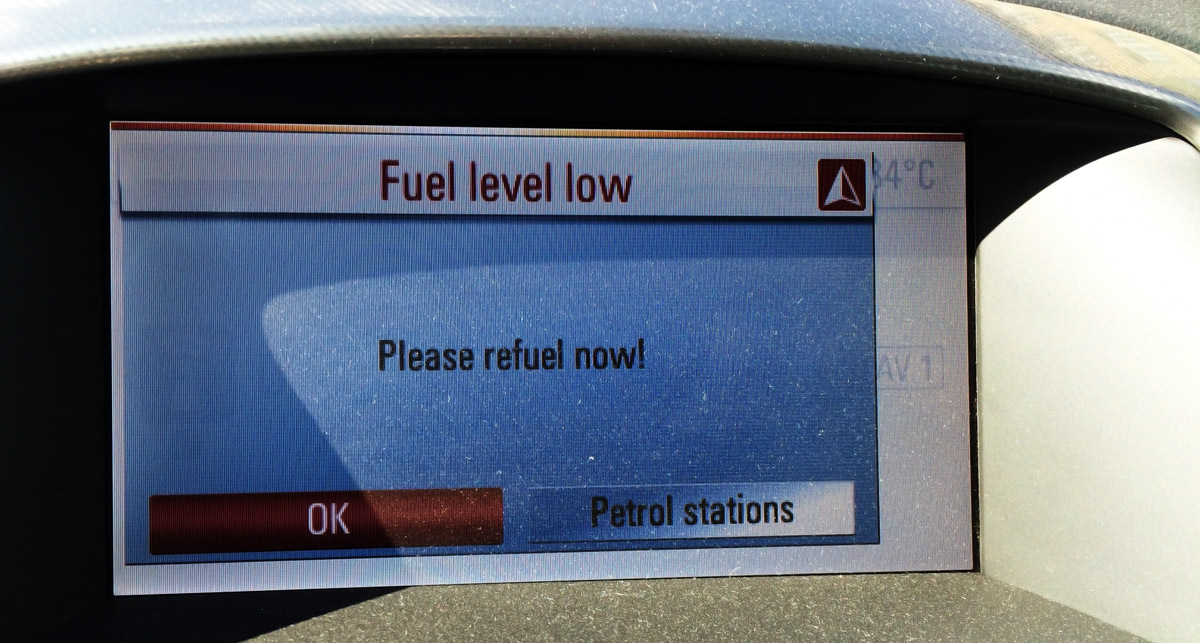
When running out of fuel, not only does my car light an LED, but also offers to show the nearest petrol stations using the built-in navigation.
Any error or problem message in an interface should not just state it indifferently, but also help you find a solution.
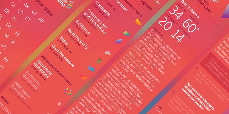
I designed the new user interface for the BarPrepHero app. Now it stands out among apps for lawyers:
Apple did a great job: they invented Face ID, which reliably protects the phone and still works seamlessly. But the scientists at the Wuhan lab did an even better job: they invented a coronavirus that forced the mankind to wear face masks.
As a result, shopping for groceries with a list in your phone became a torture. You have to enter the damn password every time.
I want a feature: disable iPhone protection for fifteen minutes, during which I can take it out of my pocket and unlock with just a Slide to Unlock, as with the original iPhone.
I guess I can disable all the protection in Settings, but that’s way too much work, and turning the protection back on is even worse; nobody would do it. With my idea you can’t forget anything, the phone returns itself back to protected mode automatically. It could display a red “unprotected” icon in the status bar. Tap on it, and the protected mode returns immediately.
Imagine yourself preparing for difficult negotiations not knowing how you’ll express or defend your position. You already have a hundred scenarios in your head, ninety of which are horrible. What if they perceive my proposal as impudence and turn me away without giving me a chance to discuss the options? What if they get offended by my offer and our relationship goes sour? What if they don’t expect this and expect that? What if... Your brain explodes from trying to think out a “plan” in different cases, and at some point you don’t even know where to start the conversation.
In this case, I have a simple recipe: start with the words “Here is how I want it”.
You don’t know the outcome of the negotiations and you don’t know what the other side has in mind. You can’t make the other side do anything. But you know what you want, and you can say it clearly. It’s okay to want something. The key is to speak in a way that doesn’t make the other party feel pressured or manipulated. You’re just sharing a wish, as if you were sharing an observation about the weather.
Someone struggles to come up with a justification for a salary increase and makes a list of their merits. But sometimes you can just write, “I want to double the salary starting with the next project” and get a “Deal”. Some people spend months wooing or using pick-up tricks to someone they have a crush on. But sometimes you can just write, “I want to go to bed with you”, and get an “I’m in”.
Let’s jump right in to the examples. In an online store, you need to select which bank card to use. You’ve been a client for many years, so a whole bunch of cards are already saved. You need to pick the one that you want to use right now:
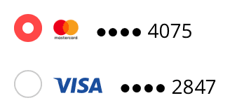
It would be great if the store reminded you, which card you used to make the recent purchase. Even better, specify last purchase date next to each one.
When you make mistake entering a Google password, it reminds you when you set it:
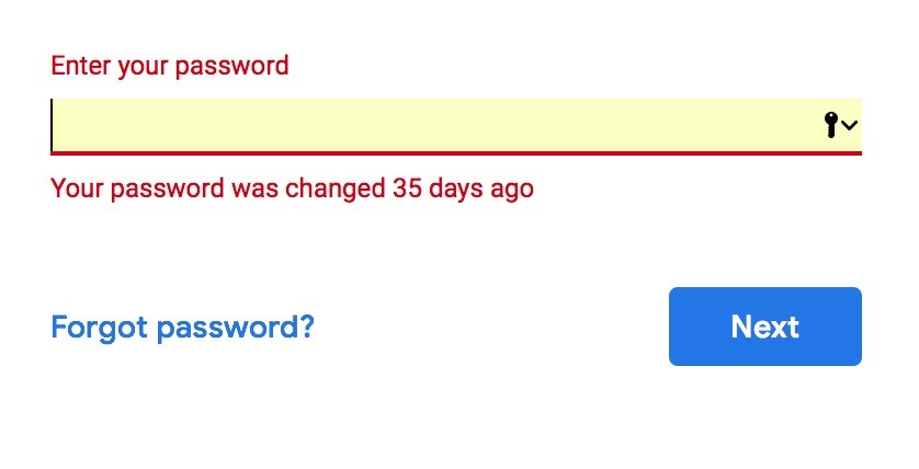
It will only say this if you are entering your old password. If you enter a wrong password that has never been right, it will just say it’s wrong. These “35 days” could be useful, e. g. if they remind you of the circumstances, in which you changed the password, you could remember the password itself.
More examples:
Here’s a short fragment of my UI course in Intercom (Dublin). Talking about paging and scrolling, I show how my book “User Interface” works:
Sorry for the quality, the recording was originally made for Intercom’s internal use.
A text selection not only has a beginning and an end, but also an anchor. It is whether I started selecting from the beginning or from the end. It’s not displayed anywhere, but the operating system sets it and accounts for it.
If you select a text from left to right, the selection will be anchored on the left. When you use Shift+arrows, the end of the selection will be adjusted, while the beginning will stay intact. Conversely, if you select a text from right to left, the selection will be anchored on the right and Shift+arrows will adjust the beginning of the selection. This works even if the initial selection is made with a mouse, try it yourself.
In older Mac OS versions this was not implemented well in lists. In Finder, for example, when you clicked a file and then Shift-clicked another one that was above in the list, Shift+arrows would still adjust the bottom end of the selected range, not the top one. That was irritating. At some point Apple fixed it and Finder selections began to work correctly. In text selection, it worked right all the time that I remember.
But even in text, there is still a bug in Mac OS: when Undo restores a selection, it will reset its anchor to left.
At least in Mojave. Select some text from right to left, then try adjusting it with Shift-arrows—everything will work fine, the beginning of the selection will be changed. Then delete the text and put it back with ⌘Z. Now, Shift-arrows will adjust the end of the selection. Why, Apple?
It’s commonplace to praise Apple for their attention to detail. But there is actually a lot of such user interface sloppiness on their part, and always have been. In never occurred to me that there was such thing as a selection anchor when I used Windows, because in Windows, it always worked flawlessly.