Check out the Superpedestrian fleet management interface:
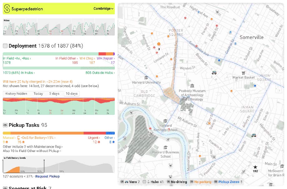
I like designing interfaces of this kind where you need to figure out an obscure process.
Check out the Superpedestrian fleet management interface:
I like designing interfaces of this kind where you need to figure out an obscure process.
Check out the new Samara metro map:
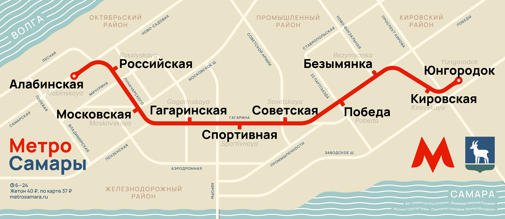
Designed by Nikolay Romanov, directed by myself. Special thanks to Sergey Chikin and Leonid Motovskih.
New email apps keep coming out, trying to organize your inbox. Folders in email were invented nearly fifty years ago, and since then we’ve had filters, rules, and now AI — all aiming to automate sorting.
Some apps don’t even call them “folders” anymore, but “categories” or something else that only adds to the confusion. Every new app tries to outsmart the others at sorting: “inbox”, “important”, “newsletters”, “social”, “purchases”.
Even Apple Mail recently jumped in with its own version: “primary”, “promotions”, and so on. Surely, I have no idea how it decides where things go. To avoid missing an email, I have to check all the categories, so the workload goes up, not down. “Didn’t get our message? Check your spam, secondary, non-urgent, and low-priority folders!” I turned that off immediately, of course.
For some reason, email designers don’t get that folders only work when you create them yourself and sort things manually. If the system exists in your head and you stick to it, you can trust it. But someone else’s system makes you second-guess everything.
Instead of sorting emails into folders, computers should be mining the actual information from them.
Yes, finding booking references and boarding pass QR codes in your inbox is a pain. But even finding them inside an email you’ve already opened is a pain! I don’t want just a folder with those emails — ideally, I’d see the info without even opening a message. If I do need more context, let there be a shortcut to the original message. And I don’t care what folder it’s in.
If an email invites me to a conference and asks me to respond by the 25th, I want that deadline clearly flagged next to the message. And show me, in my inbox, the three emails I should respond to today — based on what they say. Leave folders for people who actually like manual sorting.
The Mac’s built-in noise cancellation suppresses keyboard clicks. It makes perfect sense, but there’s an annoying side effect. When you’re taking notes during a client call, it looks like you’re just reacting slowly or constantly zoning out. It’s hard to convince anyone you’re actually typing because they can’t hear a thing!
On the left is how Apple Watch displays a swim workout, on the right is how it could:
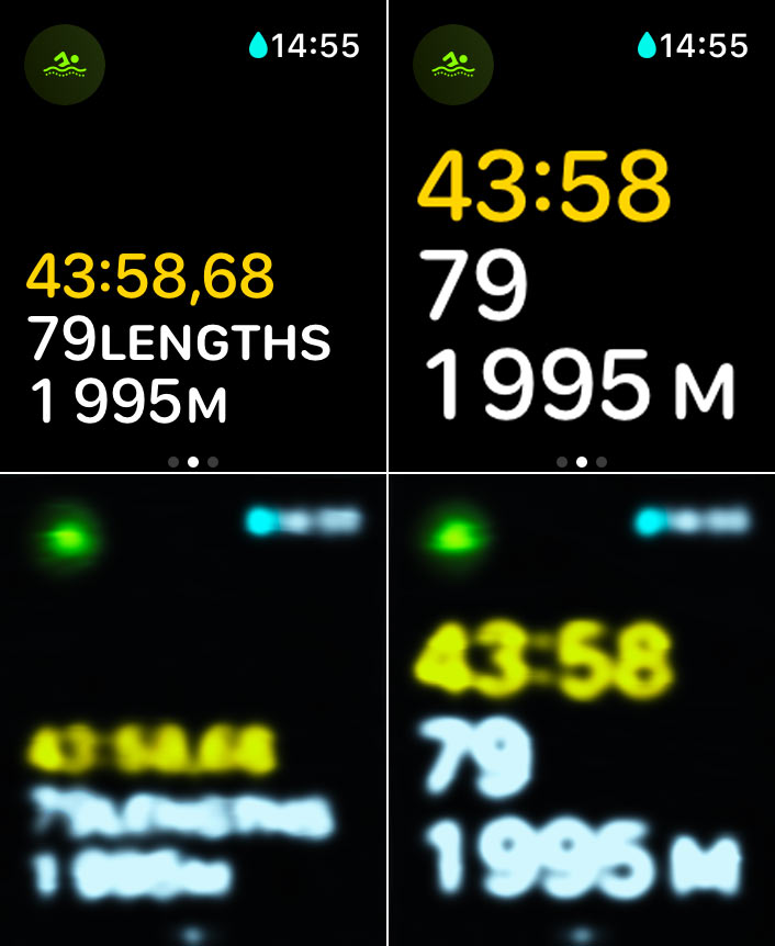
And below is what you can see in both cases, if your goggles are fogged up (Photoshop simulation).
Apple’s design is silly: what’s the point of using small type when you can use large type? But it’s especially silly that even if you enable enlarged fonts in the accessibility settings, it doesn’t apply to the workout screens anyway.
Check out a new large project: wayfinding for suppliers of Wildberries, the largest Russian online retailer.
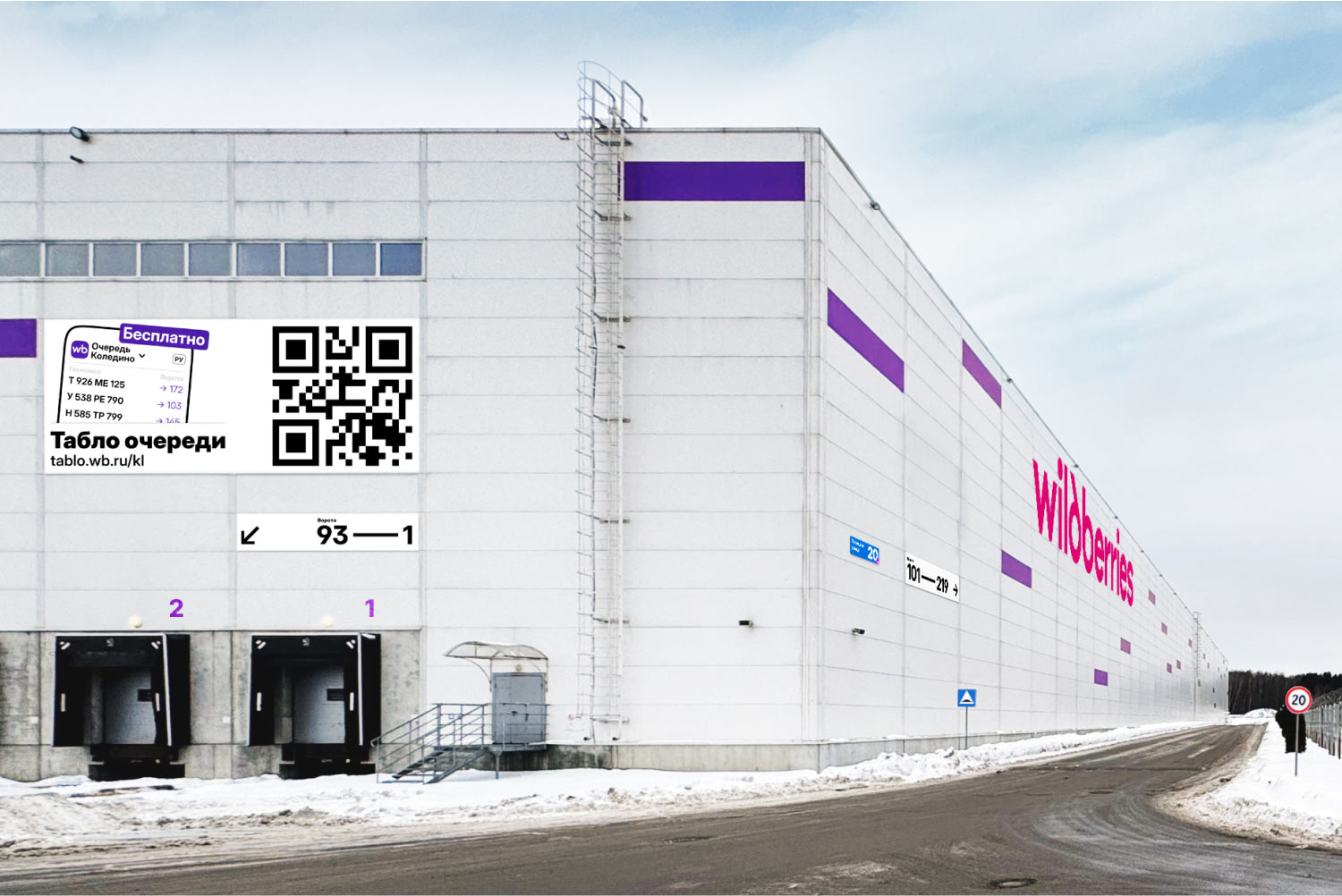
Wayfinding is not about drawing signs, but about streamlining the whole scenario of how people find something, and even how they understand what they need to look for. The project included signage, maps, printed instructions, a mobile website, an LED board, and a banner. And that’s all systematized for multiple warehouses.
Here’s a video of my February talk at the Transit Mapping Symposium in Abu Dhabi:
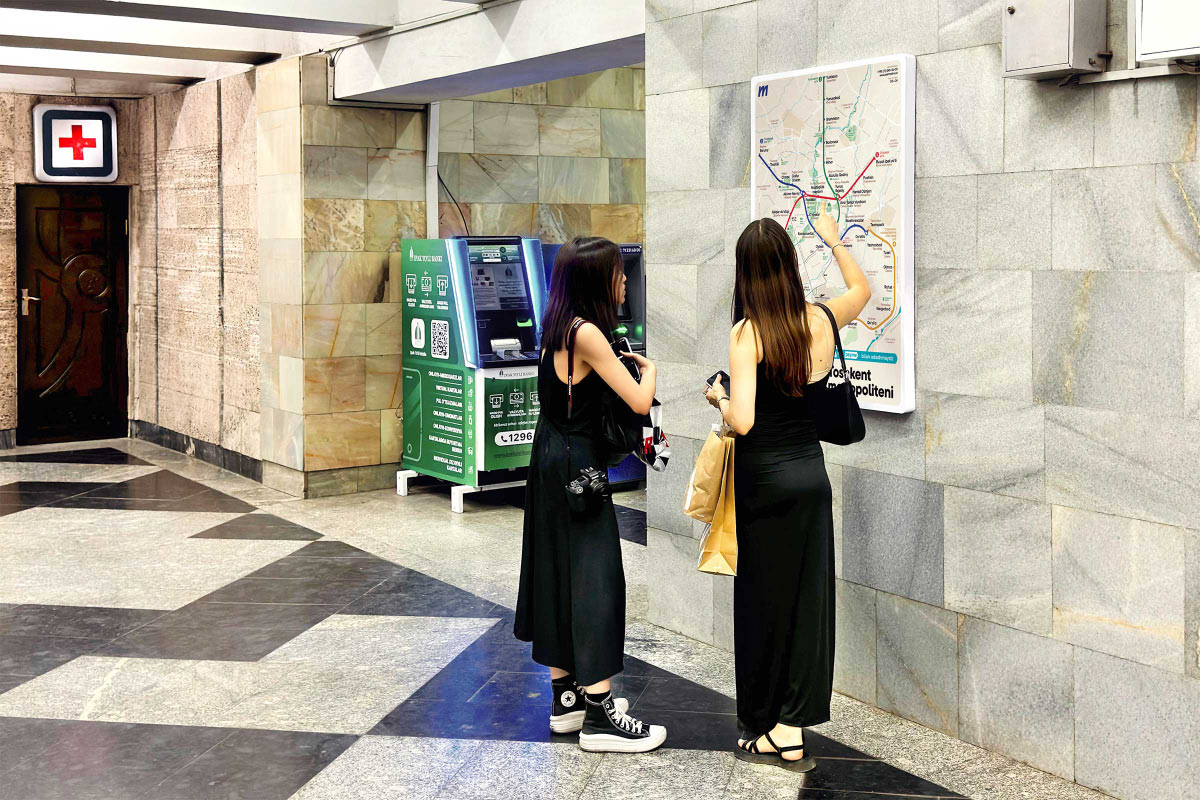
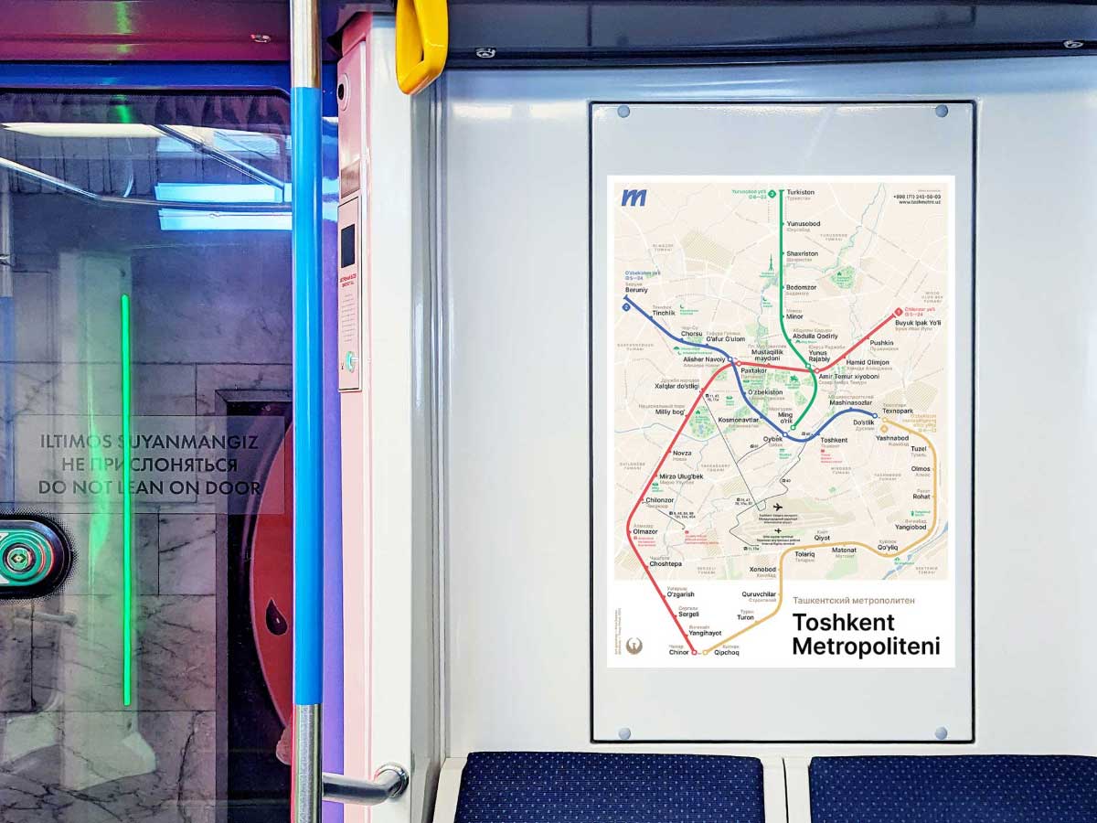
A new version of our Tashkent metro map is now an official map.
Check out our new Metro map for Tashkent, Uzbekistan: