Blog

Later Ctrl + ↑

Delete at least the empty things without confirmation

In The Humane Interface, Raskin explains that confirmations do not help prevent destructive actions, as people quickly form a habit of responding “Yes” to every “Are you sure?”. To protect the user’s data from their own mistakes, it is much more effective to implement the undo feature ubiquitously.

But if you are too lazy for that, at least check if the thing I am deleting is valuable. Adobe Lightroom is at least this smart: when you ask it to delete an empty folder, it does so stat. Apple’s Reminders, on the other hand, is very dumb: when you try to delete an empty list, it still wants to make sure you are sure.

How I bought into the iOS 7 icons’ large circles

Many designers seem to not like the size of the circles in iOS 7 icons constructed with the help of “Jonny Ive’s grid”. Here is a fragment from Neven Mrgan’s blog:

The large circle is too big. Many apps in iOS 7 use it: all the Store apps, Safari, Messages, Photos… In all these icons, the big shape in the center is simply too big. Every icon designer I’ve asked would instead draw something like the icon on the right. To our eyes—and we get paid to have good ones, we’re told—this is more correct.

At first, I also liked the smaller “iOS 6 style” circle better, it looked more balanced to me. But I also kept thinking that there was something good about the new icon. Somehow the fact that there were almost no margins around the circle makes it look lighter. Why?

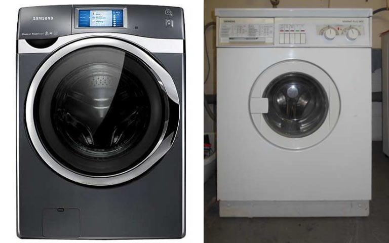
A couple of days ago I accidentally saw a state-of-the-art washing machine (by pure accident it turned out to be Samsung). My own washing machine is about 20 years old, but it still works fine, so I never bothered to look at the new ones. On the left, the washing machine I saw, or the right, my own one:

Notice something? After having seen the one on the left, I can no longer tolerate the old iOS 6 icons. Those gigantic margins make them look heavy and outdated (like the washing machine on the right). The old TV sets’ curvy screens also had very large areas around them, it was technically necessary. The old houses had very small windows, or it would be next to impossible to heat them. But today people build houses where the whole wall is a window. Televisions try to have as thin frames as possible. And washing machines have large transparent doors.

The new App Store icons should be spacious. There is no need to balance the inner and outer parts of the circle: the outer part has no reason to exist at all. At the same time, the bigger the App Store sign is within the icon, the easier it is to see it. Which is a win.

What we perceive as beautiful is largely defined by the technological progress.

The principle of one link

Web services send notification emails. The links in such emails serve a sole purpose of bringing users back to the services’ websites. Therefore, there should always be exactly one link per such email. The flow: the receiver clicks the blue underlined text without even reading anything and ends up in the right place.

Example: an email to confirm registration by following a special link

Typical mistake (the links in the example don’t work, obviously):

Dear Ilya,

You have tried to sign up for the Exciting Service. To confirm your registration please follow the link. Make sure to subscribe to our blog to get the latest news and go try our great iPhone app!

Sincerely,
Exciting Service’s team

To take an action, I need to read and understand all the crap that the author has written here.

Here is the right way:

Ilya, confirm your registration:
Confirm and start using Exciting Service

Exciting Service

The right place to tell the user about the blog and the iPhone app is the website itself. You will have more room to talk about them, and the user will be much more motivated to check them out after he or she has completed the registration.

Example: an email to notify you about a shipped online order

Typical mistake:

Greeting from AwesomeBooks, dear customer Ilya!

You have ordered the book “How to Order Books Online” by James Writer (see your order history). The books has been shipped, and the tracking code is WTF4382430324.

Learn more about shipping and delivery, warranty and return policy. If you have any further questions, contact the support.

There are 0 items in your cart. Since you have bought the book “How to Order Books Online”, you might also be interested in “Underlining links: an essential design skill”, “What makes an email notification bad” and “What should one do if he cannot come up with a third stupid book name”.

Thank you very much!

Your AwesomeBooks

Notice how the only thing that interests me, the tracking code, is not a link.

Here is the right way:

Ilya, the book “How to Order Books Online” has shipped to you.
Track the delivery and see more recommendations

AwesomeBooks

The links leads to a page with tracking information, recommendations and all the service links.

It may seem hard to leave just one link in an email. What if you need both this and that? The solution is to change the approach: treat the whole email as a link. There is only one by definition. Ask yourself: “Where does this email lead?”, and it will all make sense.

Obviously, the principle is not applicable to email designed for reading and thus does not lead anywhere.

Grandpa’s London Underground map

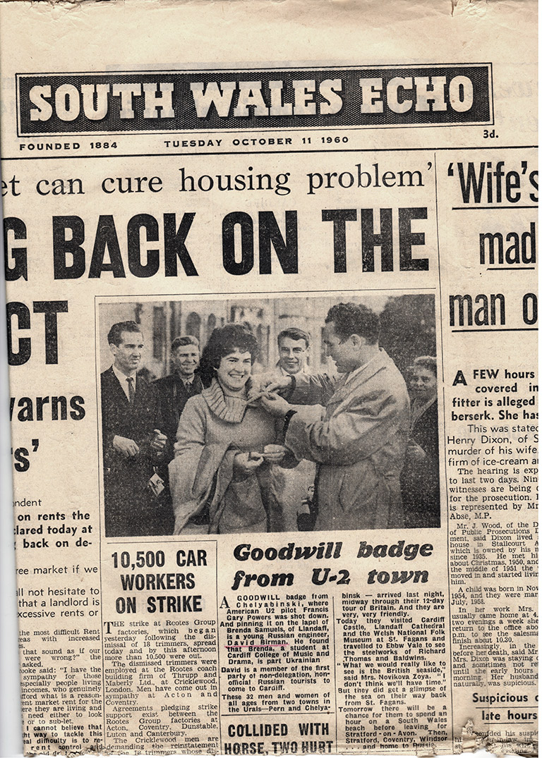
In the year 1960, my grandpa went to Great Britain as a member of one of the first tourist groups from the USSR. It was quite a trip for a soviet engineer. When he was still alive, he recounted the trip and even showed me this Welsh newspaper with his picture and a mention of him:

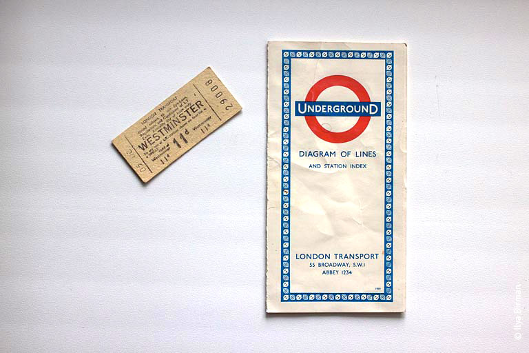
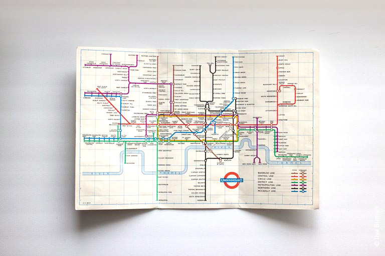
But there is something he did not show me, and I did not ask. Among his papers was found an actual map of the London Underground (and a ticket):

It is amazing that he brought and saved it. There is even a name of Harry Beck in the left bottom corner:

If he went to London a year later, I would not be so lucky, as in 1961 the brilliant Beck’s diagram was replaced by the miserable Hatchinson’s one. In 1964 the design for improved but the diagram never looked quite that good.

The hope for a beautiful iPhone

When I first saw the leaked pictures of iPhone 4, I thought, no way, this cannot be true, it is ugly as hell. Why do all these sites even publish the pictures? Clearly, they are fake.

Turned out, I was wrong: the pictures were real. Interestingly, when Apple announced it, Steve Jobs even had to vindicate the design explaining how the lines on the edges were actually part of an antenna, and so it was a brilliant design. I was disappointed.

Turned out, I was wrong to be disappointed: when I saw the phone in an Apple store, it made a good impression. It looked much, much better in person than in any photos, including Apple’s own official ones.

A couple of years later Apple has shown iPhone 5. To me it looked even uglier than the iPhone 4 on the pictures. But having learned my lesson I decided to not make any conclusions before I saw the device in person. I thought that it will look much better in real life.

Turned out, I was wrong, again: the iPhone 5 is ugly, even in person. I’m still using my old, slow iPhone 4 and I don’t want to switch.

Here is the iPhone 5:

The top is a pain to look at. The camera is positioned randomly in a stripe of plastic:

It wants more air around it, it doesn’t want to be squeezed there like this.

Also look how it’s misaligned relatively to the corner:

And the way this stupid piece of plastic is touching the antenna band gaps on the sides?

So sloppy.

Compare with the design of the iPhone 4:

Everything is balanced, everything is where it should be.

I was hoping that they would change the design for the next iPhone so I could finally have something to replace my old iPhone 4 with. But going by the latest rumors, the design will stay the same, so I am sad. By the way, the rumored “cheap” version (aka iPhone 5C) looks better:

Anyway after you’ve seen and held in hand the iPod touch (no-camera version) everything looks and feels wrong. I wonder, how many years should pass for us to see an iPhone that is well designed?

Wait, you mean they print this every day?

John Gruber telling a story about two young women and a newspaper on a counter in Starbucks:

I’m gonna just say there are twentyish. And they had a New York Times on the counter in front of them. And one young woman was explaining to the other — and I know it sounds comical, and I don’t think she was stupid, but I think she grew up on the Internet. I wouldn’t be surprised if she was in fact a college student, I don’t think she was living in a cave or something.

But the one really had no idea what a newspaper was, and she said to the other one: “Wait, you mean they print this every day?”

And the other one says: “Yes, exactly”.

And the other one goes: “Why would they do that?”

And she was clearly impressed.

I am also twentyish (okay, I’m 28) and I am also impressed. I find it amazing that people still print stuff. I have no reasonable explanation as to why would anyone buy a newspaper, unless they are a designer liking the layout. I was profoundly surprised by Apple’s announcement of Airprint a couple of years ago: it felt like I was taken back to the 1990s — by Apple, that is. Printing, Apple, are you serious? Come on.

Apparently, printing is still a thing.

Anyway, I was thinking lately: what will look really weird when one watches a today’s movie five or ten years from now? A criminal taking a SIM card out of a phone and throwing it away probably will. What is that thing, right? Or taking an SD card out of a camera to secure the pictures. Why, aren’t the pictures online already?

Fast forward some more years, and we’ll hear questions like, why does he need to hold this thing next to his ear to talk to someone? Why is she holding this thing in front of her saying “cheese” to her children? Why is he holding that round thing in his hands when riding a car? Why does she look so old if she is just 80 years old?

The future is awesome.

Paris road marking experiments

Oleg Andreev sent me a couple of pictures of Paris experiments with pedestrian crossings marking:

Here’s a sign about the experiment:

I like the first approach, where the stripes turn 90° and the roles change: now the cars cross the pedestrians’ way, not the other way around. Also, the third design matches the London one. They don’t use “zebras” in London, just put the small dots on the egdes:

See also: photos from The Netherlands, where the new road markings are being tested on the highways.

Earlier Ctrl + ↓