Blog

Later Ctrl + ↑

Transport map design. Part 1

For many people, a map of a transport network is a given, an expected part of a system, something that just is — like a fire escape plan in a building. So when I say that I design transport maps, they don’t understand. What is there to design, even?

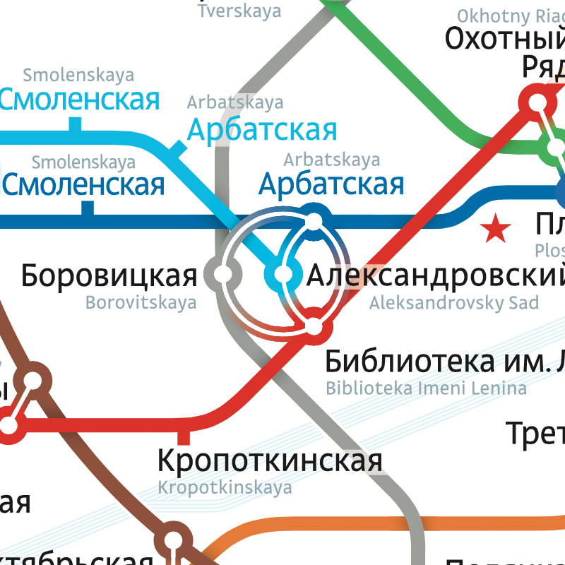
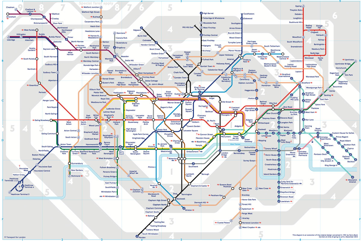
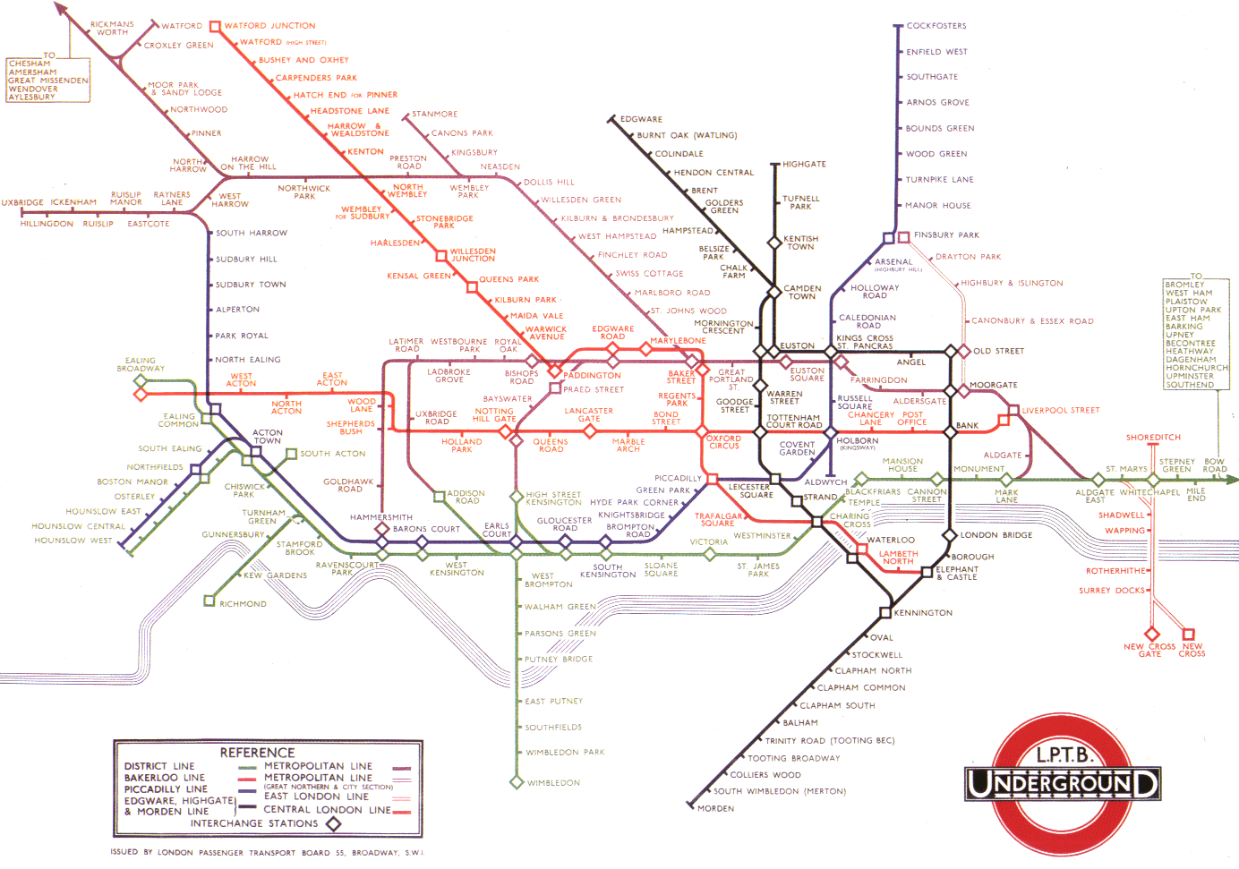
The London underground map by Harry Beck was the world’s first transport map to use the principles of electrical circuit drawings:

Transport map design as a city’s signature

All line segments were put to the angles of 45° and 90°. The distances between stations were equalised. I wrote about it in part three of my “Maps and reality” series, Diagrams.

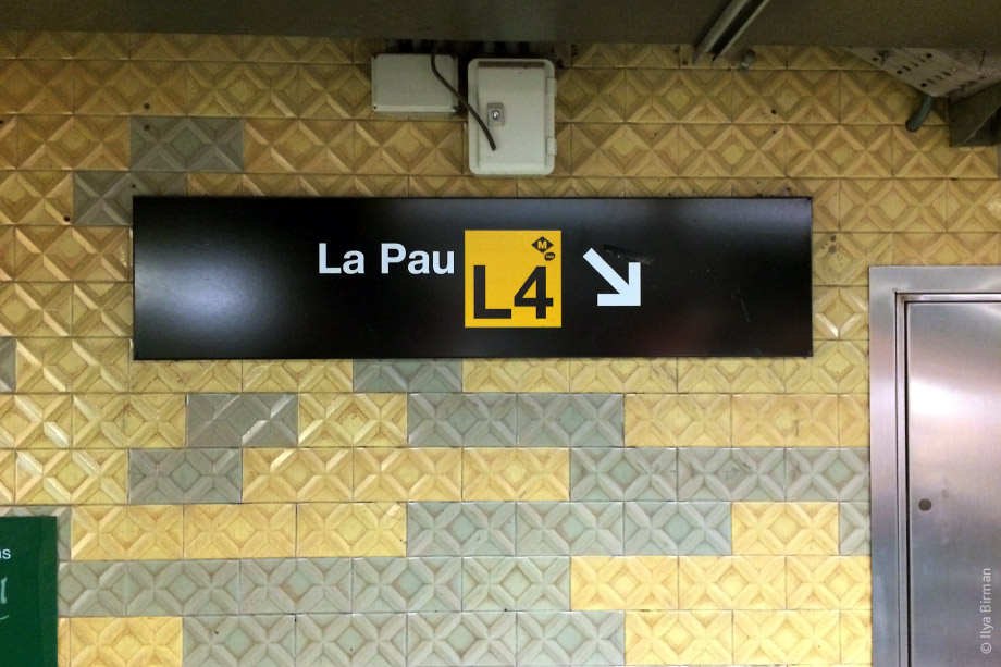
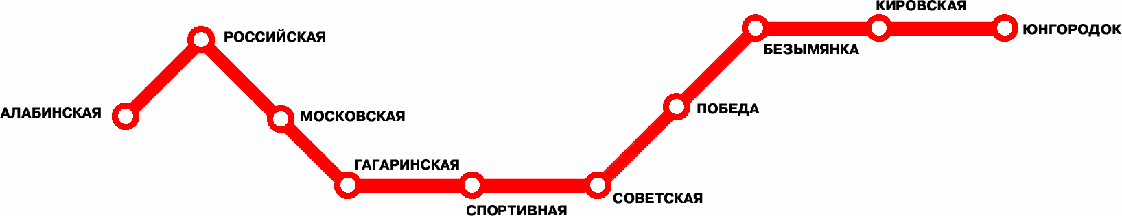
This schematic approach was later adopted by many transport maps of the world. But not every time was this a good idea. This is one useless map (Samara, Russia):

It adds almost nothing to just listing the stations:

Алабинская · Российская · Московская · Гагаринская · Спортивная · Советская…

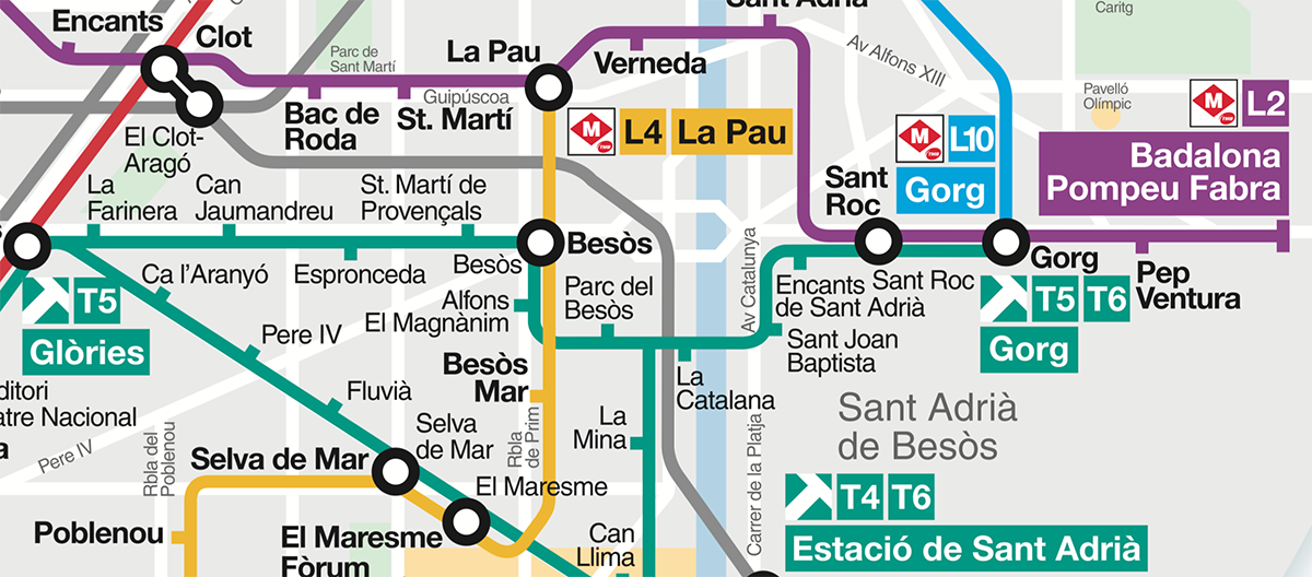
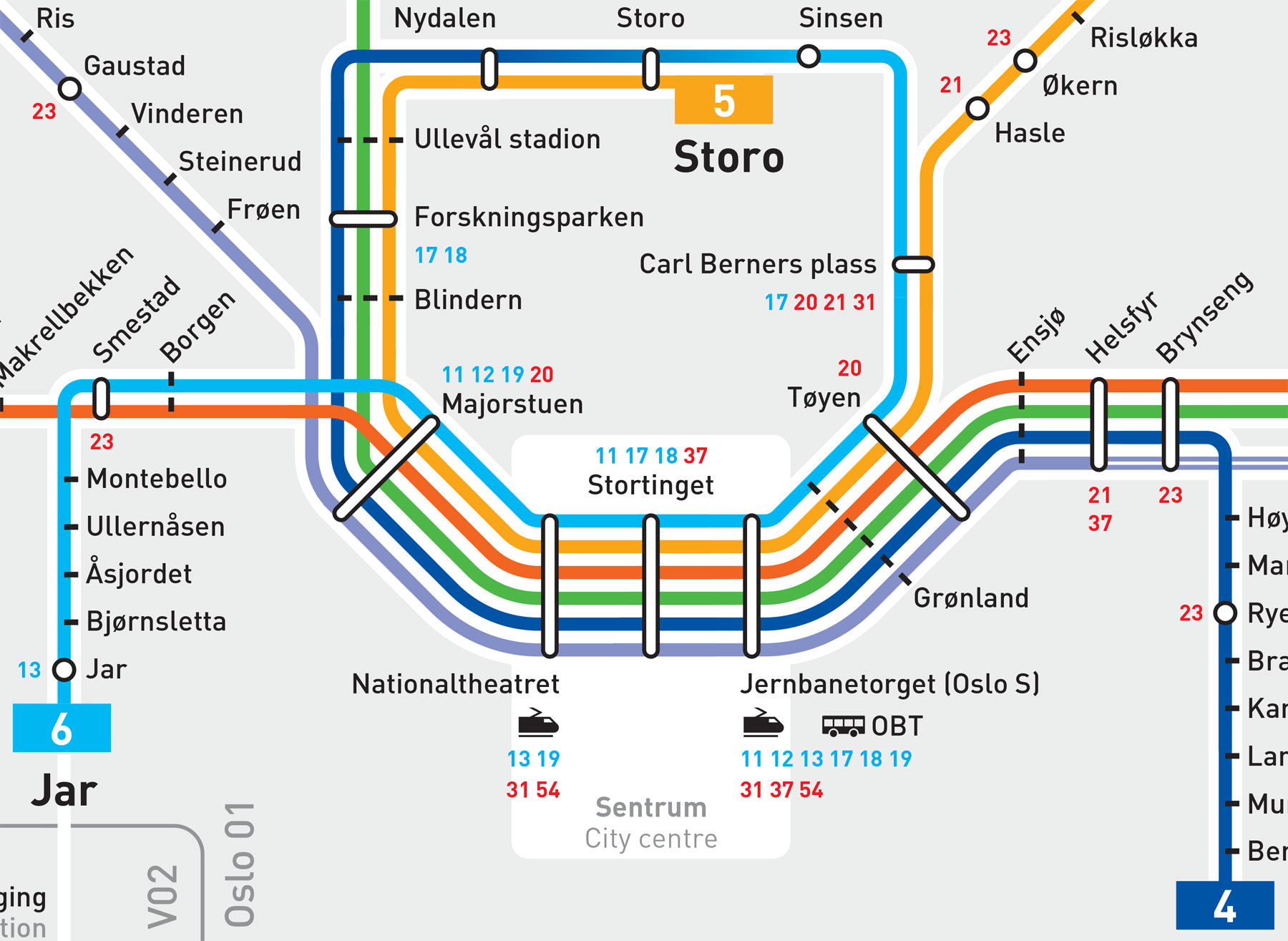
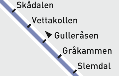
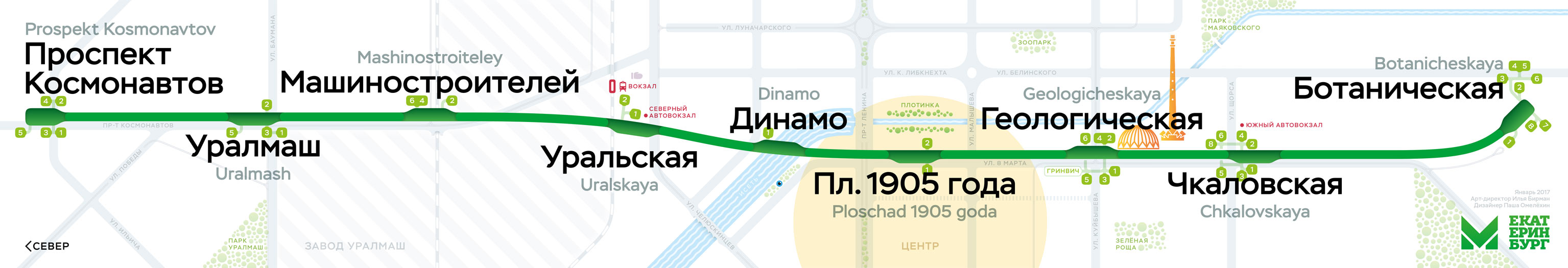
Beck’s design dealt with growing complexity and spread of London underground rail network. When there is just one line, it’s better to put this line in context. See our Ekaterinburg metro map, for example:

Every transport network requires a specialised solution.

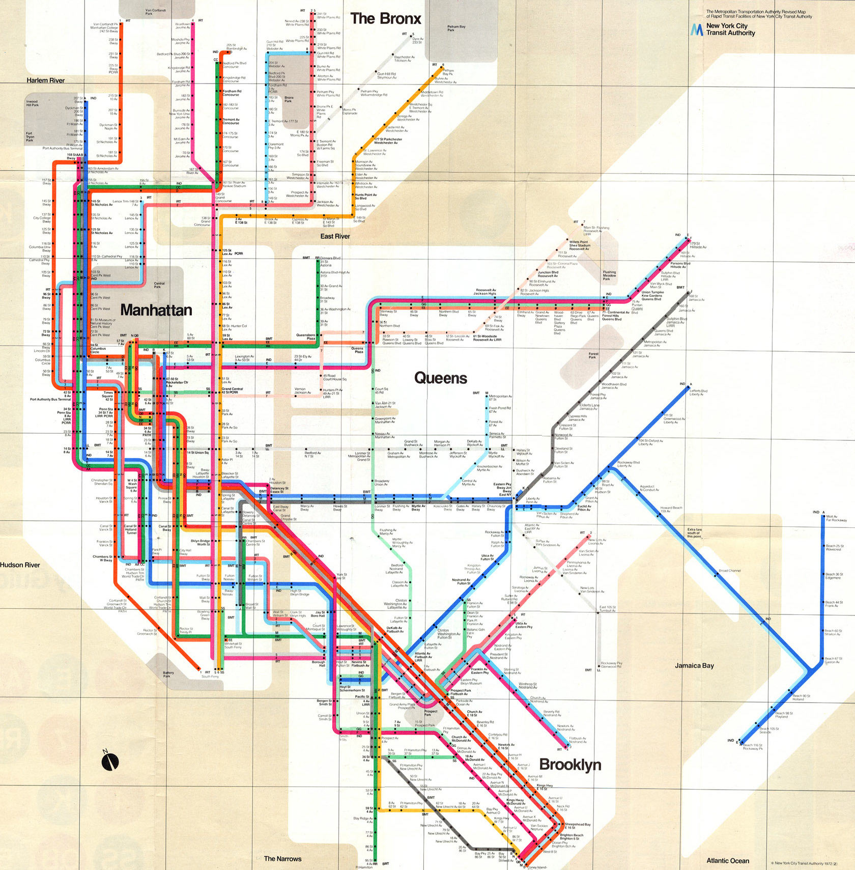
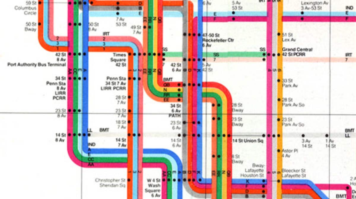
Let’s look at New York. The subway is large and complicated, but quite different from London: trains can have different routes, which are denoted by both numbers and letters. In 1972, Massimo Vignelli designed this map:

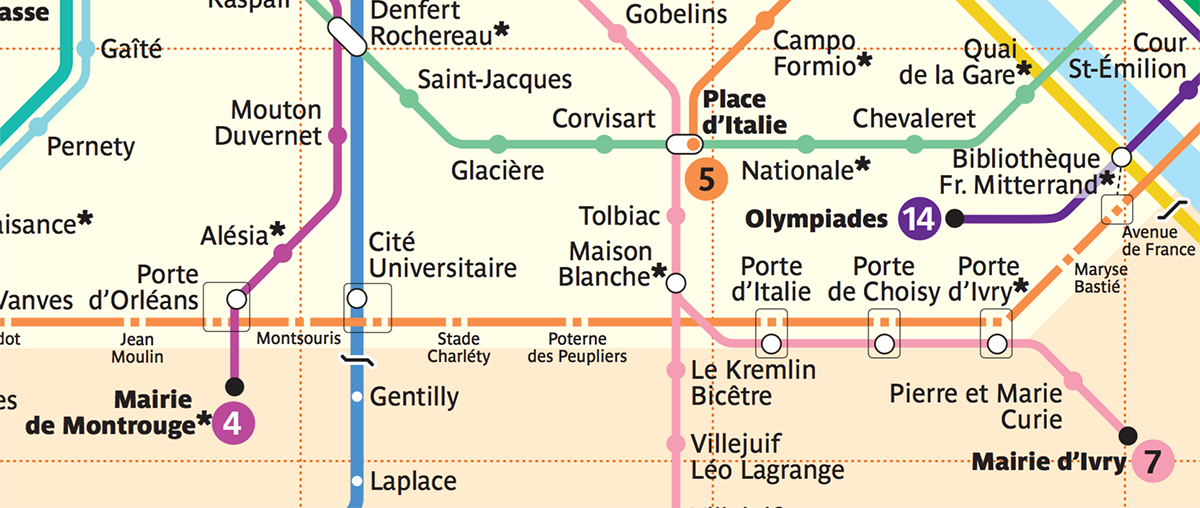
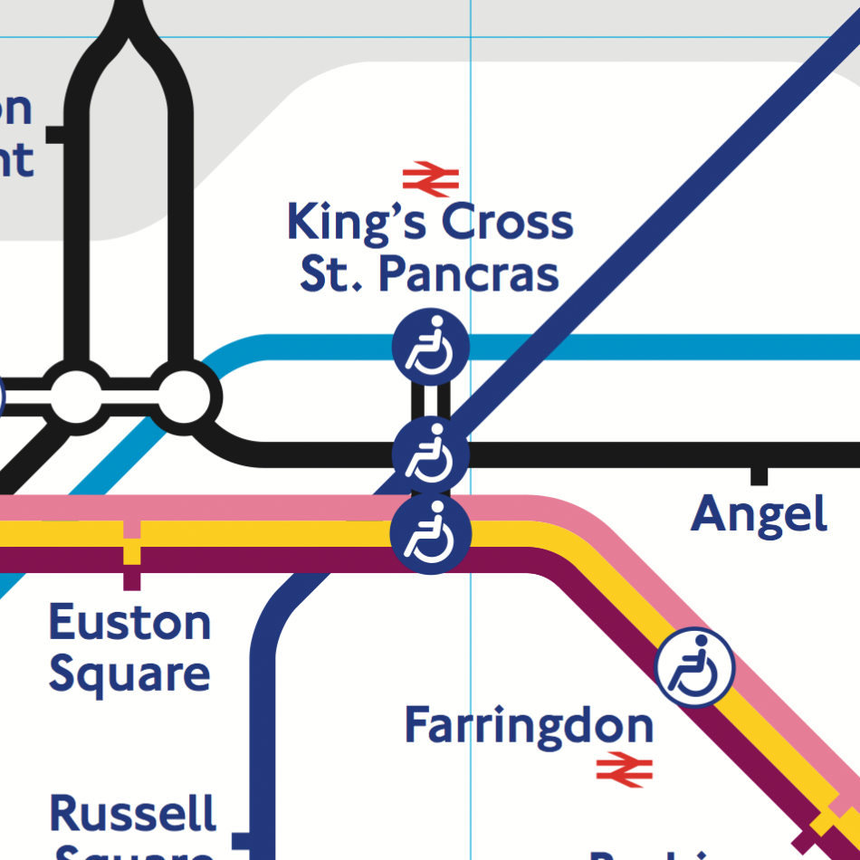
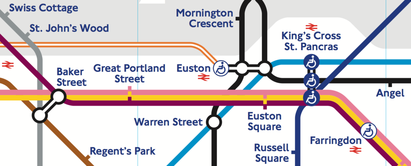
In London, ticks are used to depict stations:

Vignelli couldn’t have used them in New York. In London, lines rarely run together through the same stations. And when they do, all trains in a “wisp” stop at all of them — see Great Portland Street and Euston Square above.

In New York, such wisps are everywhere, and some trains don’t stop at some stations. So when there is a stop on a particular route, Vignelli puts a black bullet in the route’s line:

You can see that at some stations, not every line has a bullet.

Vignelli’s map was beautiful, but, unfortunately, unsuccessful. People considered it too abstract. Having no geographical reference, the eye had nothing to catch on. Also, the stations named with street numbers looked identical — the font was just too small for that.

This design was the closest to London’s that New York has ever seen.

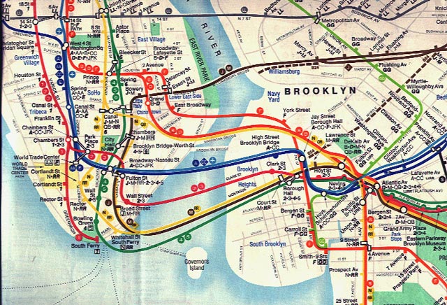
The successful design was the one by Michel Hertz (1979) — still in use. It includes parks, ponds, main streets and areas names:

Illustration from an interview with Michel Hertz

The related routes are denoted with just one line, not a wisp:

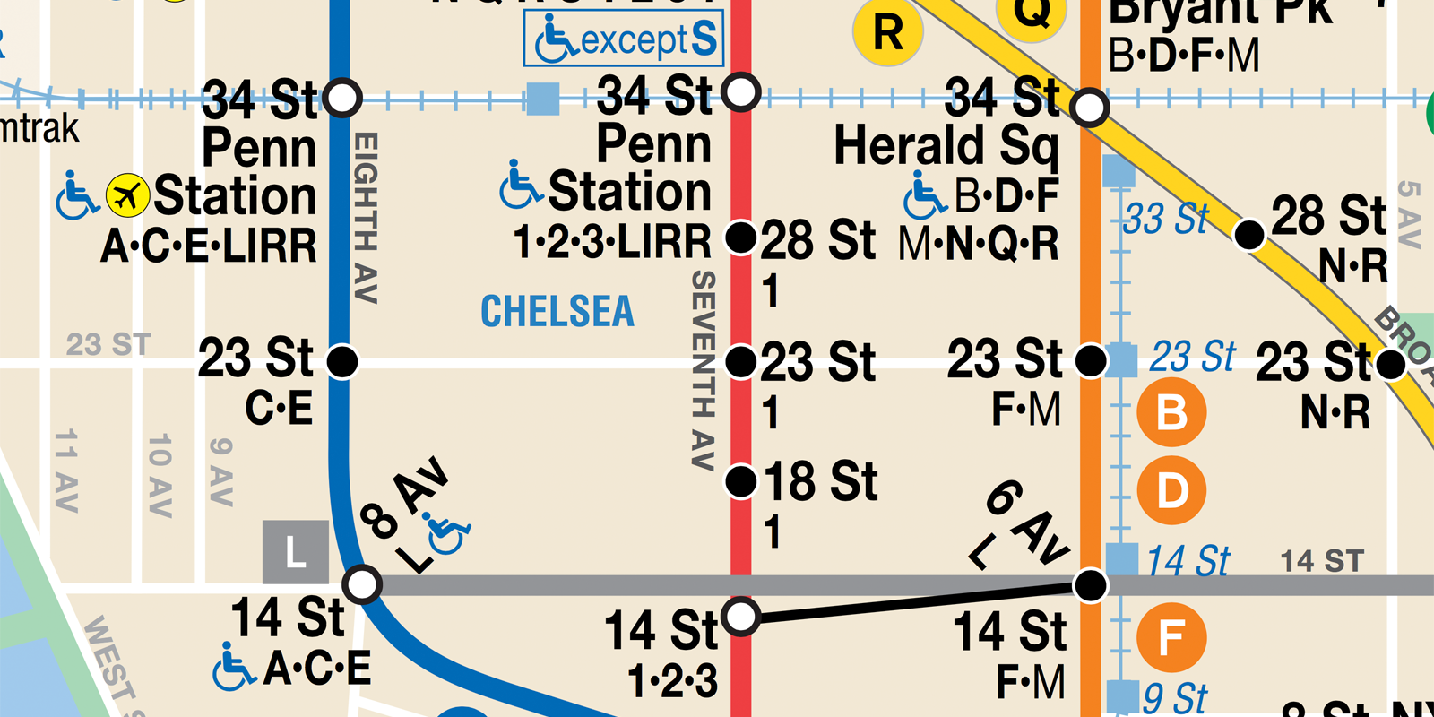
But there’s a list of stopping routes at each station. Look at the red line, for example. Only route 1 stops at 18, 23 and 28 st., but all routes stop at 14 and 34 st.

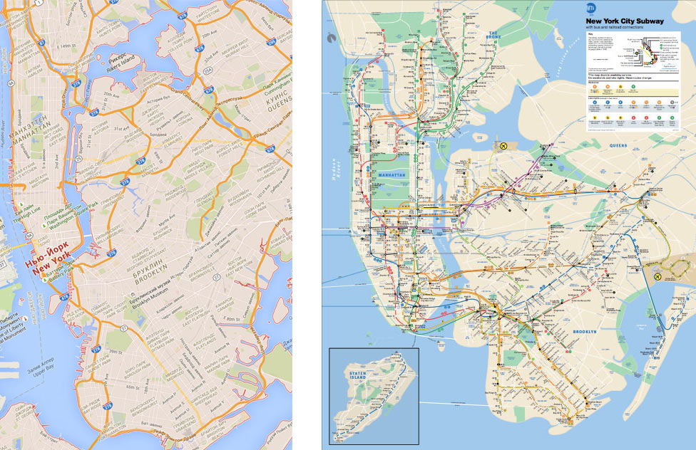
Hertz wanted his map to look geographical. But he knew that a “true” map would use the format very inefficiently. So his map is actually distorted significantly for everything to fit. Google Maps on the left, Hertz’s map on the right:

Hertz’s map doesn’t look stylish. But it has proven to work well. This is a very specific, bulletproof design tailored to New York.

Continued

Berlin U-bahn station names

Here are some Berlin metro station names (photos from trips of August 2005, April and May 2016).

1
2
3
4
5
6
7
8
9
10
11
12
13
14
15

My favourite plate:

16
17
18
19

Animals:

20
21

Another boring one:

22

Kiev in April 2016, all the rest

Here are the rest photos from Kiev in April 2016 that I wanted to share.

In Kiev, there are several peculiar subways. The stairways from the crossing streets run down in a form of an arc, uncovered. The entrance to the subway is where the stairways meet:

These graphics in one of the subways represent the Ukrainian cities:

A manhole cover:

An airplane pictogram confusingly points in wrong direction:

The university is painted with a crazy colour:

At night it looks infernal:

A sign on a fence:

Wall art:

Another example:

There was an exhibition of painted eggs on a square — many looked beautiful:

Dnipro:

More Kiev:

Mimic 2.0: The client’s feedback

I’ve recently designed the new user interface for Mimic, a web developer tool for mocking server responses in a browser. Ilya Gelman, one of the Mimic’s developers, comments on working with me:

Ilya is of that rare kind of designers that seek to find solutions to problems instead of matching colors and shadows. He asks the right questions, concentrates on important things and understands that real products aren’t just beautiful pictures on dribble. He helped us redefine our tool to make it simpler to use and easier to understand.

Working with local Israeli designers, we usually communicated by real-time channels like Slack, WhatsApp or phone. It was a bit different with Ilya because we had to communicate mainly via email and had to schedule our calls ahead of time. Part of this was the difference in time zones and part of it was Ilya’s principle of managing his own time, which I can fully understand and respect. All in all we never had an issue of lack of communication and everything was always delivered on time.

What I liked about Ilya the most is that he was able to explain the reasoning behind his design decisions, and that he knew how to work together with us to get our tool released on time.

Signs and plaques in Kiev

More photos from Kiev.

Listed building:

1

A memorial plaque:

2

A museum:

3

Hand-written posters:

4

Hardware store:

5

A hairdresser’s sign:

6

Another one:

7

Some kind of a special kind of house:

8

Don’t park here:

9

A cafe:

10

M & M:

11, 12

Nice curves:

13

A clothes and vinyl shop:

14

Nice layout:

15

Make text lower case

Sometimes you paste a text from somewhere, and it’s all upper case, and you want to make it normal case. Few people know that changing text case is a built-in feature of every text field on a Mac, like cut, copy and paste.

Edit → Transformations → Make Lower Case:

Make text lower case

See also: Quickly convert any text to plain text.

User interface for Mimic 2.0

A web application’s front end (what the user sees) and back end (what happens on a remote server) are often developed separately. If the back end of some feature is not ready yet, the front-end developer is very limited in what they can do.

I’ve designed the user interface for Mimic 2.0, a web developer tool for mocking server responses in a browser. With Mimic, you can develop as if the server was alive. It’s very easy to set up a simple mock. Say, you want to pretend the server responds with a line of JSON:

It lets you set up very advanced mocks, adjusting HTTP headers, timeouts and what not:

The great thing about Mimic is that you don’t need to set up a local server and change request URIs in your application. It works with the existing applications as they are, right in the browser. And you don’t even need to install browser extensions: you just link one script to your application and that’s it.

Read more about the user interface on the project page.

Kiev street name plates

A characteristic Kiev street name plate looks like this:

1
2

There is a bulb inside, sometimes:

3
4

An old one:

5

An ugly soviet one:

6

The ones on Khreshchatyk look more like car license plates:

7-8

There is also a blue design:

9
10

And also there are these weird boxes at the entrances:

11
12

Transport in Kiev

More pictures from the same April trip to Kiev as the recent yards.

Nice yellow trolleybuses:

Not as nice:

Jitney stops list:

A stop:

Metro ticket hall:

Inside:

Turnstiles:

A poster:

Map booklets:

River station:

Anything goes to protect your parking stop. Bottles:

Planks:

This is a different kind of transport. They attach you to a cable and you fly to the island:

Looks cool:

How to un-hang a hung app on a Mac

In some cases an app on your Mac would hang: the mouse cursor would turn into a spinning beach ball, and the app would ignore all clicks and key presses. If this doesn’t cure itself in a couple of seconds, there’s not much you can do other than to force quit the app and re-launch it.

Except that sometimes you can. Open Activity Monitor and select the hung app in the list. It’s shown in red as “not responding”. Then click the gear icon and select “Sample Process”:

How to un-hang a hung app on a Mac

If you are lucky, the app would just magically un-hang!

I have no idea what this feature is for, and it doesn’t always work. But if the app’s data is very valuable to you, you don’t just want to give up and force quit it. So you can try this. I’ve saved a couple of Photoshop files this way.

Earlier Ctrl + ↓