Blog

Later Ctrl + ↑

The design of the iPhone 7

Somehow it’s become a common knowledge that the design of the iPhone 7 is almost the same as the design of the iPhone 6. This boggles my mind.

How can you not see that the iPhones 6 and 7 are the most different iPhones in the history of iPhones? The iPhone 6 is the ugliest iPhone ever created. The iPhone 7 is the most beautiful iPhone ever created.

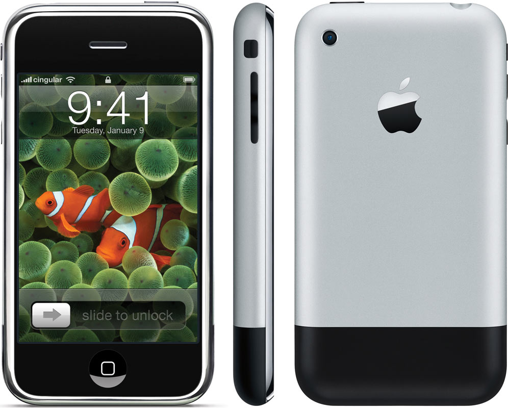
This is the original iPhone:

Original iPhone

It was beautiful. Everything was perfectly aligned. It would be better without the black stripe on the bottom, but it had to be there for the antennas to work.

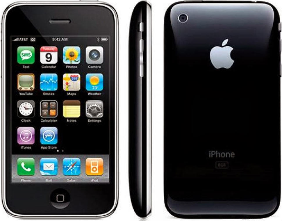
iPhones 3G and 3Gs were worse:

iPhones 3G and 3Gs

They looked fine in pictures, but were plastic, felt cheap and often cracked.

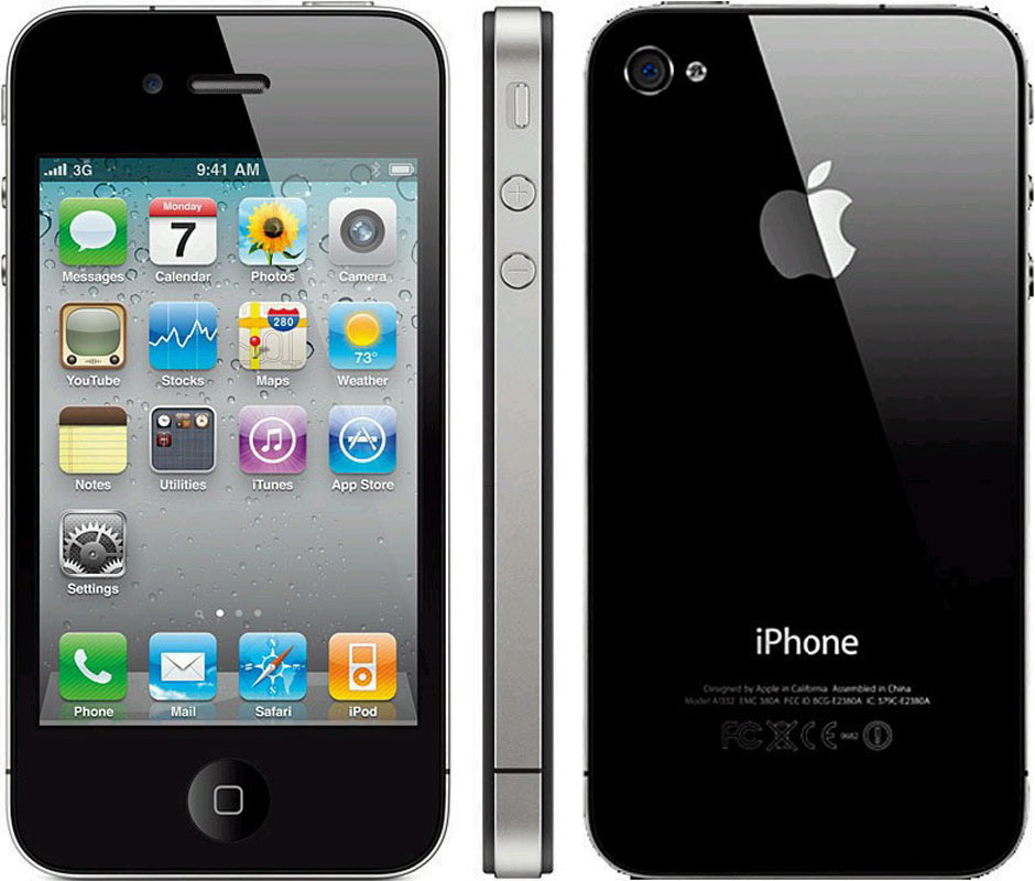
Then there were the iPhones 4 and 4s:

iPhone 4

These were special. They didn’t look nice in pictures, but were very attractive in person. The antenna lines bugged me a lot, but overall these were good ones. The glass back was really cool (I don’t break my phones).

Since then, things went downhill. The iPhones 5 and 5s were ugly:

iPhone 5

The black stripes, unlike on the original iPhone, were completely out of place. The camera was misaligned.

I wrote about it in The hope for a beautiful iPhone.

Then came the iPhones 6 and 6s, painfully ugly:

iPhone 6

The camera was not aligned with anything and sticked out. The rubber stripes were all over the back. How was this even possible? Imagine somebody showing it to you in 2008, after you’ve seen the first iPhones. You wouldn’t believe Apple would have shipped such a device.

Definitely, these were the ugliest iPhones ever built.

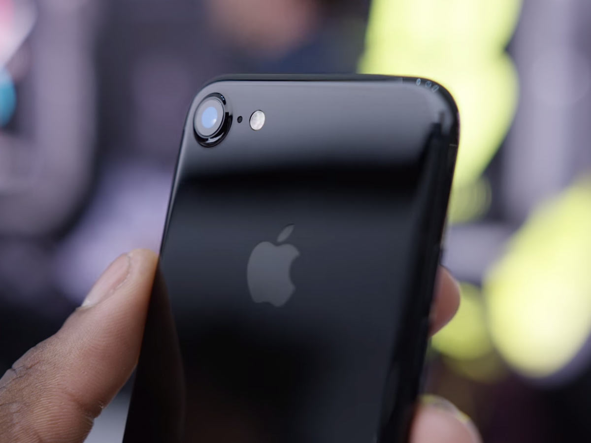
And then Apple showed the iPhone 7:

iPhone 7

Image from wylsa.com

How can you even compare it to the 6? This one is finally beautiful, after several years of ugliness. The camera is aligned with the phone’s corner, for the first time after the iPhone 4! It still sticks out, but this time the phone is designed with this in mind. It’s not slapped on top of an unexpecting phone; it’s there because it was meant to be there. The same for the antenna lines: they are part of the design, not some crap put on top because it had to be.

This is the first iPhone in years that you can enjoy just looking at. And unlike the iPhone 4, it looks great from every angle. It’s the opposite of the iPhones 6.

What’s wrong with Safari’s address bar

Oh, a lot of things. It’s broken beyond repair:

  • It sometimes forgets its address while the page is open and shows the default search prompt.
  • In Top Sites, the address bar would sometimes display topsites:// instead of the search prompt.
  • When you press Back, you sometimes end up on an empty page with parenttab:// (or something like this) in the address bar.
  • If you enter an address and press Enter, sometimes that would just unfocus the address bar, but not initiate a request. You need to re-focus the address bar and press Enter again (if you are lucky and Safari still remembers the address).
  • If you enter an address and press Enter, then switch tab, the page you’ve requested would sometimes open in the tab you’ve switched to instead of the one you’ve typed the address into, replacing the tab’s contents.
  • If you enter an address and press Enter, then drag the current tab to another window while it’s still loading, it would sometimes stop loading and even forget its address, becoming a new clean tab with an empty search prompt in the address bar.
  • If you enter an address and switch tabs without pressing Enter (i. e. to look something up), when you return to the original tab you will probably find out that the part of the address you have entered has been forgotten and replaced with the search prompt.
  • The progress bar will sometimes get stuck at some point after the page has been fully loaded (rare).
  • The progress bar will sometimes not get displayed at all during the loading of the page (rare).
  • When you press Esc while a website is loading, the address bar would sometimes clean itself.
  • Top Sites would sometimes be displayed instead of a page, while the URL in the addressbar is an URL of a page.

Live mix: Loophole

This saturday I played techno in Bukowski Bar:

Live mix: Loophole

The playlist:

0:00:00 Rekord 61 Sverh (Radio Slave FYM Remix 2)
0:01:52 Pig & Dan & Alberto Ruiz Truenos (Original Mix)
0:06:05 Fixon The Pain Is Gone (Audio Injection Remix)
0:07:43 Israel Toledo Standing
0:11:22 Martin Eyerer & Florian Meindl The Rush (Original Mix)
0:15:31 Filterheadz Music Saved My Life (Original Mix)
0:18:55 Nastia Reigel Figures in Brine (Truncate Repaint)
0:22:50 Cirez D On Off (Original Mix)
0:27:44 Reinier Zonneveld & Axan Loophole (Original Mix)
0:31:32 Phunk Investigation Noizer (Original Mix)
0:35:24 Sam Paganini Dusty
0:39:03 Petter B Voltage Controlled Time (Original Mix)
0:43:43 NoizyKnobs Really Deep
0:46:29 Orion Forerunner (Jerome Sydenham & Janne Tavi Remix)
0:50:54 Woo York Siberian Night
0:54:35 Developer Catch My Flow
0:58:21 Cirez D Glow (Original Mix)
1:03:09 Tensal Achievement 3
1:05:37 Stanny Franssen Bionical Clones
1:08:09 Norbert Davenport & Robin Hirte Tijuana Mode
1:12:04 Spark Taberner Meteors
1:17:06 Robert Hood Power To Prophet
1:21:37 Marco Bailey Night Attack (Sian S Calpol Mix)
1:24:24 Adoo Drumigos (Original Mix)
1:28:18 Marcel Dettmann Linux
1:31:14 Fixon Detachment
1:34:37 David Moleon Pasive (DJ Lukas Remix)
1:36:45 Dustin Zahn Sunday Night Fever (Original Mix)
1:39:39 Vegim Thorazine (Original mix)
1:43:14 Unam Zetineb Transmissions
1:46:57 Alan Fitzpatrick Turn Down The Lights (Original Mix)
1:50:14 Birth Of Frequency In Their Steps
1:55:12 P.E.A.R.L. Desolation (Reeko Deep Version)

See also a Mixcloud page.

How to install Aegea

To install Aegea, the blogging engine, you will need:

  • A server with Apache, PHP 5 and MySQL,
  • FTP or SFTP access to the server or another way to access the server’s file system,
  • Access to a MySQL database.

If you don’t have all this or don’t know what this means, you will not be able to install Aegea on your own. Seek assistance.

Get Aegea package
Download the Aegea zip archive from the website and unzip it:

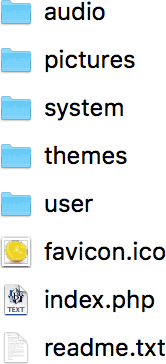
Inside, you will see files like these (the list may differ depending on the version):

Put files on server
Upload all these files to the server (I’m using the FTP client Flow here):

As you can see, I’ve created a “blog” folder on the server and put the files in that folder:

Open Installer with browser
Navigate to the server with your browser. As I’ve created the folder “blog” for Aegea, I go to blogengine.me/blog/:

Enter your MySQL database access parameters: the server, the username, the password and the database name. The last thing to fill in is the password that you want to use to access your blog (you can change it later):

Click “Start blogging” and go:

Permission problems
You may find that instead of the Installer Aegea shows you something like this:

In this case, you need to change the permissions of Aegea’s folder and everything inside it to let the engine do anything it wants. Select the folder “blog” (in my case) and press ⌘I (in Flow’s case) to open its details:

Click the pencil icon next to Permissions (or open the permissions in some other way). Set permissions like this:

Then go back to the browser and press “Try again”. Installer should work now.

Venice

I’ve updated the “World” section with photos from Venice.

Introducing Aegea

Introducing Aegea, a great blogging engine.

An engine is a program that runs on the blogger’s website. It provides the writing tools to the author, shows the posts to the readers and lets them write comments. Medium.com (or similar) is simpler, but they can shut down and take all your posts offline. With an engine, the blog runs on your own website and you have access to the files and the database (you don’t have to deal with the files or the database, but you own all the data).

I want most people to have access to personal blogging in this way. That’s why it uses the most easily available platform: PHP with MySQL.

Aegea powers this and many other blogs. Among my favourites:

With Aegea, you can use the built-in neutral theme or customise it however you like (this blog is an example). Be flexible with comments: allow and disallow them globally or per post. Refine posts using Drafts. Add images, videos, audio or code to illustrate your point. Organise your writing with tags.

Designers, writers, musicians and software developers use Aegea to show their work, communicate and spread knowledge. They love it because it’s simple and fast yet does everything they need. Aegea is free for personal use and paid for business use.

Learn more and get Aegea at blogengine.me.

Reminders app is so buggy

Reminders is one of buggiest apps Apple has ever made. Sometimes it forgets to remind, sometimes it reminds twice. It cannot sync anything between Macs, iOS devices and the watch. And now, it decided to remind me of five things:

Reminders app

Thanks, I guess.

Emerge 1.3 with video support and replay control

In 2013, I released Emerge, a page load coordinator:

Normally, when a complex web page is loading, elements appear in random order, causing unpleasant flashing. To replace it with nice and coordinated animations, programming is required. Emerge.js simplifies the task by removing the need to write any JavaScript code. The framework uses a declarative approach, where you specify the desired behaviour for each element and do not think about the implementation.

See also the introductory blog post.

Version 1.3 adds support for video tags and an easy-to-use replay control useful for debugging.

Update for free

If you’ve bought Emerge, you get the updates for free. Just re-download using the same link you got when you bought the script. Or drop me a line if you have any questions.

Map and reality: diagrams

In the previous two parts, we’ve figured out that the preferred distortion and layers depend on the map’s supposed use case.

With public transport maps, our goal is to help the customer get from point A to point B using the displayed transport network.

This is a map of Paris Metro of 1915:

Paris Metro, 1915

The city is shown in full detail. There are many layers. The metro lines, however, stand out because of the use of contrasting red thick lines.

Compare with the map of London underground railways of 1908:

London underground railways, 1908

The lines of different railways are denoted by different colours. The rest of the city — the roads, the parks and the river — makes one pale-gray layer.

But even this layer is removed by 1932:

London underground railways, 1932

The river Thames is the only non-railway object that remains on this map. And it is the only device that links the railways to the surface geography.

It is always interesting to explore a detailed map with lots of layers. But in this case, the pleasure of exploration is much less important than the customers’ ability to quickly pick out which train to take. The information richness is sacrificed to the comprehension speed.

But as we see, despite all the simplifications, the central part is still rather hard to read. In several places, arrows had to be used to clarify the correspondence of labels and stations.

The engineer Harry Beck has come up with a radical idea. He suggested redesigning the maps using the principles of electrical circuit drawings.

Electrical circuit

Such drawings prioritise the logical connection between the elements over their physical position. What if a railway map also displayed first and foremost the logical connection between the stations?

The Beck’s diagram replaced the map in 1933:

Beck’s Underground map, 1933

All lines segments were put to the angles of 45° and 90°. The distances between stations were equalised.

The modern diagram has twice as many lines and many more layers, but it inherits the Beck’s principles:

Modern London Underground map

Compare with a geographical map of the same lines:

Geographical London Underground map

The central part here is so dense that it had to be put in a cutaway at a bigger scale. And even so, everything turned out very small. Now we see that showing “true” geography is not universally useful. This geographical map is much harder to read. For the railways’ customers, the diagram excels.

If the distances between the stations are equal, the reader will grasp that it’s just a convention and won’t rely on it. If the lines are strictly at 45° or 90°, the reader will grasp that they do not represent the actual paths of the underground tracks and won’t rely on it either. But this doesn’t mean that you can get rid of any geographical reference.
In 2007 I made a rectilinear Moscow Metro map as an experiment:

While the principles of the above diagram are easy to figure out, there still is a problem: even if you live in Moscow, you will have a hard time finding your station.

Since any map is perceived in reference to the image of reality formed by the geographical maps, you have to respect that. If the reader knows roughly where a station is in the city, they should be able to find it on the diagram, too.
Earlier Ctrl + ↓