The current official Metro map looks like this (feel free to reorder the letters in the word “this”):
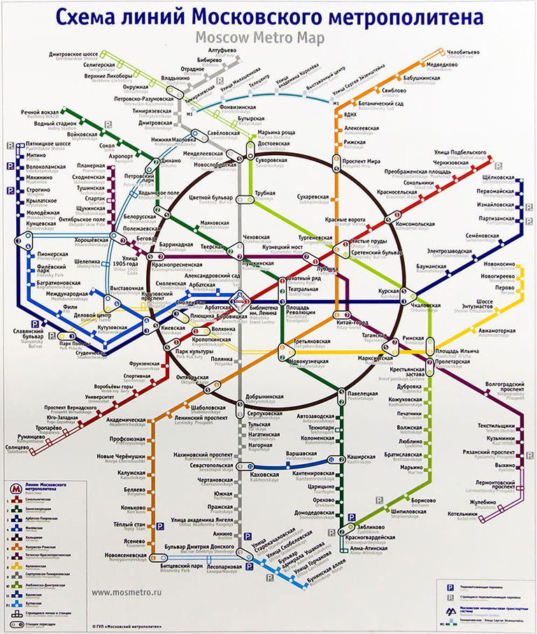
The official map has always been quite bad, but this design (debuted September, 2012) is just embarrassing. It made the indignation spread from designers to the regular people, which means the design is really, really poor. In November the Moscow Department of Transportation announced a design competition for a new Metro map. The deadline: end of December. The prize: your map in the carriages.
I’ve actually been working on Moscow Metro map since 2006, and have released the first version in 2007. At first I thought I would send them my old map, but it turned out to be a bad idea: every competing design should have included a number of features my map did not have (i. e.: having all station names repeated in English). Adding all the features to the old map wasn’t possible due to its design. So I had to come up with a new map in two months.
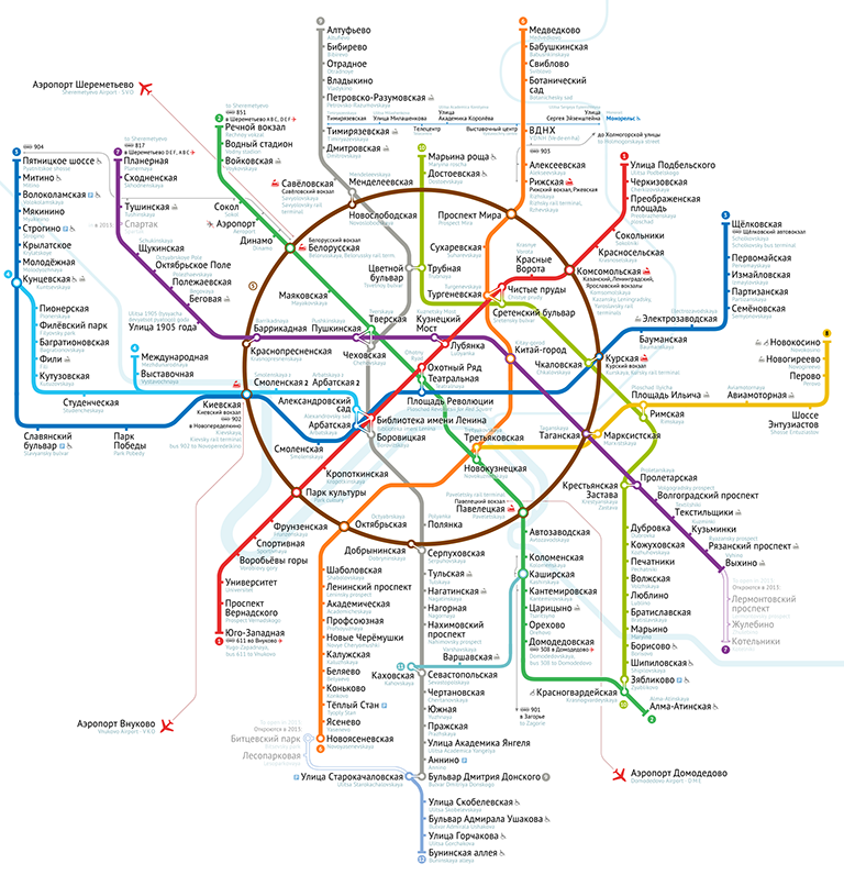
Here’s the design I proposed:
The competition has just finished, and unfortunately my design hadn’t won. I took the 2nd place among 37 competitors, losing only to Art. Lebedev Studio, the most well-known Russian design studio. By the way, the 3rd place was taken by the Russian International News Agency (RIA Novosti), one of the largest state-owned news agencies.
I’ve completed a “case study” page for this project, and would like to invite you to read it: Moscow Metro map.
I’ve also been blogging in Russian during the final stages of the competition. If you are any curious, I invite you to look through the posts. As I said, they are in Russian, but there are many pictures. It’s one of my most important design works.