Blog

Later Ctrl + ↑

Sigward: Obvious Cinema

One of the best tracks of 2011:

Progressive something between pop music and techno. It’s like Yaki-Da’s “I Saw You Dancing”, but serious. Very technical and warm. Worth listening to in a good quality. The worst moment is when it ends — could easily play on repeat for an hour.

UI Shadows in Photoshop

The use of Photoshop’s standard Drop Shadow effect is immediately visible. It usually produces unrealistic and dull shadows:

A button with a Drop Shadow effect

Here’s how the shadow is constructed: the object’s mask is put beneath it, blurred and shifted. Here are the parameters of the above shadow:

Photoshop Drop Shadow parameters

However to make a shadow look better, you don’t always have to draw it “by hand”. The “Quality” group of parameters will help.

Number one is contour. You can change it by bending this graph:

Shadow contour in Photoshop

The graph defines the fade of the shadow. For some reason it’s reversed: the point farthest to the object is on the left, the closest one is on the right. In most cases dragging the midpoint down is the right thing to do: you want the shadow to be lighter halfway from the object.

Photoshop includes some crazy contours that make no sense at all. This adds to the relative unpopularity of the feature (see the first two rows):

Shadow contours in Photoshop

The last four contours are mine. Don’t hesitate to save your good ones there so that you can pick them faster. Like this one:

Shadow contour in Photoshop

The real shadow does not fade linearly because there are many light sources. Bend the curve until it looks fine.

Number two is noise. Just add noise at 2 to 3 percent:

Photoshop shadow noise

Here’s the above button with adjusted contour and added noise (other parameters intact):

A button with a better Drop Shadow effect

No doubt hand-made shadows are better (if made by a good graphic designer). But the production cost is also higher, sometimes too high. Here everything remains scalable and you can transform the button, clone it etc.

A possible shortcoming of this approach is that you can’t make this button with pure CSS. In some cases manufacturability is more important than beauty. And of course all this is about UI shadows (as in buttons, toolbars and such). When you want a real shadow of a real object, Drop Shadow is of no use.

When people get a Mac

There are many explanations to the fact that some prefer Mac to Windows. They suffer religious fanaticism. They worship Steve Jobs. They want to impress others with an expensive gadget. After all, no one argues the power of Apple’s marketing.

But the idea that Macs are of higher quality and reliability seems unfounded. Obviously this can’t be true. Those who choose Macs are fooled. Marketers make naïve people buy expensive things with fictional advantages. The members of the Mac sect aren’t intelligent enough to understand that Mac is just a dummy in a sweet box.

In the last couple of years five or six of my anti-Apple friends who loved to make fun of Macs, switched. Quickly their homes became full with Apple gadgets. And now they help their relatives and friends switch too. It’s pain to see how people become dumb and unreasonable. It’s pain to see how they lose their ability to confront the Apple Church evangelism. It’s pain to see them outsmarted and robbed by selfish “entrepreneurs” from Cupertino.

Once we were discussing Macs and fanboys with Evgeny Stepanischev, and he said: “When I used Windows I thought you were a fan, but I no longer think so”. Not long ago John Gruber gave a definition of fanboy: “Someone who began using Apple products before you did”. These are striking examples of previously normal people losing control of their action and mind. How to make these people regain reason and common sense? How to escape the terrible crisis?

The language you can’t comprehend

great article about how people don’t make sense anymore:

We have forgotten how to use the real names of real things. Like doorknobs. Instead, people talk about the idea of doorknobs, without actually using the word “doorknob”. So a new idea for a doorknob becomes “an innovation in residential access”.

Not a new thought, but well written.

Tech specs as a measure of ineffectiveness

John Gruber on irrelevance of tech specs today:

Spec-based reviews of computers and gadgets are inherently flawed, a relic of an era that’s already gone. Movie reviews are about what the movie is like to watch. Is it enjoyable, is it entertaining, does it look and sound good? Imagine a movie review based on specs, where you gave points for how long it was, whether the photography is in focus, deduct points for continuity errors in the story, and then out comes a number like “7,5 / 10”, with little to no mention about, you know, whether the movie was effective as a piece of art.

High tech specs sometimes say just how bad a device is.

CPU clock speed and amount of RAM is a measure of device’s ineffectiveness. Just think about a 350 hp car that gets to 60 mph in 30 seconds. Something is obviously wrong with it.

If some device has too much memory or too fast processor, two things follow: 1) it costs more than it could have, since you pay for unnecessary hardware; 2) the battery life is worse than it could have been, since all this hardware consumes power.

A company should tell us how awesome and amazing “as a piece of art” their new device is, and then add, just for the geeks, that it has just a single-core 500-MHz processor and 128 MB of RAM. Wow, such a cool device with specs this low? That might be interesting.

On my love to Opera

Following my post on the topic in Russian, Opera’s Vadim Makeev asked me to reproduce it in English so that other guys from Opera could fully enjoy it. So here are some screenshots from my dear Opera browser, which I’ve been using for years, and have just switched from to stupid Safari a couple of days ago. Safari sucks, as well as any other browser, but at least it looks good.

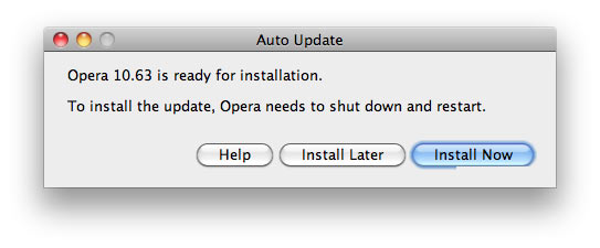
Here’s how Opera says it has to update:

Opera says it has to update

Everything is just awesome. The copy. The order and positioning of buttons. The very existence of Help button. But the winner is the crippled glow of “Install Now”.

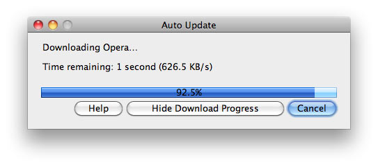
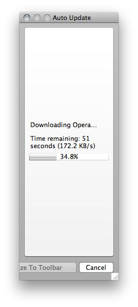
And here’s the update process:

Opera updates itself

This one is also great. The download speed is specified up to a tenth of a kilobyte. The progress bar has a custom glare. The percentage of progress is in the middle and is displayed as black on dark-blue, again with high precision. “Time remaining: 1 second” instead of “1 second remaining”. Charming selection of buttons, with “Cancel” as the main one.

But the sweetest treat here is that this window is resizable:

Opera update window is resizable

This one is from some other version (notice how the weird button is called Minimize To Toolbar here).

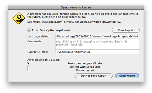
But update is not the only thing Norwegian designers are keen at. Here’s a window stating that Opera has crashed:

A window stating that Opera has crashed

All measures are taken to make sure that the news freaks out the user completely. Nothing fits anywhere. The radio-button labels are centered (they should patent it!).

By the way, the default button is Send Report, which is an outrage on humanity: a browser crash is no fun in the first place, and then I have to send some crappy report? It’s kind of obvious that if you want a report, you just send it in the background and shut up. If you click the button, a page opens in the browser to imitate report sending, but in reality nothing happens. I’ve typically waited for some time, with a maximum of 3 to 4 minutes, with no success. Maybe by design it needed 15 minutes to send the report, who knows? Anyway, I got used to clicking Do Not Send Report.

The icon is nifty, but if you think about it, they have designed a custom icon for a browser crash. Crashes are important aspect of the user experience with Opera, so I guess that sort of makes sense.

Also, Opera is a unique application. After crashing it manages to do one impossible thing. It restarts and a new Opera icon appears on the right side of the Dock (while the old ones remains in the Dock). The new icon starts jumping happily, while the one to the left stays calm. How’s that even possible? I have no clue, but apparently Opera does. Because of this, after every crash it is necessary to remove the old Dock icon and then move the new one into its place.

One day the new icon didn’t appear immediately, so I clicked the old one. It started jumping, and then the new one appeared, also jumping, of course. That was real fun, since they both started to bombard me with error boxes, saying something about conflicting resources, and then they hung so I had to force quit both. Epic.

But hey, Opera has “Unite”.

Samara

Samara is a city on the Volga river in Russia.

There are reversible lanes here. Also, notice the sign on the very right:

There are reversible lanes in Samara

Street name plates have two names:

Street name plates have two names in Samara

One is historical, the other one is current:

A street name plate in Samara

Trolleybus route plate utilises a beautiful font:

Trolleybus route plate utilises a beautiful font in Samara

Tram and trolleybus authority:

Tram and trolleybus authority in Samara

An anchor:

An anchor sign in Samara

Entrances to a bath-house and a laundry:

Entrances to a bath-house and a laundry in Samara

The artists’ society:

A house of the artists’ society in Samara

The house is barely standing:

The house is barely standing in Samara

The pictures are from the trip in October, 2010.

Milan

Can’t help but envy those who see this beauty on their way to work:

Square name plate in Milan Street name plate in Milan Street name plate in Milan Street name plate in Milan

The buildings with these plaques are also gorgeous:

A building in Milan
A building in Milan
A building in Milan
A building in Milan
A building in Milan
A building in Milan

A ceiling in a shopping mall:

A ceiling in a shopping mall in Milan

***

Suits ride motorcycles here:

Suits ride motorcycles in Milan

Local police drive Alfa-Romeos:

Local police drives Alfa-Romeos in Milan

The trams are adorable:

Trams are adorable in Milan

Or skewed:

A skewed tram in Milan

Or just have six bellows:

A tram with six bellows in Milan

People sew in Milan. Even a fountain is stitched to a square:

A fountain is stitched to a square in Milan A fountain is stitched to a square in Milan

***

Italian is easy to understand:

Italian is easy to understand Italian is easy to understand Italian is easy to understand

Bank:

Стабильность в Милане in Milan

Patriotism:

Патриотизм в Милане in Milan

The pictures are from the trip in July, 2010.

Shall and will

On shall and will:

In formal writing, the future tense requires shall for the first person, will for the second and third. The formula to express the speaker’s belief regarding the future action or state is I shall; I will expresses determination or consent. A swimmer in distress cries, «I shall drown; no one will save me!» A suicide puts it the other way: «I will drown; no one shall save me!» In relaxed speech, however, the words shall and will are seldom used precisely; our ear guides us or fails to guide us, as the case may be, and we are quite likely to drown when we want to survive and survive when we want to drown.

William Strunk jr. and E. B. White. The Elements Of Style.

It’s always appeared to me that shall has a tinge of “should”.

Highly recommended reading.