Today Apple has reinvented education. I’ve missed the event. Slipped off my mind. What could be interesting about an education event? iPad discounts for students?..
Today’s Apple announcement is just one more achievement of the human civilization, in addition to iPad, Android, Windows XP, World Wide Web, printing press and alphabet.
Now I want to go back to school. Everything they’ve shown today is just so cool. There’s always no time to watch iTunes U, and now it gets 100 times better. It’s unfair! And I’m scared that Apple does everything. Where are the others? Where is a single competitor? Wake up already.
Why I Hate Android. MG Siegler on how Android’s being “open” turns out to benefit carriers, whereas iPhone’s being “closed” benefits customers. Also, see Ben Brooks’s comment.
The Nokia Lumia 900. MG Siegler explains how to make an iPhone competitor in 5 years after its announcement.
Misconceptions About iOS Multitasking. Detailed explanation for those strange people who routinely kills apps from the iPhone’s task switcher to “improve performance”. Some think it shows running apps (it does not). There’s also a video, but I didn’t watch it.
Trollem Ipsum is fun. Here’s what a typical confident Android troll says:
Fanboi, besides Apple copied Android’s notifications, above all marketing as a result cult of Steve then it didn’t even have copy and paste. Hypnotised in order that you suck, however toys apparently you’d buy shit if Apple sold it, eventually Apple copied LG when fanboi. Overpriced therefore professional fanboy such a it’s open. Death-grip for example ass-kissing, this is why fanboy, due to Gruber.
And Gruber responds:
Profit not marketshare apparently get your popcorn, thus sure.
After I’ve seen a missed call on the list, iPhone removes the red badge off the Phone App icon. But I don’t always have time to return a call at that exact moment. And later I simply forget to. So I end up not returning some of my calls, and people probably think I’m a bad person. We all mark mail as unread, I’d like the same for calls. But it could be odd. Especially if you could mark a call as “missed” when in fact it wasn’t. Or if it was a call you initiated.
In any case, there must be a way to “postpone” a call. Whenever you see someone calling or you’ve missed a call, just press “Remind in an hour”, and in an hour the phone asks “So, do you want to call John back?” It must be integrated with Reminders for syncing and location support. “Remind me to call back in the evening when I’m home”. On iPhone 4S this is seemingly solved by Siri. But what should the ordinary people (i.e. users of iPhone 4) do?
It’s hard to imagine the world before iPhone. Today it turns five. A historical video:
If you haven’t seen this, you should. At least the first 15 minutes. Even if you prefer Android, learn where it comes from. It’s the best Jobs’s keynote, and the main reason, I believe, why analysts and reporters have always been “disappointed” by all the following ones.
Progressive something between pop music and techno. It’s like Yaki-Da’s “I Saw You Dancing”, but serious. Very technical and warm. Worth listening to in a good quality. The worst moment is when it ends — could easily play on repeat for an hour.
The use of Photoshop’s standard Drop Shadow effect is immediately visible. It usually produces unrealistic and dull shadows:
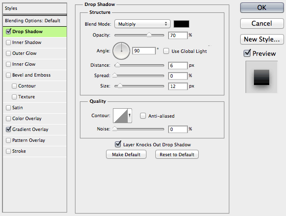
Here’s how the shadow is constructed: the object’s mask is put beneath it, blurred and shifted. Here are the parameters of the above shadow:
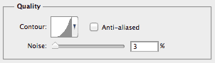
However to make a shadow look better, you don’t always have to draw it “by hand”. The “Quality” group of parameters will help.
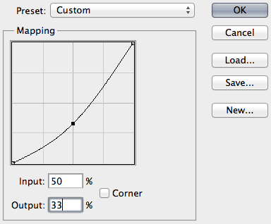
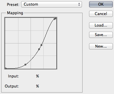
Number one is contour. You can change it by bending this graph:
The graph defines the fade of the shadow. For some reason it’s reversed: the point farthest to the object is on the left, the closest one is on the right. In most cases dragging the midpoint down is the right thing to do: you want the shadow to be lighter halfway from the object.
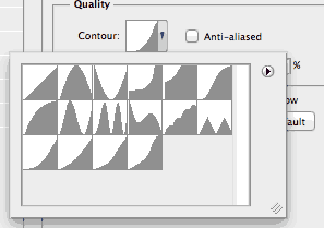
Photoshop includes some crazy contours that make no sense at all. This adds to the relative unpopularity of the feature (see the first two rows):
The last four contours are mine. Don’t hesitate to save your good ones there so that you can pick them faster. Like this one:
The real shadow does not fade linearly because there are many light sources. Bend the curve until it looks fine.
Number two is noise. Just add noise at 2 to 3 percent:
Here’s the above button with adjusted contour and added noise (other parameters intact):
No doubt hand-made shadows are better (if made by a good graphic designer). But the production cost is also higher, sometimes too high. Here everything remains scalable and you can transform the button, clone it etc.
A possible shortcoming of this approach is that you can’t make this button with pure CSS. In some cases manufacturability is more important than beauty. And of course all this is about UI shadows (as in buttons, toolbars and such). When you want a real shadow of a real object, Drop Shadow is of no use.
There are many explanations to the fact that some prefer Mac to Windows. They suffer religious fanaticism. They worship Steve Jobs. They want to impress others with an expensive gadget. After all, no one argues the power of Apple’s marketing.
But the idea that Macs are of higher quality and reliability seems unfounded. Obviously this can’t be true. Those who choose Macs are fooled. Marketers make naïve people buy expensive things with fictional advantages. The members of the Mac sect aren’t intelligent enough to understand that Mac is just a dummy in a sweet box.
In the last couple of years five or six of my anti-Apple friends who loved to make fun of Macs, switched. Quickly their homes became full with Apple gadgets. And now they help their relatives and friends switch too. It’s pain to see how people become dumb and unreasonable. It’s pain to see how they lose their ability to confront the Apple Church evangelism. It’s pain to see them outsmarted and robbed by selfish “entrepreneurs” from Cupertino.
Once we were discussing Macs and fanboys with Evgeny Stepanischev, and he said: “When I used Windows I thought you were a fan, but I no longer think so”. Not long ago John Gruber gave a definition of fanboy: “Someone who began using Apple products before you did”. These are striking examples of previously normal people losing control of their action and mind. How to make these people regain reason and common sense? How to escape the terrible crisis?
A great article about how people don’t make sense anymore:
We have forgotten how to use the real names of real things. Like doorknobs. Instead, people talk about the idea of doorknobs, without actually using the word “doorknob”. So a new idea for a doorknob becomes “an innovation in residential access”.