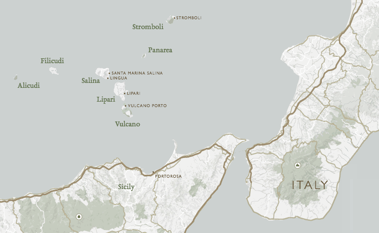
I was lucky enough to take part in sailing Aeolian Islands in the beginning of June. Here they are:
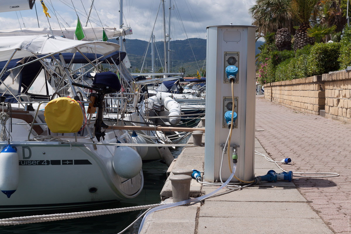
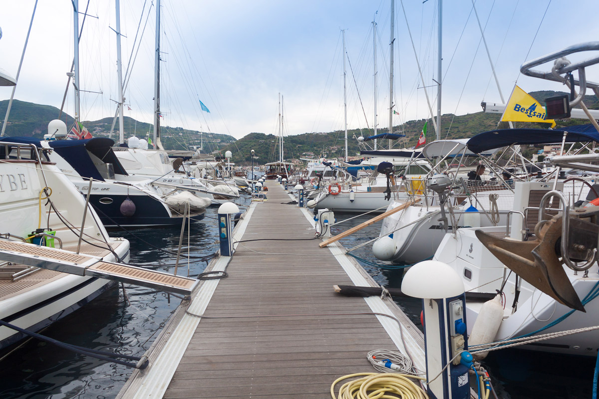
My mind was blown by the amount of new things I’ve learned. In marinas there are special stubs with electricity and water. This helps when you need to charge your iPhone or swab your deck. This one is in Portorosa where we’ve chartered a boat:
As we arrived at a Vulcano bay, we’ve found that there was no marina. I thought we would have to sail to one of the other islands, but it turned out you could moor without a marina! Special� buoys designate points with available mooring lines. You leave your boat a hundred meters into the sea and go to the island on a dinghy. We didn’t actually have to float our dinghy. Giovanni, a local with a motor boat, brought us to Vulcano:
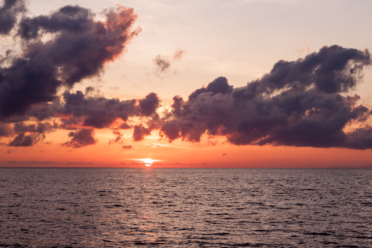
A Vulcano sunset:
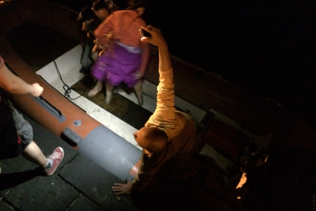
After several hours on the island, Giovanni takes us back “home”:
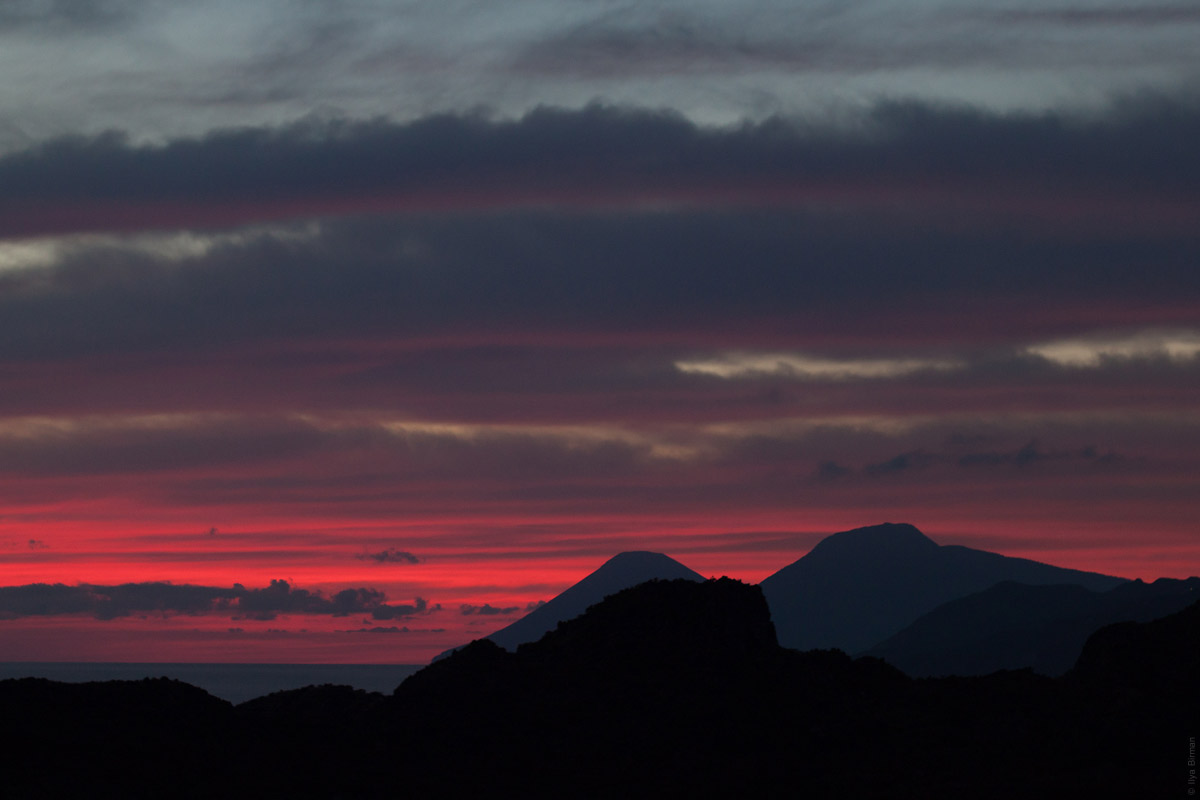
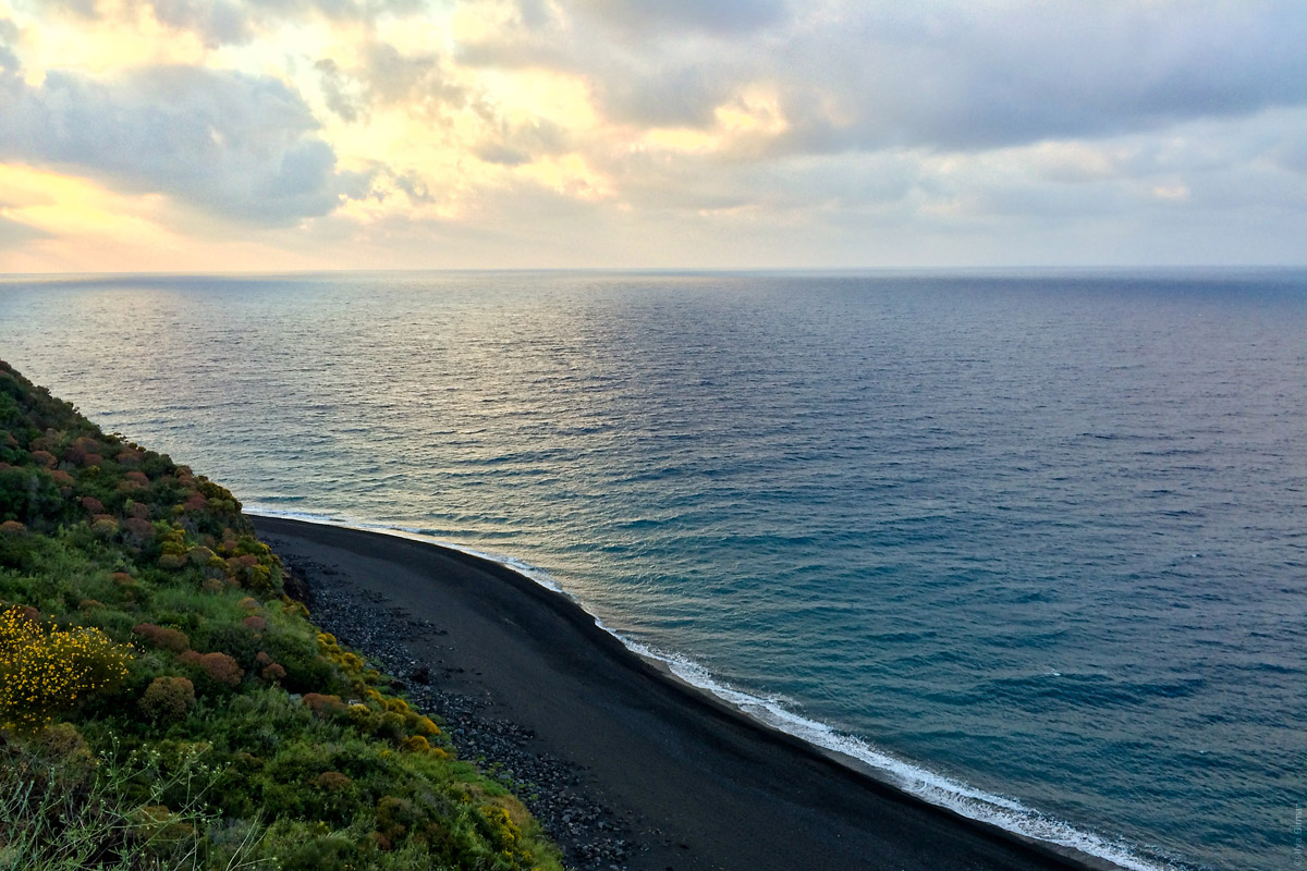
A Vulcano sunrise:
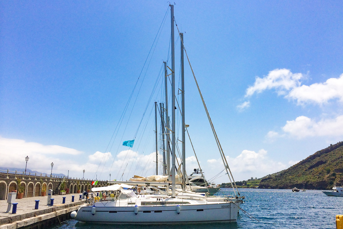
In Lipari, there was a marina with electricity, water and even free Wi-Fi:
The Wi-Fi came in handy: the night at Lipari was the night after WWDC and I was able to watch the Keynote.
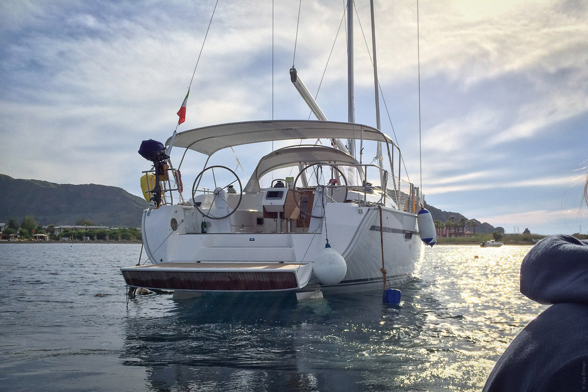
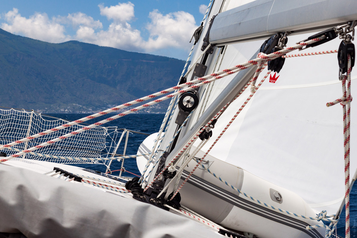
Sailing to Salina:
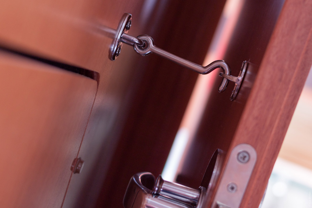
All the doors have hooks to fix them open:
Our boat (the closest one) at Santa Marina Salina:
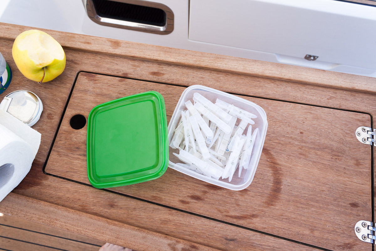
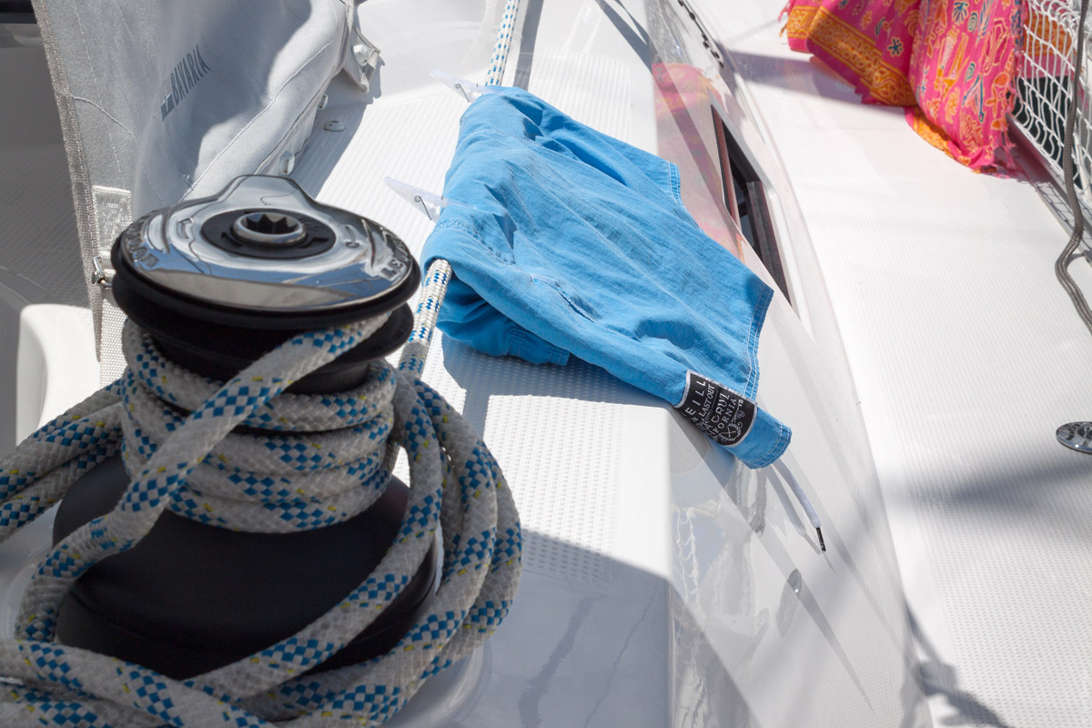
Clothes-pegs are very useful on a boat:
Here, two are used to fix my bathing trunks to a jibsheet:
We were planning to sail next to Stromboli, an active volcano. Unfortunately, there was not only no marina on Stromboli, there weren’t any mooring buoys either. The skipper explained the anchorage theory, but later we decided to change the plan due to unfavourable weather. We booked a hotel and took a ferry to Stromboli.
A Stromboli beach:
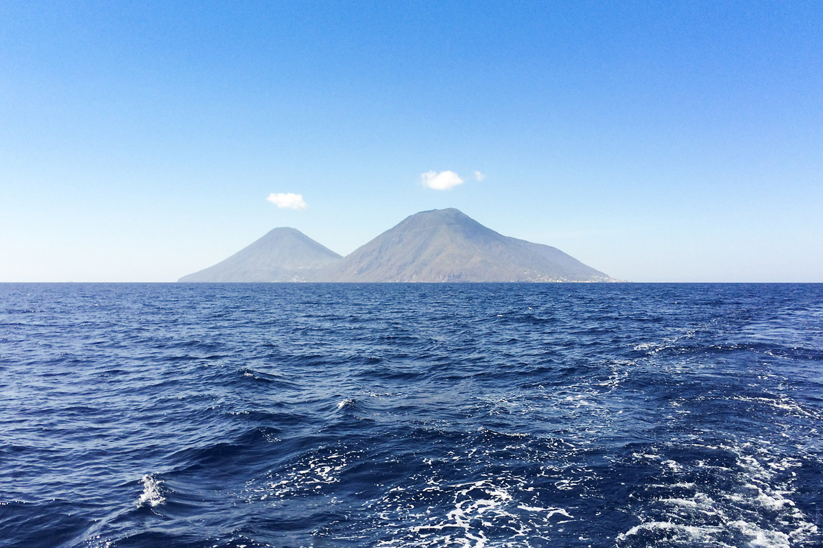
The clouds form cute hats above the islands:
We returned to Sicily having one day of the charter left, so we used it to sail to a nice harbour not far from Portorosa and practice anchorage in a good weather.
I will probably write about the islands themselves sometime later.